Create new RichFaces Documentation Jira issue

JBoss.orgCommunity Documentation
RichFaces was developed with an open architecture to be compatible with the widest possible variety of environments.
This is what you need to start working with RichFaces 3.3.3:
Java
JavaServer Faces
Java application server or servlet container
Browser (on client side)
RichFaces framework
This chapter describes all necessary actions and configurations that should be done for plugging the RichFaces components into a JSF appplication. The description relies on a simple JSF with RichFaces application creation process from downloading the libraries to running the application in a browser. The process of application creation described here is common and does not depend on used IDE.
The latest release of RichFaces components is available for download at
JBoss RichFaces Downloads area at JBoss community.
Binary files (uploaded there in *.bin.zip or
*.bin.tar.gz archives) contains compiled,
ready-to-use version of RichFaces with set of basic skins.
To start with RichFaces in computer file system create new folder with name "RichFaces", download and unzip the archive with binaries there.
For those who want to download and compile the RichFaces by themselfs there is an article at JBoss community that describes the RichFaces repository's structure overview and some aspects of working with it.
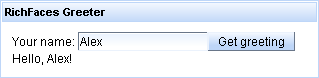
"RichFaces Greeter"—the simple application—is hello-world like application but with one difference: the world of RichFaces will say "Hello!" to user first.
Create standard JSF 1.2 project with all necessary libraries; name the project "Greeter" and follow the decription.
...

<!-- Plugging the "Blue Sky" skin into the project -->

<context-param>

   <param-name>org.richfaces.SKIN</param-name>

   <param-value>blueSky</param-value>

</context-param>


<!-- Making the RichFaces skin spread to standard HTML controls -->

<context-param>

      <param-name>org.richfaces.CONTROL_SKINNING</param-name>

      <param-value>enable</param-value>

</context-param>


<!-- Defining and mapping the RichFaces filter -->

<filter>

   <display-name>RichFaces Filter</display-name>

   <filter-name>richfaces</filter-name>

   <filter-class>org.ajax4jsf.Filter</filter-class>

</filter>


<filter-mapping>

   <filter-name>richfaces</filter-name>

   <servlet-name>Faces Servlet</servlet-name>

   <dispatcher>REQUEST</dispatcher>

   <dispatcher>FORWARD</dispatcher>

   <dispatcher>INCLUDE</dispatcher>

</filter-mapping>

...
For more information on how to work with RichFaces skins read "Skinnabilty" chapter.
Finally the web.xml should look like this:
<?xml version="1.0"?>

<web-app version="2.5"

                xmlns="http://java.sun.com/xml/ns/javaee"

                xmlns:xsi="http://www.w3.org/2001/XMLSchema-instance"

                xsi:schemaLocation="http://java.sun.com/xml/ns/javaee http://java.sun.com/xml/ns/javaee/web-app_2_5.xsd">

<display-name>Greeter</display-name>


<context-param>

   <param-name>javax.faces.STATE_SAVING_METHOD</param-name>

   <param-value>server</param-value>

</context-param>


<context-param>

   <param-name>org.richfaces.SKIN</param-name>

   <param-value>blueSky</param-value>

</context-param>


<context-param>

      <param-name>org.richfaces.CONTROL_SKINNING</param-name>

      <param-value>enable</param-value>

</context-param>


<filter>

   <display-name>RichFaces Filter</display-name>

   <filter-name>richfaces</filter-name>

   <filter-class>org.ajax4jsf.Filter</filter-class>

</filter>


<filter-mapping>

   <filter-name>richfaces</filter-name>

   <servlet-name>Faces Servlet</servlet-name>

   <dispatcher>REQUEST</dispatcher>

   <dispatcher>FORWARD</dispatcher>

   <dispatcher>INCLUDE</dispatcher>

</filter-mapping>


<listener>

   <listener-class>com.sun.faces.config.ConfigureListener</listener-class>

</listener>


<!-- Faces Servlet -->

<servlet>

   <servlet-name>Faces Servlet</servlet-name>

   <servlet-class>javax.faces.webapp.FacesServlet</servlet-class>

   <load-on-startup>1</load-on-startup>

</servlet>


<!-- Faces Servlet Mapping -->

<servlet-mapping>

   <servlet-name>Faces Servlet</servlet-name>

   <url-pattern>*.jsf</url-pattern>

</servlet-mapping>


<login-config>

   <auth-method>BASIC</auth-method>

   </login-config>

</web-app>
With the next step the user bean should be
registered in faces-config.xml file:
<?xml version="1.0" encoding="UTF-8"?>

<faces-config version="1.2"

                    xmlns="http://java.sun.com/xml/ns/javaee"

                    xmlns:xi="http://www.w3.org/2001/XInclude"

                    xmlns:xsi="http://www.w3.org/2001/XMLSchema-instance"

                    xsi:schemaLocation="http://java.sun.com/xml/ns/javaee http://java.sun.com/xml/ns/javaee/web-facesconfig_1_2.xsd">

   <managed-bean>

      <description>UsernName Bean</description>

      <managed-bean-name>user</managed-bean-name>

      <managed-bean-class>demo.user</managed-bean-class>

      <managed-bean-scope>request</managed-bean-scope>

      <managed-property>

         <property-name>name</property-name>

         <property-class>java.lang.String</property-class>

         <value/>

      </managed-property>

   </managed-bean>

</faces-config>
<!doctype html public "-//w3c//dtd html 4.0 transitional//en">

<%@ taglib uri="http://java.sun.com/jsf/core" prefix="f" %>

<%@ taglib uri="http://java.sun.com/jsf/html" prefix="h" %>

<!-- RichFaces tag library declaration -->

<%@ taglib uri="http://richfaces.org/a4j" prefix="a4j"%>

<%@ taglib uri="http://richfaces.org/rich" prefix="rich"%>


<html>

      <head>

            <title>RichFaces Greeter</title>

      </head>

      <body>

            <f:view>

                  <a4j:form>

                        <rich:panel header="RichFaces Greeter" style="width: 315px">

                              <h:outputText value="Your name: " />

                              <h:inputText value="#{user.name}" >

                                    <f:validateLength minimum="1" maximum="30" />

                              </h:inputText>


                              <a4j:commandButton value="Get greeting" reRender="greeting" />


                              <h:panelGroup id="greeting" >

                                    <h:outputText value="Hello, " rendered="#{not empty user.name}" />

                                    <h:outputText value="#{user.name}" />

                                    <h:outputText value="!" rendered="#{not empty user.name}" />

                              </h:panelGroup>

                        </rich:panel>

                  </a4j:form>

            </f:view>

      </body>

</html>
Note, that the RichFaces tag library should be declared on each JSP page.
For Facelets you should add the following lines for tag library declaration:
<ui:composition xmlns="http://www.w3.org/1999/xhtml"

                xmlns:ui="http://java.sun.com/jsf/facelets"

                xmlns:a4j="http://richfaces.org/a4j"

                xmlns:rich="http://richfaces.org/rich">

   ...

</ui:composition>
In this section we will tell how you can create a simple JSF application with RichFaces using Maven.
<profile>

    <id>jsf-app-profile</id>

    <repositories>

        <repository>

            <releases>

                <enabled>true</enabled>

            </releases>

            <snapshots>

                <enabled>true</enabled>

                <updatePolicy>always</updatePolicy>

            </snapshots>

            <id>snapshots.jboss.org</id>

            <name>Snapshot Jboss Repository for Maven</name>

            <url>http://snapshots.jboss.org/maven2/</url>

            <layout>default</layout>

        </repository>

        <repository>

            <releases>

                <enabled>true</enabled>

            </releases>

            <snapshots>

                <enabled>true</enabled>

                <updatePolicy>always</updatePolicy>

            </snapshots>

            <id>repository.jboss.com</id>

            <name>Jboss Repository for Maven</name>

            <url>http://repository.jboss.com/maven2/</url>

            <layout>default</layout>

        </repository>

    </repositories>

</profile>
...

<activeProfiles>

  <activeProfile>jsf-app-profile</activeProfile>

</activeProfiles>

...
...

mvn archetype:generate -DarchetypeGroupId=org.richfaces.cdk -DarchetypeArtifactId=maven-archetype-jsfwebapp -DarchetypeVersion=3.3.3-SNAPSHOT -DgroupId=org.docs.richfaces -DartifactId=jsf-app

...
You can adjust some parameters of the command.
This command generates a JSF project that has the following structure:
jsf-app

|-- pom.xml

`-- src

    |-- main

    |   |-- java

    |   |   `-- org

    |   |       `-- docs

    |   |           `-- richfaces

    |   |               `-- Bean.java

    |   |-- resources

    |   `-- webapp

    |       |-- WEB-INF

    |       |   |-- faces-config.xml

    |       |   `-- web.xml

    |       |-- index.jsp

    |       `-- pages

    |           |-- index.jsp

    |           `-- index.xhtml

    `-- test

        `-- java

            `-- org

                `-- docs

                    `-- richfaces

                        `-- BeanTest.java
Now go to "jsf-app" folder, it contains a project descriptor(pom.xml). Open the project descriptor to edit and add dependencies to the <dependencies> element. Your <dependencies> element content should be the following:
...

<dependencies>

    <dependency>

        <groupId>junit</groupId>

        <artifactId>junit</artifactId>

        <version>3.8.1</version>

        <scope>test</scope>

    </dependency>

    <dependency>

        <groupId>javax.servlet</groupId>

        <artifactId>servlet-api</artifactId>

        <version>2.4</version>

        <scope>provided</scope>

    </dependency>

    <dependency>

        <groupId>javax.servlet</groupId>

        <artifactId>jsp-api</artifactId>

        <version>2.0</version>

        <scope>provided</scope>

    </dependency>

    <dependency>

        <groupId>jstl</groupId>

        <artifactId>jstl</artifactId>

        <version>1.1.2</version>

    </dependency>

    <dependency>

        <groupId>javax.servlet.jsp</groupId>

        <artifactId>jsp-api</artifactId>

        <version>2.1</version>

        <scope>provided</scope>

    </dependency>

    <dependency>

        <groupId>javax.faces</groupId>

        <artifactId>jsf-api</artifactId>

        <version>1.2_12</version>

    </dependency>

    <dependency>

        <groupId>javax.faces</groupId>

        <artifactId>jsf-impl</artifactId>

        <version>1.2_12</version>

    </dependency>

    <dependency>

        <groupId>javax.el</groupId>

        <artifactId>el-api</artifactId>

        <version>1.0</version>

        <scope>provided</scope>

    </dependency>

    <dependency>

        <groupId>el-impl</groupId>

        <artifactId>el-impl</artifactId>

        <version>1.0</version>

        <scope>provided</scope>

    </dependency>

    <dependency>

        <groupId>javax.annotation</groupId>

        <artifactId>jsr250-api</artifactId>

        <version>1.0</version>

    </dependency>

    <!-- RichFaces libraries -->

    <dependency>

        <groupId>org.richfaces.framework</groupId>

        <artifactId>richfaces-api</artifactId>

        <version>3.3.3-SNAPSHOT</version>

    </dependency>

    <dependency>

        <groupId>org.richfaces.framework</groupId>

        <artifactId>richfaces-impl</artifactId>

        <version>3.3.3-SNAPSHOT</version>

    </dependency>

    <dependency>

        <groupId>org.richfaces.ui</groupId>

        <artifactId>richfaces-ui</artifactId>

        <version>3.3.3-SNAPSHOT</version>

    </dependency>

</dependencies>

...
The last three dependences add RichFaces libraries to the project. You can now build the project with the mvn install command.
When you see the "BUILD SUCCESSFUL" message, the project is assembled and can be imported to a IDE and run on the server.
The project can be built for Eclipse IDE with mvn eclipse:eclipse -Dwtpversion=2.0 command.
Then you can import the project into Eclipse. After importing to Eclipse open the "jsf-app/src/main/webapp/WEB-INF/web.xml" to configure it according to the listing in the Registering RichFaces in web.xml section of the guide.
The project is configured and now you can start using RichFaces. Open "jsf-app/src/main/webapp/pages/index.jsp" file and add the tag library declaration.
...

<%@ taglib uri="http://richfaces.org/rich" prefix="rich"%>

...
Add some RichFaces component to the "index.jsp" page, for instance <rich:calendar>. Your "index.jsp" page will look like this:
...

<%@ taglib uri="http://java.sun.com/jsf/html" prefix="h" %>

<%@ taglib uri="http://java.sun.com/jsf/core" prefix="f"%>

<%@ taglib uri="http://richfaces.org/rich" prefix="rich"%>

<html>

    <head>

        <title>JSF Application with RichFaces built by Maven</title>

    </head>

    <body>

        <f:view>

        <rich:calendar />

        </f:view>

    </body>

</html>

...
Now run the application on Tomcat server and open it in your favourite browser by pointing it to "http://localhost:8080/jsf-app/" .
The Photo Album Application is designed and developed with RichFaces.
Maven Resource Dependency Plugin Reference article discusses plugin configuration and usage.
See also the "How to start RichFaces application with NetBeans IDE" article in the RichFaces Cookbook.
JBoss Developer Studio comes with a tight integration with RichFaces component framework. Following links might be useful for those who already use this IDE and RichFaces for developing applications and those who wish to improve their development process:
"Rich Components" chapter in "Getting Started with JBoss Developer Studio Guide" describes how to add RichFaces components into a CRUD application;
"JBoss Tools Palette" chapter in "Visual Web Tools Reference Guide" describes advantages that gives Tools Pallete (comes together with JBDS) for quick and easy pages creation processs including RichFaces applications;
"RichFaces Toolkit for developing Web application" video tutorial demonstrates some aspects of interaction with JBoss Developer Studio while working with RichFaces.
"How to Configure Maven for RichFaces" article shortly discusses Maven configuration for RichFaces.
" RichFaces Release Procedure " article describes how RichFaces release builds are made.
Read "RichFaces installing and configuration" article to find out how to integrate RichFaces and Trinidad and possible problems that may occur while launching the RichFaces sample on the JBoss server.
Read also the quick overview to "Practical RichFaces " book by Max Katz at his blog.
RichFaces comes with support for all tags (components) included in the JavaServer Faces specification. To add RichFaces capabilities to the existing JSF project you should just put the RichFaces libraries into the lib folder of the project and add filter mapping. The behavior of the existing project doesn't change just because of RichFaces.
Table 4.1. Initialization Parameters
| Name | Default | Description |
|---|---|---|
| org.richfaces.SKIN | DEFAULT | Is a name of a skin used in an
application. It can be a
literal string with a skin
name, or the
EL
expression
(#{...})
pointed to a
String
property (skin
name) or a property of a
org.richfaces.framework.skin
type. Skin in last case, this
instance is used as a current
skin |
| org.richfaces.LoadScriptStrategy | DEFAULT | Defines how the RichFaces script files are loaded to application. Possible values are: ALL, DEFAULT, NONE. For more information see "Scripts and Styles Load Strategy". |
| org.richfaces.LoadStyleStrategy | DEFAULT | Defines how the RichFaces style files are loaded to application. Possible values are: ALL, DEFAULT, NONE. For more information see "Scripts and Styles Load Strategy". |
| org.ajax4jsf.LOGFILE | none | Is an URL to an application or a container log file (if possible). If this parameter is set, content from the given URL is shown on a Debug error page in the iframe window |
| org.ajax4jsf.VIEW_HANDLERS | none | Is a comma-separated list of custom ViewHandler instances for inserting in chain. Handlers are inserted BEFORE RichFaces viewhandlers in the given order. For example, in facelets application this parameter must contain com.sun.facelets.FaceletViewHandler, instead of declaration in faces-config.xml |
| org.ajax4jsf.CONTROL_COMPONENTS | none | Is a comma-separated list of names for a component as a special control case, such as messages bundle loader, alias bean components, etc. Is a type of component got by a reflection from the static field COMPONENT_TYPE . For components with such types encode methods always are called in rendering Ajax responses, even if a component isn't in an updated part |
| org.ajax4jsf.ENCRYPT_RESOURCE_DATA | false | For generated resources, such as encrypt generation data, it's encoded in the resource URL. For example, URL for an image generated from the mediaOutput component contains a name of a generation method, since for a hacker attack, it is possible to create a request for any JSF baked beans or other attributes. To prevent such attacks, set this parameter to "true" in critical applications (works with JRE > 1.4 ) |
| org.ajax4jsf.ENCRYPT_PASSWORD | random | Is a password for encryption of resources data. If isn't set, a random password is used |
| org.ajax4jsf.COMPRESS_SCRIPT | true | It doesn't allow framework to reformat JavaScript files (makes it impossible to debug) |
| org.ajax4jsf.RESOURCE_URI_PREFIX | a4j | Defines prefix which is added to all URIs of generated resources. This prefix designed to handle RichFaces generated resources requests |
| org.ajax4jsf.GLOBAL_RESOURCE_URI_PREFIX | a4j/g | Defines prefix which is added to URIs of global resources. This prefix designed to handle RichFaces generated resources requests |
| org.ajax4jsf.SESSION_RESOURCE_URI_PREFIX | a4j/s | Defines prefix which is used for session tracking for generated resources. This prefix designed to handle RichFaces generated resources requests |
| org.ajax4jsf.DEFAULT_EXPIRE | 86400 | Defines in seconds how long streamed back to browser resources can be cached |
| org.ajax4jsf.SERIALIZE_SERVER_STATE | false | If enabled the component state
(not the tree) will be
serialized before being stored
in the session. This may be
desirable for applications
that may have issues with view
state being sensitive to model
changes. Instead of this
parameter can use
com.sun.faces.serializeServerState
and
org.apache.myfaces.SERIALIZE_STATE_IN_SESSION
parameters for
corresponding environments.
|
| java.sun.com |
Additional information how to get ViewExpiredExceptions
when using RichFaces with JSF
1.2_12 you can find in RichFaces Cookbook article.
For more information look at: http://myfaces.apache.org
There's one more problem while using MyFaces + Seam . If you use this combination you should use <a4j:page> inside <f:view> (right after it in your code) wrapping another content inside your pages because of some problems in realization of <f:view> in myFaces.
The problem is to be overcome in the nearest future.
Your web.xml for Seam 1.2 must be like this:
<?xml version="1.0" ?>

<web-app xmlns="http://java.sun.com/xml/ns/j2ee"

                   xmlns:xsi="http://www.w3.org/2001/XMLSchema-instance"

                   xsi:schemaLocation="http://java.sun.com/xml/ns/j2ee http://java.sun.com/xml/ns/j2ee/web-app_2_4.xsd"

                   version="2.4">


     <!-- richfaces -->


     <filter>

          <display-name>RichFaces Filter</display-name>

          <filter-name>richfaces</filter-name>

          <filter-class>org.ajax4jsf.Filter</filter-class>

     </filter>


     <filter-mapping>

          <filter-name>richfaces</filter-name>

          <url-pattern>*.seam</url-pattern>

     </filter-mapping>


     <!-- Seam -->


     <listener>

          <listener-class>org.jboss.seam.servlet.SeamListener</listener-class>

     </listener>


     <servlet>

          <servlet-name>Seam Resource Servlet</servlet-name>

          <servlet-class>org.jboss.seam.servlet.ResourceServlet</servlet-class>

     </servlet>


     <servlet-mapping>

          <servlet-name>Seam Resource Servlet</servlet-name>

          <url-pattern>/seam/resource/*</url-pattern>

     </servlet-mapping>


     <filter>

          <filter-name>Seam Filter</filter-name>

          <filter-class>org.jboss.seam.web.SeamFilter</filter-class>

     </filter>


     <filter-mapping>

          <filter-name>Seam Filter</filter-name>

          <url-pattern>/*</url-pattern>

     </filter-mapping>


     <!-- MyFaces -->


     <listener>

          <listener-class>org.apache.myfaces.webapp.StartupServletContextListener</listener-class>

     </listener>


     <!-- JSF -->


     <context-param>

          <param-name>javax.faces.STATE_SAVING_METHOD</param-name>

          <param-value>client</param-value>

     </context-param>


     <context-param>

          <param-name>javax.faces.DEFAULT_SUFFIX</param-name>

         <param-value>.xhtml</param-value>

     </context-param>


     <servlet>

          <servlet-name>Faces Servlet</servlet-name>

          <servlet-class>javax.faces.webapp.FacesServlet</servlet-class>

          <load-on-startup>1</load-on-startup>

     </servlet>


     <servlet-mapping>

          <servlet-name>Faces Servlet</servlet-name>

          <url-pattern>*.seam</url-pattern>

     </servlet-mapping>

</web-app>
Seam 2 supports RichFaces Filter. Thus your web.xml for Seam 2 must be like this:
<?xml version="1.0" encoding="UTF-8"?>

<web-app version="2.5"

                   xmlns="http://java.sun.com/xml/ns/javaee"

                   xmlns:xsi="http://www.w3.org/2001/XMLSchema-instance"

                   xsi:schemaLocation="http://java.sun.com/xml/ns/javaee http://java.sun.com/xml/ns/javaee/web-app_2_5.xsd">


     <context-param>

          <param-name>org.ajax4jsf.VIEW_HANDLERS</param-name>

          <param-value>com.sun.facelets.FaceletViewHandler</param-value>

     </context-param>


     <!-- Seam -->


     <listener>

          <listener-class>org.jboss.seam.servlet.SeamListener</listener-class>

     </listener>


     <servlet>

          <servlet-name>Seam Resource Servlet</servlet-name>

          <servlet-class>org.jboss.seam.servlet.SeamResourceServlet</servlet-class>

     </servlet>


     <servlet-mapping>

          <servlet-name>Seam Resource Servlet</servlet-name>

          <url-pattern>/seam/resource/*</url-pattern>

     </servlet-mapping>


     <filter>

          <filter-name>Seam Filter</filter-name>

          <filter-class>org.jboss.seam.servlet.SeamFilter</filter-class>

     </filter>


     <filter-mapping>

          <filter-name>Seam Filter</filter-name>

          <url-pattern>/*</url-pattern>

     </filter-mapping>


     <!-- JSF -->


     <context-param>

          <param-name>javax.faces.DEFAULT_SUFFIX</param-name>

          <param-value>.xhtml</param-value>

     </context-param>


     <context-param>

          <param-name>facelets.DEVELOPMENT</param-name>

          <param-value>true</param-value>

     </context-param>


     <servlet>

          <servlet-name>Faces Servlet</servlet-name>

          <servlet-class>javax.faces.webapp.FacesServlet</servlet-class>

          <load-on-startup>1</load-on-startup>

     </servlet>


     <servlet-mapping>

          <servlet-name>Faces Servlet</servlet-name>

          <url-pattern>*.seam</url-pattern>

     </servlet-mapping>

</web-app>
Only one issue still persists while using Seam with MyFaces. Look at myFaces part of this section.
Detailed information on how to integrate Richfaces and Trinidad and how to hide ".seam" postfix in the URL you can find in the RichFaces Cookbook article
The load-on-startup for the Faces Servlet had to be set to 0 in web.xml.
...

<servlet>

     <servlet-name>Faces Servlet</servlet-name>

     <servlet-class>javax.faces.webapp.FacesServlet</servlet-class>

     <load-on-startup>0</load-on-startup>

</servlet>

...
- 5.1. Introduction
- 5.2. RichFaces Architecture Overview
- 5.3. Partial Rendering
- 5.4. RichFaces Integral Parts
- 5.5. Limitations and Rules
- 5.6. Ajax Request Optimization
- 5.7. How To...
- 5.8. Filter Configuration
- 5.9. Scripts and Styles Load Strategy
- 5.10. Request Errors and Session Expiration Handling
- 5.11. Skinnability
- 5.12. Definition of Custom Style Classes
- 5.13. State Manager API
- 5.14. Identifying User Roles
Next Figure shows how it works:
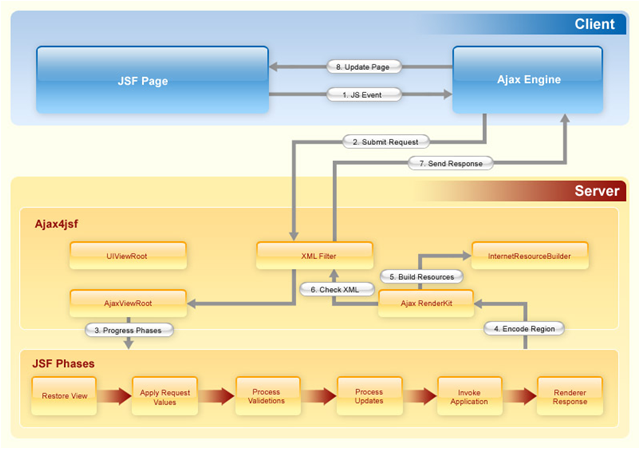
RichFaces allows to define (by means of JSF tags) different parts of a JSF page you wish to update with an Ajax request and provide a few options to send Ajax requests to the server. Also JSF page doesn't change from a "regular" JSF page and you don't need to write any JavaScript or XMLHTTPRequest objects by hands, everything is done automatically.
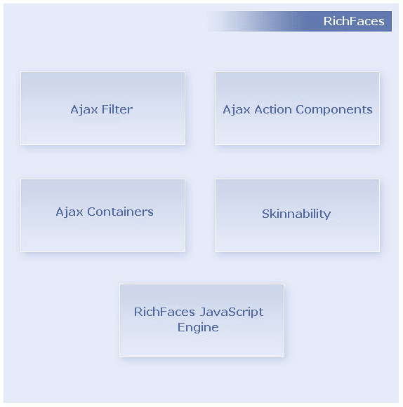
Next figure lists several important elements of the RichFaces framework
Ajax Filter.
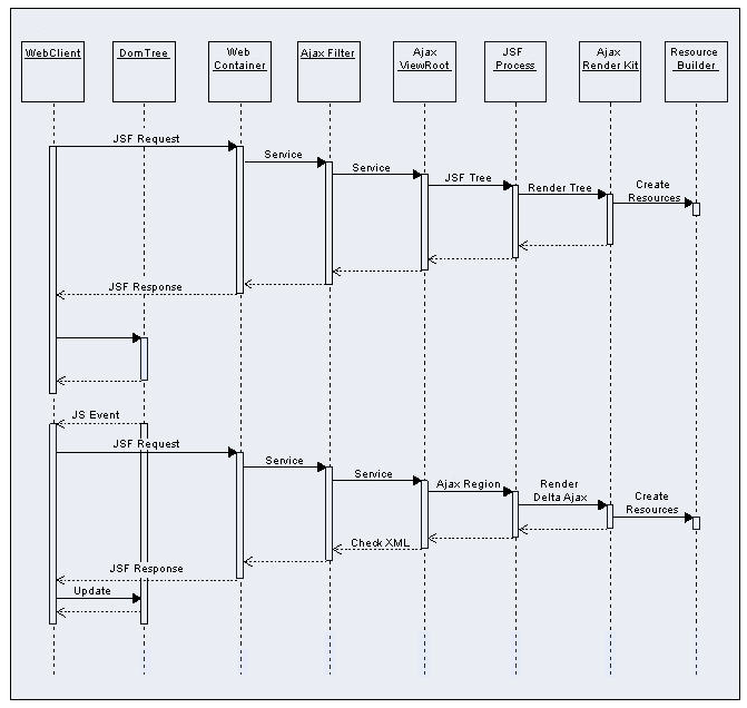
To get all benefits of RichFaces , you should register a Filter in web.xml file of your application. The Filter recognizes multiple request types. Necessary information about Filter configuration can be found in the "Filter configuration" section. The sequence diagram on Figure 3 shows the difference in processing of a "regular" JSF request and an Ajax request.
In the first case the whole JSF tree will be encoded, in the second one option it depends on the "size" of the Ajax region. As you can see, in the second case the filter parses the content of an Ajax response before sending it to the client side.
Have a look at the next picture to understand these two ways:
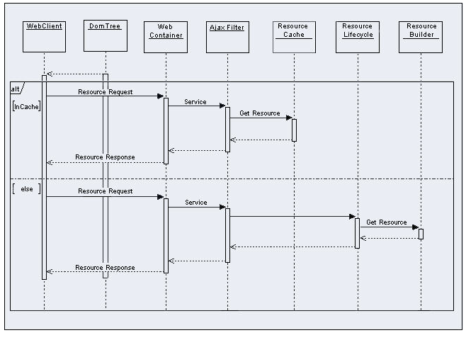
In both cases, the information about required static or dynamic resources that your application requests is registered in the ResourseBuilder class.
When a request for a resource comes (Figure 4), the RichFaces filter checks the Resource Cache for this resource and if it is there, the resource is sent to the client. Otherwise, the filter searches for the resource among those that are registered by the ResourceBuilder. If the resource is registered, the RichFaces filter will send a request to the ResourceBuilder to create (deliver) the resource.
Next Figure shows the ways of resource request processing.
AJAX Action Components
There are Ajax Action Components: <a4j:commandButton> , <a4j:commandLink> , <a4j:poll> and <a4j:support> and etc. You can use them to send Ajax requests from the client side.
AJAX Containers
AjaxContainer is an interface that describes an area on your JSF page that should
be decoded during an Ajax request. AjaxViewRoot and
AjaxRegion are implementations of this interface.
JavaScript Engine
RichFaces JavaScript Engine runs on the client-side. It knows how to update different areas on your JSF page based on the information from the Ajax response. Do not use this JavaScript code directly, as it is available automatically.
The RichFaces comes with a number of integral parts (framework, libraries):
For more information about framework and libraries loading see the following section in the FAQ.
Note:
In order to prevent JavaScript versions conflict you should use only one version of the framework or library. You could find more information about libraries exclusion in the FAQ.
In order to create RichFaces applications properly, keep the following points in mind:
A simple example is placed below:
...

<a4j:commandButton value="update" reRender="infoBlock"/>

...

<h:panelGrid id="infoBlock">

    ...

</h:panelGrid>

...
"reRender" uses UIComponent.findComponent() algorithm (with some additional exceptions) to find the component in the component tree. As can you see, the algorithm presumes several steps. Each other step is used if the previous step is not successful. Therefore, you can define how fast the component is found mentioning it more precisely. The following example shows the difference in approaches (both buttons will work successfully):
...

<h:form id="form1">

    ...

    <a4j: commandButton value="Usual Way" reRender="infoBlock, infoBlock2" />

    <a4j:commandButton value="Shortcut" reRender=":infoBlockl,:sv:infoBlock2" />

    ...

</h:form>

<h:panelGrid id="infoBlock">

    ...

</h:panelGrid>

...

<f:subview id="sv">

    <h:panelGrid id="infoBlock2">

        ...

    </h:panelGrid>

    ...

</f:subview>

...
It's also possible to use JSF EL expression as a value of the reRender attribute. It might be a property of types Set, Collection, Array or simple String. The EL for reRender is resolved right before the Render Response phase. Hence, you can calculate what should be re-rendered on any previous phase during the Ajax request processing.
Most common problem with using reRender is pointing it to the component that has
a
"rendered"
attribute. Note, that JSF does not mark the place in the browser DOM
where the outcome of the component should be placed in case the
"rendered"
condition returns false. Therefore, after the component becomes rendered
during the Ajax request, RichFaces delivers the rendered code to the client, but
does not update a page, because the place for update is unknown. You need to point
to one of the parent components that has no
"rendered"
attribute. As an alternative, you can wrap the component with
<a4j:outputPanel>
layout="none" .
"ajaxRendered" attribute of the <a4j:outputPanel> set to "true" allows to define the area of the page that will be re-rendered even if it is not pointed in the reRender attribute explicitly. It might be useful if you have an area on a page that should be updated as a response on any Ajax request. For example, the following code allows to output error messages regardless of what Ajax request causes the Validation phase failed.
...

<a4j:outputPanel ajaxRendered="true">

    <h:messages />

</a4j:outputPanel>

...
"limitToList"
attribute allows to dismiss the behavior of the
<a4j:outputPanel>
"ajaxRendered"
attribute. limitToList = "true" means to update
only the area(s) that mentioned in the
"reRender"
attribute explicitly. All output panels with
ajaxRendered="true" is ignored. An example is placed
below:
...

<h:form>

    <h:inputText value="#{person.name}">

        <a4j:support event="onkeyup" reRender="test" limitToList="true"/>

    </h:inputText>

    <h:outputText value="#{person.name}" id="test"/>

</form>

...
...

<h:inputText value="#{userBean.name}">

    <a4j:support event="onkeyup" eventsQueue="foo" reRender="bar" />

</h:inputText>

...
More information can be found on the RichFaces Users Forum .
"timeout" attribute is used for setting response waiting time on a particular request. If a response is not received during this time, the request is aborted.
Starting from 3.3.0 version RichFaces has an improved queue.
There are some reasons why the queue has been improved. In previous versions the queue had quite simple implementation: it sent to the server only the last Ajax request out of all requests coming in the queue during request delay.
The improved queue allows to
Eliminate the possibility of collisions when several JSF requests pass the JSF lifecycle at the same time. The queue prevents sending such requests. Only one request is processed. The rest ones are waiting.
Reduce the traffic between browser and the server. The "similar" requests came within request delay are absorbed. Only the last one is actually sent. Reducing the number of request reduces the server load.
There are 4 types of the queue:
Global default queue, defined in the web.xml file
View scoped default queue
View scoped named queue
Form-based default queue
In this section we will take a closer look at the listed above types of the queue and see in more detail how they differ. Usage details are covered in the <a4j:queue> chapter.
Global default queue has application scope and is defined in the web.xml
...

<context-param>

   <param-name>org.richfaces.queue.global.enabled</param-name>

   <param-value>true</param-value>

</context-param>

...
You can also programmatically enable/disable the global queue on a single view using the following:
...

<a4j:queue name="org.richfaces.queue.global" disabled="true"... />

...
Now, you can override the default settings using the attributes of the <a4j:queue> component. The full list of attributes is given in the "6.20. <a4j:queue>" chapter of the guide.
Example:
...

<a4j:queue name="org.richfaces.queue.global" requestDelay="1000" />

...
View scoped queue can be also added by just definition of the queue without name specified. In this case it should be placed anywhere outside the forms in order not to be recognized as a form-based queue.
...

<a4j:queue ... />

...
You can use either a JSF <h:form> or an Ajax4JSF <a4j:form>.
...

<h:form ... >

    <a4j:queue ... /><!-- note no name specified -->

    ...

</h:form>

...
Though, using an Ajax4JSF <a4j:form> you can refrence a named queue via the "eventsQueue".
...

<a4j:form eventsQueue="fooQueue" ...>

    ...

</a4j:form>

...
...

<a4j:queue name="sampleQueue" ... /> <!-- named queue -->

...

<h:form ... >

    <a4j:queue ... /><!-- form-based queue-->

    <a4j:commandButton ... /> <!-- uses the form-based queue -->

    <a4j:commandButton eventsQueue="sampleQueue" /> <!-- uses named queue -->

</h:form>

...
...

onsubmit="if (mynosendfunct()==false){return false}"

...
...

<a4j:commandButton value="Update" data="#{userBean.name}" oncomplete="showTheName(data.name)" />

...
There is a number of useful functions which can be used in JavaScript:
rich:element('id')- is a shortcut fordocument.getElementById(#{rich:clientId('id')})rich:component('id')- is a shortcut for#{rich:clientId('id')}.component...
<h:inputText id="myInput">
<a4j:support event="onkeyup" reRender="outtext"/>
</h:inputText>
<h:outputText id="outtext" value="#{rich:findComponent('myInput').value}" />
...
...

<a4j:region id="extr">

    <h:form>

        <h:outputText value="Status:" />

        <a4j:status id="commonstatus" startText="In Progress...." stopText=""/>

        <h:panelGrid columns="2">

            <h:outputText value="Name"/>

            <h:inputText id="name" value="#{userBean.name}">

                <a4j:support event="onkeyup" reRender="out" />

            </h:inputText>

            <h:outputText value="Job"/>

            <a4j:region  id="intr">

                <h:inputText id="job" value="#{userBean.job}">

                    <a4j:support event="onkeyup"  reRender="out" status="commonstatus"/>

                </h:inputText>

            </a4j:region>

        </h:panelGrid>

        <a4j:region>

            <h:outputText id="out" value="Name: #{userBean.name}, Job: #{userBean.job}" />

            <br />

            <a4j:commandButton ajaxSingle="true" value="Clean Up Form" reRender="name, job, out"  status="commonstatus">

                <a4j:actionparam name="n" value=""  assignTo="#{userBean.name}" />

                <a4j:actionparam name="j" value=""  assignTo="#{userBean.job}" />

            </a4j:commandButton>

        </a4j:region>

    </h:form>

</a4j:region>

...
More information could be found on the RichFaces Live Demo .
Other useful attribute is "focus" . It points to an ID of a component where focus will be set after an Ajax request.
An example of how to set a Filter in a web.xml file of your application is placed below.
...

<filter>

    <display-name>RichFaces Filter</display-name>

    <filter-name>richfaces</filter-name>

    <filter-class>org.ajax4jsf.Filter</filter-class>

</filter>

...
Note:
Fast Filter is deprecated and available only for backward compatibility with previous RichFaces versions. Fast Filter usage isn't recomended, because there is another way to use its functionality by means of Neko filter type .
From RichFaces 3.2 filter configuration becomes more flexible. It's possible to configure different filters for different sets of pages for the same application.
The possible filter types are:
TIDY
"TIDY" filter type based on the Tidy parser. This filter is recommended for applications with complicated or non-standard markup when all necessary code corrections are made by the filter when a response comes from the server.
An example of configuration is placed below.
...

<context-param>

    <param-name>org.ajax4jsf.xmlparser.ORDER</param-name>

    <param-value>NONE,NEKO,TIDY</param-value>

</context-param>

<context-param>

    <param-name>org.ajax4jsf.xmlparser.NONE</param-name>

    <param-value>/pages/performance\.xhtml,/pages/default.*\.xhtml</param-value>

</context-param>

<context-param>

    <param-name>org.ajax4jsf.xmlparser.NEKO</param-name>

    <param-value>/pages/repeat\.xhtml</param-value>

</context-param>

<filter>

    <display-name>RichFaces Filter</display-name>

    <filter-name>richfaces</filter-name>

    <filter-class>org.ajax4jsf.Filter</filter-class>

</filter>

<filter-mapping>

    <filter-name>richfaces</filter-name>

    <servlet-name>Faces Servlet</servlet-name>

    <dispatcher>FORWARD</dispatcher>

    <dispatcher>REQUEST</dispatcher>

    <dispatcher>INCLUDE</dispatcher>

</filter-mapping>

...
<param-value>/pages/performance\.xhtml,/pages/default.*\.xhtml</param-value>
If a page relates to the second set that is defined in the following way:
<param-value>/pages/repeat\.xhtml</param-value>
org.richfaces.LoadScriptStrategy
The following declaration in your web.xml allows loading the integrated script files.
...

<context-param>

    <param-name>org.richfaces.LoadScriptStrategy</param-name>

    <param-value>ALL</param-value>

</context-param>

...
If you do not declare the org.richfaces.LoadScriptStrategy in the
web.xml, it equals to:
...

<context-param>

    <param-name>org.richfaces.LoadScriptStrategy</param-name>

    <param-value>DEFAULT</param-value>

</context-param>

...
org.richfaces.LoadStyleStrategy
The following declaration allows to load only one integrated style sheet file.
...

<context-param>

    <param-name>org.richfaces.LoadStyleStrategy</param-name>

    <param-value>ALL</param-value>

</context-param>

...
RichFaces allows to redefine standard handlers responsible for processing of different exceptional situations. It helps to define own JavaScript, which is executed when these situations occur.
Add the following code to web.xml:
<context-param>

    <param-name>org.ajax4jsf.handleViewExpiredOnClient</param-name>

    <param-value>true</param-value>

</context-param>
 A4J.AJAX.onError = function(req, status, message){

    window.alert("Custom onError handler "+message);

}
The function defined this way accepts as parameters:
A4J.AJAX.onExpired = function(loc, expiredMsg){

    if(window.confirm("Custom onExpired handler "+expiredMsg+" for a location: "+loc)){

      return loc;

    } else {

     return false;

    }

}
Here the function receives in params:
- 5.11.1. Why Skinnability
- 5.11.2. Using Skinnability
- 5.11.3. Example
- 5.11.4. Skin Parameters Tables in RichFaces
- 5.11.5. Creating and Using Your Own Skin File
- 5.11.6. Built-in Skinnability in RichFaces
- 5.11.7. Changing skin in runtime
- 5.11.8. Standard Controls Skinning
- 5.11.9. Client-side Script for Extended Skinning Support
- 5.11.10. XCSS File Format
- 5.11.11. Plug-n-Skin
RichFaces skinnability is designed for mixed usage with:
The color scheme of the component can be applied to its elements using any of three style classes:
Here is a simple panel component:
<rich:panel> ... </rich:panel>
<div class="dr-pnl rich-panel">

     ...

</div>
dr-pnl is a CSS class specified in the framework via skin parameters:
It's possible to change all colors for all panels on all pages by changing these skin parameters.
A developer may also change the style properties for a particular panel. The following definition:
<rich:panel styleClass="customClass" />
<div class="dr_pnl rich-panel customClass">

    ...

</div>
To plug one in, it's necessary to specify a skin name in the
org.richfaces.SKIN context-param.
Here is an example of a table with values for one of the main skins, "blueSky" .
Table 5.4. Fonts
| Parameter name | Default value |
|---|---|
| headerSizeFont | 11px |
| headerFamilyFont | Arial, Verdana, sans-serif |
| tabSizeFont | 11px |
| tabFamilyFont | Arial, Verdana, sans-serif |
| buttonSizeFont | 11px |
| buttonFamilyFont | Arial, Verdana, sans-serif |
| tableBackgroundColor | #FFFFFF |
| tableFooterBackgroundColor | #cccccc |
| tableSubfooterBackgroundColor | #f1f1f1 |
| tableBorderColor | #C0C0C0 |
Skin "plain" was added from 3.0.2 version. It doesn't have any parameters. It's necessary for embedding RichFaces components into existing projecst which have its own styles.
To get detailed information on particular parameter possibilities, see the chapter where each component has skin parameters described corresponding to its elements.
In order to create your own skin file, do the following:
Create a file and define in it skin constants which are used by style classes (see section "Skin Parameters Tables in RichFaces" ). The name of skin file should correspond to the following format:
<name>.skin.properties. As an example of such file you can see RichFaces predefined skin parameters (skins): blueSky, classic, deepMarine, etc. These files are located in therichfaces-impl-xxxxx.jarinside the /META-INF/skins folder.Add a skin definition
<contex-param>to the web.xml of your application. An example is placed below:Example:
...

<context-param>

     <param-name>org.richfaces.SKIN</param-name>

     <param-value>name</param-value>

</context-param>

...
Put your
<name>.skin.propertiesfile in one of the following classpath elements: META-INF/skins/ or classpath folder (e.g. WEB-INF/classes).
| http://livedemo.exadel.com/richfaces-demo/ |
To find out more on skinnability possibilities, follow these steps:
Create a custom render kit and register it in the faces-config.xml like this:
<render-kit>

     <render-kit-id>NEW_SKIN</render-kit-id>

     <render-kit-class>org.ajax4jsf.framework.renderer.ChameleonRenderKitImpl</render-kit-class>

</render-kit>
<renderer>

    <component-family>javax.faces.Command</component-family>

    <renderer-type>javax.faces.Link</renderer-type>

    <renderer-class>newskin.HtmlCommandLinkRenderer</renderer-class>

</renderer>
Extra information on custom renderers creation can be found at:
| http://java.sun.com/javaee/javaserverfaces/reference/docs/index.html |
<context-param>

    <param-name>org.richfaces.SKIN</param-name>

    <param-value>#{skinBean.skin}</param-value>

</context-param>
The skinBean code looks as follows:
public class SkinBean {


    private String skin;


    public String getSkin() {

        return skin;

    }

    public void setSkin(String skin) {

        this.skin = skin;

    }

}
<managed-bean>

    <managed-bean-name>skinBean</managed-bean-name>

    <managed-bean-class>SkinBean</managed-bean-class>

    <managed-bean-scope>session</managed-bean-scope>

    <managed-property>

        <property-name>skin</property-name>

        <value>classic</value>

    </managed-property>

</managed-bean>
<h:form>
<div style="display: block; float: left">
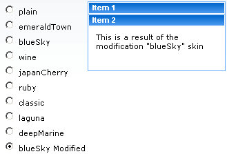
<h:selectOneRadio value="#{skinBean.skin}" border="0" layout="pageDirection" title="Changing skin" style="font-size: 8; font-family: comic" onchange="submit()">
<f:selectItem itemLabel="plain" itemValue="plain" />
<f:selectItem itemLabel="emeraldTown" itemValue="emeraldTown" />
<f:selectItem itemLabel="blueSky" itemValue="blueSky" />
<f:selectItem itemLabel="wine" itemValue="wine" />
<f:selectItem itemLabel="japanCherry" itemValue="japanCherry" />
<f:selectItem itemLabel="ruby" itemValue="ruby" />
<f:selectItem itemLabel="classic" itemValue="classic" />
<f:selectItem itemLabel="laguna" itemValue="laguna" />
<f:selectItem itemLabel="deepMarine" itemValue="deepMarine" />
<f:selectItem itemLabel="blueSky Modified" itemValue="blueSkyModify" />
</h:selectOneRadio>
</div>
<div style="display: block; float: left">
<rich:panelBar height="100" width="200">
<rich:panelBarItem label="Item 1" style="font-family: monospace; font-size: 12;">
Changing skin in runtime
</rich:panelBarItem>
<rich:panelBarItem label="Item 2" style="font-family: monospace; font-size: 12;">
This is a result of the modification "blueSky" skin
</rich:panelBarItem>
</rich:panelBar>
</div>
</h:form>
The feature is designed to unify the look and feel of standard HTML element and RichFaces components. Skinning can be applied to all controls on a page basing on elements' name and attribute type (where applicable). Also this feature provides a set of CSS styles so that skinning can be applied assigning rich-* classes to particular elements or to container of elements that nests controls.
Standard controls skinning feature provides 2 levels of skinning: Standard and Extended. The level is based
on detecting the browser type. If browser type is not identified, Advanced level is
used. However, if you want to explicitly specify the level of skinning you want to be applied, you need to add a context parameter to your web.xml
with org.richfaces.CONTROL_SKINNING_LEVEL as the parameter name
and value set to either basic or extended.
Standard level provides customization for only basic style properties.
To the following browsers Standard level of skinning is applied:
Internet Explorer 6
Internet Explorer 7 in BackCompat mode (see document.compatMode property in MSDN )
Opera
Safari
Extended level extends basic level introducing broader number of style properties and is applied to browsers with rich visual styling capability of controls
The following browsers support Extended level of skinning:
Mozilla Firefox
Internet Explorer 7 in Standards-compliant mode (CSS1Compat mode)
These are the elements that affected by skinning:
input
select
textarea
keygen
isindex
legend
fieldset
hr
a (together with a:hover, a:visited "pseudo"-elements)
Skinning for standard HTML controls can be initialized in two ways:
by adding
org.richfaces.CONTROL_SKINNINGparameter to web.xml. Values: "enable" and "disable". This way implies that skinning style properties are applied to elements by element name and attribute type (where applicable). No additional steps required. Please find below the table that contains the list of elements to which skinning is applicable.by adding
org.richfaces.CONTROL_SKINNING_CLASSESparameter to web.xml file. Possible values "enable" and "disable". When this option is enabled you are provided with a set of predefined CSS classes that you can use for skinning your HTML components.
By setting org.richfaces.CONTROL_SKINNING_CLASSES to
"enable" you are provided with style classes applicable to:
Basic elements nested inside element having rich-container class, e.g.:
Example:
...

.rich-container select {

   //class content

}

...
Elements that have class name corresponding to one of the basic elements name/type mapped by the following scheme
rich-<elementName>[-<elementType>]. See the example:Example:
...

.rich-select {

  //class content

}


.rich-input-text {

  //class content

}


...
Note:
Elements have classes based on "link" and pseudo class name, e.g.: rich-link, rich-link-hover, rich-link-visited
Additionally, the predefined rich CSS classes that we provide can be used not only as classes for basic HTML elements but also as classes for creation of complex elements .
There is a snippet with some of them for example:
...

<u:selector name=".rich-box-bgcolor-header">

     <u:style name="background-color" skin="headerBackgroundColor" />

</u:selector>

<u:selector name=".rich-box-bgcolor-general">

     <u:style name="background-color" skin="generalBackgroundColor" />

</u:selector>

...

//gradient elements

...

<u:selector name=".rich-gradient-menu">

     <u:style name="background-image">

          <f:resource f:key="org.richfaces.renderkit.html.gradientimages.MenuGradientImage"/>

     </u:style>

     <u:style name="background-repeat" value="repeat-x" />

</u:selector>

<u:selector name=".rich-gradient-tab">

     <u:style name="background-image">

          <f:resource f:key="org.richfaces.renderkit.html.gradientimages.TabGradientImage"/>

     </u:style>

     <u:style name="background-repeat" value="repeat-x" />

</u:selector>

...
To get a better idea of standard component skinning we recommend to explore CSS files located in ui/core/src/main/resources/org/richfaces/ folder of RichFaces svn.
Table 5.6. Html Elements Skin Bindings for fieldset
| CSS Properties | Skin parameters |
|---|---|
| border-color | panelBorderColor |
Table 5.7. Html Elements Skin Bindings for hr
| CSS Properties | Skin parameters |
|---|---|
| border-color | panelBorderColor |
Table 5.9. Html Elements Skin Bindings for a:hover
| CSS Properties | Skin parameters |
|---|---|
| color | hoverLinkColorgeneralLinkColor |
Table 5.10. Html Elements Skin Bindings for a:visited
| CSS Properties | Skin parameters |
|---|---|
| color | visitedLinkColor |
Table 5.11. Rich Elements Skin Bindings for .rich-input, .rich-select, .rich-textarea, .rich-keygen, .rich-isindex, .rich-link
| CSS Properties | Skin parameters |
|---|---|
| font-size | generalSizeFont |
| font-family | generalFamilyFont |
| color | controlTextColor |
Table 5.12. Rich Elements Skin Bindings for .rich-fieldset
| CSS Properties | Skin parameters |
|---|---|
| border-color | panelBorderColor |
Table 5.13. Rich Elements Skin Bindings for .rich-hr
| CSS Properties | Skin parameters/Value |
|---|---|
| border-color | panelBorderColor |
| border-width | 1px |
| border-style | solid |
Table 5.14. Rich Elements Skin Bindings for .rich-link
| CSS Properties | Skin parameters |
|---|---|
| color | generalLinkColor |
Table 5.15. Rich Elements Skin Bindings for .rich-link:hover
| CSS Properties | Skin parameters |
|---|---|
| color | hoverLinkColor |
Table 5.16. Rich Elements Skin Bindings for .rich-link:visited
| CSS Properties | Skin parameters |
|---|---|
| color | visitedLinkColor |
Table 5.17. Rich Elements Skin Bindings for .rich-field
| CSS Properties | Skin parameters/Value |
|---|---|
| border-width | 1px |
| border-style | inset |
| border-color | panelBorderColor |
| background-color | controlBackgroundColor |
| background-repeat | no-repeat |
| background-position | 1px 1px |
Table 5.18. Rich Elements Skin Bindings for .rich-field-edit
| CSS Properties | Skin parameters/Value |
|---|---|
| border-width | 1px |
| border-style | inset |
| border-color | panelBorderColor |
| background-color | editBackgroundColor |
Table 5.19. Rich Elements Skin Bindings for .rich-field-error
| CSS Properties | Skin parameter/Value |
|---|---|
| border-width | 1px |
| border-style | inset |
| border-color | panelBorderColor |
| background-color | warningBackgroundColor |
| background-repeat | no-repeat |
| background-position | center left |
| padding-left | 7px |
Table 5.20. Rich Elements Skin Bindings for .rich-button, .rich-button-disabled, .rich-button-over
| CSS Properties | Skin parameter/Value |
|---|---|
| border-width | 1px |
| border-style | solid |
| border-color | panelBorderColor |
| background-color | trimColor |
| padding | 2px 10px 2px 10px |
| text-align | center |
| cursor | pointer |
| background-repeat | repeat-x |
| background-position | top left |
Table 5.21. Rich Elements Skin Bindings for .rich-button-press
| CSS Properties | Skin parameter/Value |
|---|---|
| background-position | bottom left |
Table 5.22. Rich Elements Skin Bindings for .rich-container fieldset, .rich-fieldset
| CSS Properties | Skin parameters/Value |
|---|---|
| border-color | panelBorderColor |
| border-width | 1px |
| border-style | solid |
| padding | 10px |
| padding | 10px |
Table 5.23. Rich Elements Skin Bindings for .rich-legend
| CSS Properties | Skin parameter/Value |
|---|---|
| font-size | generalSizeFont |
| font-family | generalFamilyFont |
| color | controlTextColor |
| font-weight | bold |
Table 5.24. Rich Elements Skin Bindings for .rich-form
| CSS Properties | Skin parameters/Value |
|---|---|
| padding | 0px |
| margin | 0px |
Table 5.26. Html Elements Skin Bindings for *|button
| CSS properties | Skin parameters |
|---|---|
| border-color | panelBorderColor |
| font-size | generalSizeFont |
| font-family | generalFamilyFont |
| color | headerTextColor |
| background-color | headerBackgroundColor |
| background-image | org.richfaces.renderkit.html.images.ButtonBackgroundImage |
Table 5.27. Html Elements Skin Bindings for button[type=button], button[type=reset], button[type=submit], input[type=reset], input[type=submit], input[type=button]
| CSS properties | Skin parameters |
|---|---|
| border-color | panelBorderColor |
| font-size | generalSizeFont |
| font-family | generalFamilyFont |
| color | headerTextColor |
| background-color | headerBackgroundColor |
| background-image | org.richfaces.renderkit.html.images.ButtonBackgroundImage |
Table 5.28. Html Elements Skin Bindings for *|button[disabled], .rich-container *|button[disabled], .rich-button-disabled
| CSS properties | Skin parameters |
|---|---|
| color | tabDisabledTextColor |
| border-color | tableFooterBackgroundColor |
| background-color | tableFooterBackgroundColor |
| background-image | org.richfaces.renderkit.html.images.ButtonDisabledBackgroundImage |
Table 5.29. Html Elements Skin Bindings for .rich-button-disabled, .rich-container button[type="button"][disabled], .rich-button-button-disabled, .rich-container button[type="reset"][disabled], .rich-button-reset-disabled, .rich-container button[type="submit"][disabled], .rich-button-submit-disabled, .rich-container input[type="reset"][disabled], .rich-input-reset-disabled, .rich-container input[type="submit"][disabled], .rich-input-submit-disabled, .rich-container input[type="button"][disabled], .rich-input-button-disabled
| CSS properties | Skin parameters |
|---|---|
| color | tabDisabledTextColor |
| background-color | tableFooterBackgroundColor |
| border-color | tableFooterBackgroundColor |
| background-image | org.richfaces.renderkit.html.images.ButtonDisabledBackgroundImage |
Table 5.30. Html Elements Skin Bindings for *button[type="button"][disabled], button[type="reset"][disabled], button[type="submit"][disabled], input[type="reset"][disabled], input[type="submit"][disabled], input[type="button"][disabled]
| CSS properties | Skin parameters |
|---|---|
| color | tabDisabledTextColor |
| border-color | tableFooterBackgroundColor |
| background-color | tableFooterBackgroundColor |
Table 5.31. Html Elements Skin Bindings for *|textarea
| CSS properties | Skin parameters |
|---|---|
| border-color | panelBorderColor |
| font-size | generalSizeFont |
| font-family | generalFamilyFont |
| color | controlTextColor |
| background-color | controlBackgroundColor |
| background-image | org.richfaces.renderkit.html.images.InputBackgroundImage |
Table 5.32. Html Elements Skin Bindings for textarea[type=textarea], input[type=text], input[type=password], select
| CSS properties | Skin parameters |
|---|---|
| border-color | panelBorderColor |
| font-size | generalSizeFont |
| font-family | generalFamilyFont |
| color | controlTextColor |
| background-color | controlBackgroundColor |
| background-image | org.richfaces.renderkit.html.images.InputBackgroundImage |
Table 5.33. Html Elements Skin Bindings for *|textarea[disabled], .rich-container *|textarea[disabled]
| CSS properties | Skin parameters |
|---|---|
| color | tableBorderColor |
Table 5.34. textarea[type="textarea"][disabled], input[type="text"][disabled], input[type="password"][disabled]
| CSS properties | Skin parameters |
|---|---|
| color | tableBorderColor |
Table 5.35. textarea[type="textarea"][disabled], input[type="text"][disabled], input[type="password"][disabled]
| CSS properties | Skin parameters |
|---|---|
| color | tableBorderColor |
Note:
Standard skinning level can fail if configuration of
ajaxPortlet is as following:
...

<portlet>

   <portlet-name>ajaxPortlet</portlet-name>

   <header-content>

      <script src="/faces/rfRes/org/ajax4jsf/framework.pack.js" type="text/javascript" />

      <script src="/faces/rfRes/org/richfaces/ui.pack.js" type="text/javascript" />

      <link rel="stylesheet" type="text/css" href="/faces/rfRes/org/richfaces/skin.xcss" />

   </header-content>

</portlet>

...
Attention.
The <a4j:portlet> component is DEPRECATED as far as JSR-301 was defined the same functionality for a UIViewRoot component.
Thus, it is implicitly defined by mandatory <f:view> component.
However, if you don't want the RichFaces components and standard HTML controls to be skinned automatically and perform the skinnability implementation yourself, you might encounter with a problem, namely standard HTML controls in such browsers as Opera and Safari will be affected by standard controls skinning. ( In this section you can get more details on how to disable skinnability.)
In brief, to disable the skinnability mechanism of RichFaces you need to set the
"org.richfaces.LoadStyleStrategy" parameter to "NONE" in the
web.xml file.
...

<context-param>

    <param-name>org.richfaces.LoadStyleStrategy</param-name>

    <param-value>NONE</param-value>

</context-param>

...
Additionally, you should include the style sheets that perform skinning of the RichFaces component and standard HTML controls.
In order to resolve the problem with extended skinning in Opera and Safari a
client script (skinning.js) is added to the RichFaces library. The script detects
the browser type and enables extended skinning only for those browsers that fully
support it.
The script can be activated by inserting this JavaScript code to the page:
<script type="text/javascript">

    window.RICH_FACES_EXTENDED_SKINNING_ON = true;

</script>
When NO script loading strategy is used and extended skinning is turned on then corresponding warning message will appears in the console.
You also need to specify "media" attribute in the <link> tag which includes the "extended_both.xcss" style sheet with "rich-extended-skinning".
This is how you can include the style sheets to the page, in case automatic skinnability implementation is disabled.
<link href='/YOUR_PROJECT_NAME/a4j_3_2_2-SNAPSHOTorg/richfaces/renderkit/html/css/basic_both.xcss/DATB/eAF7sqpgb-jyGdIAFrMEaw__.jsf' type='text/css' rel='stylesheet' class='component' />

<link media='rich-extended-skinning' href='/ YOUR_PROJECT_NAME /a4j_3_2_2-SNAPSHOTorg/richfaces/renderkit/html/css/extended_both.xcss/DATB/eAF7sqpgb-jyGdIAFrMEaw__.jsf' type='text/css' rel='stylesheet' class='component' />

<link href='/ YOUR_PROJECT_NAME /a4j_3_2_2-SNAPSHOT/org/richfaces/skin.xcss/DATB/eAF7sqpgb-jyGdIAFrMEaw__.jsf' type='text/css' rel='stylesheet' class='component' />
Note
Now it's necessary to use a4j/versionXXX resources prefix instead of
a4j_versionXXX. Base64 encoder changed to use
'!' instead of '.'.
XCSS files are the core of RichFaces components skinnability.
...

<u:selector name=".rich-component-name">

    <u:style name="background-color" skin="additionalBackgroundColor" />

    <u:style name="border-color" skin="tableBorderColor" />

    <u:style name="border-width" skin="tableBorderWidth" />

    <u:style name="border-style" value="solid" />

</u:selector>

...
During processing the code in the shown example is parsed into a standard CSS format.
...

.rich-component-name {

     background-color: additionalBackgroundColor; /*the value of the constant defined by your skin*/

     border-color: tableBorderColor; /*the value of the constant defined by your skin*/

     border-width: tableBorderWidth; /*the value of the constant defined by your skin*/

     border-style: solid;

}

...
CSS selectors with identical skinning properties can be set as a comma separated list.
...

<u:selector name=".rich-ordering-control-disabled, .rich-ordering-control-top, .rich-ordering-control-bottom, .rich-ordering-control-up, .rich-ordering-control-down">

    <u:style name="border-color" skin="tableBorderColor" />

</u:selector>

...
Plug-n-Skin is a feature that gives you an opportunity to easily create, customize and plug into your project a custom skin. The skin can be created basing on parameters of some predefined RichFaces skin.
The feature also provides an option to unify the appearance of rich controls with standard HTML elements.
In order to create your own skin using Plug-n-Skin feature, you can follow these step by step instructions.
First of all, you need to create a template for the new skin. Creation of the template can be performed using Maven build and deployment tool. More information on how to configure Maven for RichFaces you can find out from JBoss wiki article . You can copy and paste these Maven instructions to command line and execute them.
...

mvn archetype:create -DarchetypeGroupId=org.richfaces.cdk -DarchetypeArtifactId=maven-archetype-plug-n-skin -DarchetypeVersion=RF-VERSION -DartifactId=ARTIFACT-ID -DgroupId=GROUP-ID -Dversion=VERSION

...
Primary keys for the command:
archetypeVersionindicates the RichFaces version. For example,"3.3.3-SNAPSHOT"artifactIdartifact id of the projectgroupIdgroup id of the projectversionthe version of the project you create, by default it is"1.0.-SNAPSHOT"
After this operation, a folder with the name of your
"ARTIFACT-ID" appears. The folder contains a template of
Maven project.
Next steps will guide you though creating of the skin itself.
In the root folder of Maven project (the one that contains "pom.xml" file) you should run the following command in the command line:
...

mvn cdk:add-skin -Dname=SKIN-NAME -Dpackage=SKIN-PACKAGE

...
Primary keys for the command:
namedefines the name of the new skinpackagebase package of the skin. By default "groupId" of the project is used.
Additional optional keys for the command:
baseSkindefines the name of the base skin.createExtif set to "true", extended CSS classes are added. For more information, please, see "Standard controls skinning"
As a result of the performed operations the following files and folders are created:
BaseImage.java - the base class to store images. Location: "\src\main\java\SKIN-PACKAGE\SKIN-NAME\images\"
BaseImageTest.java - a test version of a class that stores images. Location: "\src\test\java\SKIN-PACKAGE\SKIN-NAME\images\"
XCSS files - XCSS files define the new look of RichFaces components affected by the new skin. Location: "\src\main\resources\SKIN-PACKAGE\SKIN-NAME\css\"
SKIN-NAME.properties - a file that contains properties of the new skin. Location: "\src\main\resources\SKIN-PACKAGE\SKIN-NAME\css\"
The following properties are used to configure the SKIN-NAME.properties file:
baseSkin – the name of the base skin to be used as basis. The look of the skin you define will be affected by new style properties.
generalStyleSheet - a path to the style sheet (SKIN-NAME.xcss) that imports style sheets of the components to be affected by the new skin.
extendedStyleSheet - a path to a style sheet that is used to unify the appearance of RichFaces components and standard HTML controls. For additional information please read "Standard controls skinning" chapter.
gradientType - a predefined property to set the type of gradient applied to the new skin. Possible values are glass, plastic, plain. More information on gradient implementation you can find further in this chapter.
SKIN-NAME.xcss - a XCSS file that imports XCSS files of the components to be affected by the new skin. Location: "src\main\resources\META-INF\skins "
XCSS files If the command is executed with the "DcreateExt" key set to "true", the XCSS (extended_classes.xcss and extended.xcss) files that define style for standard controls will be created. Location: "\src\main\resources\SKIN-PACKAGE\SKIN-NAME\css\".
SKIN-NAME-ext.xcss If the command is executed with the "DcreateExt" key set to "true", the configuration SKIN-NAME-ext.xcss file that imports XCSS file defining styles for the standard controls will be created. Location: "src\main\resources\META-INF\skins ".
SKIN-NAME-resources.xml - the file contains the description of all listed above files. Location: "src\main\config\resources ".
Now you can start editing the XCSS files located in "\src\main\resources\SKIN-PACKAGE\SKIN-NAME\css\". New style properties can be assigned to the selectors (the selectors listed in the XCSS files) in two ways, which are both valid, and it'up to you what way to choose.
Standard CSS coding approach, i.e. you can add CSS properties to the given selectors. The only thing, you have to keep in mind is that the selectors must be inside
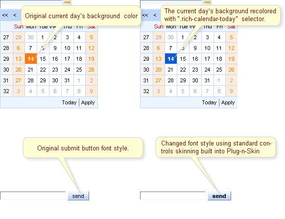
<f:verbatim> <![CDATA[ ...]]> </f:verbatim>tags.For example
...

.rich-calendar-cell {

     background: #537df8;

}

...
Using XCSS coding approach, the same way as XCSS files are normally formed in RichFaces. The XCSS tags have to be placed outside
<f:verbatim> <![CDATA[ ...]]> </f:verbatim>tags....
<u:selector name=".rich-calendar-cell">
<u:style name="border-bottom-color" skin="panelBorderColor"/>
<u:style name="border-right-color" skin="panelBorderColor"/>
<u:style name="background-color" skin="tableBackgroundColor"/>
<u:style name="font-size" skin="generalSizeFont"/>
<u:style name="font-family" skin="generalFamilyFont"/>
</u:selector>
...
Having performed described above steps and edited the XCSS files you can proceed to building the new skin and to plugging it into the project. Building the new skin can be done by executing the given below command in the command line in the root folder of you skin project (the one that contains pom.xml file).
...

mvn clean install

...
In addition Plug-n-Skin has a number of predefined gradients that you can also use to make your application look nicer. The given below code snippet shows how a gradient can be used
...

<u:selector name=".rich-combobox-item-selected">

    <u:style name="border-width" value="1px" />

    <u:style name="border-style" value="solid" />

    <u:style name="border-color" skin="newBorder" />

    <u:style name="background-position" value="0% 50%" />

    <u:style name="background-image">

        <f:resource f:key="org.richfaces.renderkit.html.CustomizeableGradient">

            <f:attribute name="valign" value="middle" />

            <f:attribute name="gradientHeight" value="17px" />

            <f:attribute name="baseColor" skin="headerBackgroundColor" />

         </f:resource>

    </u:style>

</u:selector>

...
So, as you can see, the background-image CSS property is
defined with <f:resource
f:key="org.richfaces.renderkit.html.CustomizeableGradient">
that sets the gradient. While the gradient type can be specified in the
SKIN-NAME.properties file with gradientType property. The gradientType
property can be set to one of the possible values glass, plastic, plain. The
gradient in it's turn can be can be adjusted using baseColor, gradientColor,
gradientHeight, valign attributes. Their usage is shown in the snippet above.
Now, you can use your newly-created and customized skin in your project by adding your new skin parameters to web.xml file and placing the jar file with your skin ( the jar file is located in "target" folder of your skin project) to "\WebContent\WEB-INF\lib\".
...

<context-param>

    <param-name>org.ajax4jsf.SKIN</param-name>

    <param-value>SKIN-NAME</param-value>

</context-param>

...
This command will be used to create a template of the new skin project.
mvn archetype:create -DarchetypeGroupId=org.richfaces.cdk -DarchetypeArtifactId=maven-archetype-plug-n-skin -DarchetypeVersion=3.3.3-SNAPSHOT -DartifactId=P-n-S -DgroupId=GROUPID -Dversion=1.0.-SNAPSHOT
Now you can browse the "P-n-S" folder to view what files and folders were created there.
mvn cdk:add-skin -DbaseSkin=blueSky -DcreateExt=true -Dname=PlugnSkinDemo -Dpackage=SKINPACKAGE
Thus, it will be demonstrated how to:
button[type="button"], button[type="reset"], button[type="submit"], input[type="reset"], input[type="submit"], input[type="button"] { font-weight: bold;
}
What you need to do, in order to have the new skin imported to the project is to
<context-param>

    <param-name>org.richfaces.CONTROL_SKINNING</param-name>

    <param-value>enable</param-value>

</context-param>
The result of both operations is displayed on the figure below.
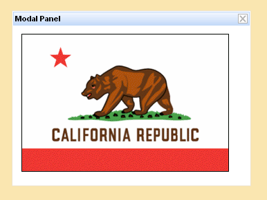
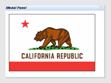
Let's consider the <rich:modalPanel> component.
To change the background color for the mask, it's enough to redefine the .rich-mpnl-mask-div class.
Example:
...

.rich-mpnl-mask-div{

    background-color:#fae6b0;

}

...
This is a result:
If you have multiple components on the page, the redefined styles will be applied to all of them. To change styles for a particular component on the page, create your own style classes and use them in corresponding style class attributes. An example on how to change the font style for the header of a particular modal panel is placed below:
Example:
...

.myClass{

    font-style:italic;

}

...
Next specify myClass as the value of the "headerClass" attribute for <rich:modalPanel> :
<rich:modalPanel ... headerClass="myClass"/>
This is a result:
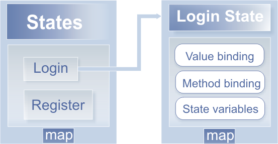
RichFaces State API allows easily to define some set of states for the pages and any properties for this states.
Actually States is a map where the entry key is a name of the State and the value is a State map. Particular State map has entries with some names as keys and any objects as values that are used after the state activation. Thus, in the State map you could define any values, method bindings, or just some simple state variables (constants) which have different values for every State.
One of the most convenience features of the RichFaces State API is a navigation between states. The RichFaces State API implements states change as the standard JSF navigation. Action component just returns outcome and the RichFaces State API extension for the JSF navigation handler checks whether this outcome is registered as a state change outcome or not. If the state change outcome is found the corresponding state is activated. Otherwise the standard navigation handling is called.
In order to use RichFaces State API you should follow the next steps:
Register State Manager EL resolver and navigation handler in the faces-config.xml:
...

<application>

    <navigation-handler>org.richfaces.ui.application.StateNavigationHandler</navigation-handler>

    <el-resolver>org.richfaces.el.StateELResolver</el-resolver>

</application>

...
Register an additional application factory in the faces-config.xml:
...

<factory>

    <application-factory>org.richfaces.ui.application.StateApplicationFactory</application-factory>

</factory>

...
Register two managed beans in the faces-config.xml:
...

<managed-bean>

    <managed-bean-name>state</managed-bean-name>

    <managed-bean-class>org.richfaces.ui.model.States</managed-bean-class>

    <managed-bean-scope>request</managed-bean-scope>

    <managed-property>

        <property-name>states</property-name>

        <property-class>org.richfaces.ui.model.States</property-class>

        <value>#{config.states}</value>

    </managed-property>

</managed-bean>

<managed-bean>

    <managed-bean-name>config</managed-bean-name>

    <managed-bean-class>org.richfaces.demo.stateApi.Config</managed-bean-class>

    <managed-bean-scope>none</managed-bean-scope>

</managed-bean>

...
One bean ("config") defines and stores states as it is shown in the following example:
...
public class Config {
/**
* @return States
*/
public States getStates() {
FacesContext facesContext = FacesContext.getCurrentInstance();
States states = new States();
// Registering new User State definition
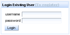
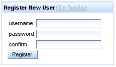
states.setCurrentState("register"); // Name of the new state
// Text labels, properties and Labels for controls in "register" state
states.put("showConfirm", Boolean.TRUE); // confirm field rendering
states.put("link", "(To login)"); // Switch State link label
states.put("okBtn", "Register"); // Login/Register button label
states.put("stateTitle", "Register New User"); // Panel title
ExpressionFactory expressionFactory = facesContext.getApplication()
.getExpressionFactory();
// Define "registerbean" available under "bean" EL binding on the page
ValueExpression beanExpression = expressionFactory
.createValueExpression(facesContext.getELContext(),
"#{registerbean}", Bean.class);
states.put("bean", beanExpression);
// Define "registeraction" available under "action" EL binding on the
// page
beanExpression = expressionFactory.createValueExpression(facesContext
.getELContext(), "#{registeraction}", RegisterAction.class);
states.put("action", beanExpression);
// Define method expression inside registeraction binding for this state
MethodExpression methodExpression = expressionFactory.createMethodExpression(
facesContext.getELContext(), "#{registeraction.ok}",
String.class, new Class[] {});
states.put("ok", methodExpression);
// Outcome for switching to login state definition
states.setNavigation("switch", "login");
// Login Existent User State analogous definition
states.setCurrentState("login");
states.put("showConfirm", Boolean.FALSE);
states.put("link", "(To register)");
states.put("okBtn", "Login");
states.put("stateTitle", "Login Existing User");
beanExpression = expressionFactory.createValueExpression(facesContext
.getELContext(), "#{loginbean}", Bean.class);
states.put("bean", beanExpression);
beanExpression = expressionFactory.createValueExpression(facesContext
.getELContext(), "#{loginaction}", LoginAction.class);
states.put("action", beanExpression);
methodExpression = expressionFactory.createMethodExpression(
facesContext.getELContext(), "#{loginaction.ok}",
String.class, new Class[] {});
states.put("ok", methodExpression);
states.setNavigation("switch", "register");
return states;
}
}
...The other bean ("state") with the type
org.richfaces.ui.model.Stateshas the "states" managed property that is bound to the "config" bean which defines states.Use state bindings on the page. See the following example:
...

<h:panelGrid columns="3">

    <h:outputText value="username" />

    <h:inputText value="#{state.bean.name}" id="name" required="true" />

    <h:outputText value="password" />

    <h:inputSecret value="#{state.bean.password}" id="password" required="true" />

    <h:outputText value="confirm" rendered="#{state.showConfirm}" />

    <h:inputSecret value="#{state.bean.confirmPassword}" rendered="#{state.showConfirm}" id="confirm" required="true" />

</h:panelGrid>

<a4j:commandButton actionListener="#{state.action.listener}" action="#{state.ok}" value="#{state.okBtn}" id="action"/>

...
To get full Login/Register dialog example, please, have a look at RichFaces Live Demo.
The library encompasses ready-made components built based on the Rich Faces CDK.
- 6.1.1. < a4j:ajaxListener > available since 3.0.0
- 6.1.2. < a4j:actionparam > available since 3.0.0
- 6.1.3. < a4j:form > available since 3.0.0
- 6.1.4. < a4j:region > available since 3.0.0
- 6.1.5. < a4j:support > available since 3.0.0
- 6.1.6. < a4j:commandButton > available since 3.0.0
- 6.1.7. < a4j:commandLink > available since 3.0.0
- 6.1.8. < a4j:jsFunction > available since 3.0.0
- 6.1.9. < a4j:poll > available since 3.0.0
- 6.1.10. < a4j:push > available since 3.0.0
- 6.1.11. < a4j:queue > available since 3.3.0
- 6.1.12. < a4j:status > available since 3.0.0
The component in this section lets you easily add Ajax capabilities to other components as well as manage Ajax requests.
The
"type"
attribute defines the fully qualified Java class name for the listener.
This Java class should implement
org.ajax4jsf.event.AjaxListener
interface which is base interface for all listeners, capable for receiving Ajax events.
The object on which the Event initially occurred could be accessed using the
java.util.EventObject.getSource()
method.
The <a4j:ajaxListener> is not invoked for non-Ajax requests and when RichFaces works in the "Ajax Request generates Non-Ajax Response" mode, so <a4j:ajaxListener> invocation is a good indicator that Ajax Response is going to be processed. Let's check it in the following example.
Example:
...

<rich:messages/>

<h:form id="form">

    <a4j:commandLink value="Click to send Ajax request">

        <a4j:ajaxListener type="org.docs.richfaces.actionListenerBean"/>

    </a4j:commandLink>

</h:form>

...
Example:
...

public class ActionListenerBean implements org.ajax4jsf.event.AjaxListener {

    public void processAjax(AjaxEvent event) {

        FacesContext.getCurrentInstance().addMessage("form", new FacesMessage("Ajax request is sent"));

    }

}

...
There is a result:

Visit AjaxListener page at RichFaces Livedemo for examples of component usage and their sources.
Check Sun JSF TLD documentation for more information on <f:valueChangeListener> tag.
The <a4j:actionparam> component has 3 main attributes:
...

<h:form id="form">

    <a4j:commandButton value="Set Name to Alex" reRender="rep">

        <a4j:actionparam name="username" value="Alex" assignTo="#{actionparamBean.name}"/>

    </a4j:commandButton>

    <br/>

    <h:outputText id="rep" value="Name: #{actionparamBean.name}"/>

</h:form>

...
...

public class ActionparamBean {

    private String name = "John";


    public String getName() {

        return name;

    }


    public void setName(String name) {

        this.name = name;

    }

}

...
You can use <a4j:actionparam> not only with Ajax components, but with non-ajax command component also. This feature allows to update model values without invoking even a single line of Java code on the server side. The usage of this feature you can find at ActionParameter Usage page of RichFaces LiveDemo.
If you need to convert the value before the "Update Model" phase you can specify the converter in the "converter" attribute.
Note:
The property is assigned with a parameter value on the "Update Model" phase. Therefore if the validation of the form is failed, this phase will be skipped and the property won't be updated.
It is possible to use JavaScript expression or function in the "value" attribute. In this case the "noEscape" attribute should be set to "true". The result of this JavaScript invocation is sent to the server as a value of <a4j:actionparam> .
Visit the ActionParameter page at RichFaces LiveDemo for examples of component usage and their sources.
More information can be found on the Ajax4jsf Users Forum.
More information about <f:param> and <f:actionListener> can be found in Sun JSF TLD documentation.
Along with a4j:htmlCommandLink , <a4j:form> component fixes the problem of <h:commandLink> component that cannot be re-rendered without re-rendering the whole form it belongs to. For the further details see the Ajax Form Usage page at RichFaces Livedemo.
The <a4j:form> component adds extra functionality to non-Ajax action/command components: submission is performed via Ajax when "ajaxSubmit" attribute set to "true".
If the <a4j:form> component works in an Ajax mode, the standard Ajax attributes such as "reRender" , "limitToList" , "requestDelay" , etc. can be used.
Example:
...

<a4j:form ajaxSubmit="true" reRender="name">

    <h:panelGrid>

        <h:commandButton value="Set Local Name to John (Ajax)" action="#{userBean.nameItJohn}" />

        <h:outputText id="name" value="Name:#{userBean.name}" />

    </h:panelGrid>

</a4j:form>

...
Here is a managed bean:
...

public class UserBean {

    private String name="";


    public String nameItJohn() {

        setName("John");

        return null;

    }

    public String getName() {

        return this.name;

    }

    public void setName(String name) {

        this.name = name;

    }

}

...
In the example above the
ajaxSubmit="true",
so all standard action components on this form become ajaxable.
The
"reRender"
attribute contains an Id of component for
re-rendering after an Ajax response.
Tip:
If you have <h:commandButton> or <h:commandLink> inside a form, they work as <a4j:commandButton> .
Note:
You should not use
<a4j:form>
component with
ajaxSubmit="true"
if it contains other Ajax command components.
Also, due to the security reason, file upload form element cannot be convertible to the be ajaxable.
Visit Ajax Form page at RichFaces Livedemo for examples of component usage and their sources.
For additional information about attributes of this component read 'Ajax Attribute section.
<h:form>

      ...

      <a4j:region>

            <a4j:commandLink/>

      </a4j:region>

      ...

<h:form>
<h:form>

       ...

      <a4j:region>

            <a4j:commandLink value="Link 1" id="link1"/>

            <a4j:region>

                 <a4j:commandLink value="Link 2" id="link2"/>

            </a4j:region >

      </a4j:region>

      ...

<h:form>
The external region is decoded for link1 and the internal one is decoded for link2.
<h:form>

       ...

      <a4j:region renderRegionOnly="true">

            <a4j:commandLink value="Link 1" id="link1"/>

      </a4j:region>

       ...

      <a4j:region renderRegionOnly="false">

            <a4j:commandLink value="Link 2" id="link2"/>

      </a4j:region>

       ...

</h:form>
<a4j:region selfRendered ="true">

      <a4j:commandLink value="Link" id="link"/>

      <!--Some HTML content-->

</a4j:region>
<rich:column>

      <a4j:region>

            <a4j:commandLink reRender="out"/>

      </a4j:region>

</rich:column>

<rich:column>

      <h:outputText id="out">

</rich:column>
In most cases there is no need to use the
<a4j:region>
as ViewRoot is a default one.
Visit <a4j:region> demo page at RichFaces live demo for examples of component usage and their sources.
Useful articles and examples:
<a4j:region> and two <h:inputTexts> in RichFaces cookbook at JBoss portal;
"A sad story about UIInput" at personal blog of I.Shabalov and exhaustive example of solving the problem with the help of <a4j:region> .
The <a4j:support> component has two key attributes:
...

<h:form id="planetsForm">

    <h:outputLabel value="Select the planet:" for="planets" />

    <h:selectOneMenu id="planets" value="#{planetsMoons.currentPlanet}" valueChangeListener="#{planetsMoons.planetChanged}">

        <f:selectItems value="#{planetsMoons.planetsList}" />

        <a4j:support event="onchange" reRender="moons" />

    </h:selectOneMenu>

    <h:dataTable id="moons" value="#{planetsMoons.moonsList}" var="item">

        <h:column>

            <h:outputText value="#{item}"/>

        </h:column>

    </h:dataTable>

</h:form>

...
Finally we need a backing bean:
...

public class PlanetsMoons {

    private String currentPlanet="";

    public List<SelectItem> planetsList = new ArrayList<SelectItem>();

    public List<String> moonsList = new ArrayList<String>();

    private static final String [] EARTH = {"The Moon"};

    private static final String [] MARS = {"Deimos", "Phobos"};

    private static final String [] JUPITER = {"Europa", "Gamymede", "Callisto"};


    public PlanetsMoons() {

        SelectItem item = new SelectItem("earth", "Earth");

        planetsList.add(item);

        item = new SelectItem("mars", "Mars");

        planetsList.add(item);

        item = new SelectItem("jupiter", "Jupiter");

        planetsList.add(item);

    }


    public void planetChanged(ValueChangeEvent event){

         moonsList.clear();

         String[] currentItems;

         if (((String)event.getNewValue()).equals("earth")) {

             currentItems = EARTH;

         }else if(((String)event.getNewValue()).equals("mars")){

             currentItems = MARS;

         }else{

             currentItems = JUPITER;

         }

         for (int i = 0; i < currentItems.length; i++) {

             moonsList.add(currentItems[i]);

         }

     }


    //Getters and Setters

    ...

}
...

<h:form id="planetsForm">

    <h:outputLabel value="Select the planet:" for="planets" />

    <h:selectOneMenu id="planets" value="#{planetsMoons.currentPlanet}" valueChangeListener="#{planetsMoons.planetChanged}">

        <f:selectItems value="#{planetsMoons.planetsList}" />

        <a4j:support event="onchange" reRender="moons"

                    onsubmit="if(!confirm('Are you sure to change the planet?')) {form.reset(); return false;}"

                    oncomplete="document.getElementById('planetsForm:moonsPanel').style.backgroundColor='#c8dcf9';" />

    </h:selectOneMenu>

    <h:dataTable id="moons" value="#{planetsMoons.moonsList}" var="item">

        <h:column>

            <h:outputText value="#{item}"/>

        </h:column>

    </h:dataTable>

</h:form>

...
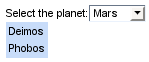
Information about the "process" attribute usage you can find in the " Decide what to process " guide section.
Tip:
The <a4j:support> component created on a page as following
<h:inputText value="#{bean.text}">

      <a4j:support event="onkeyup" reRender="output" action="#{bean.action}"/>

</h:inputText>
is decoded in HTML as
<input onkeyup="A4J.AJAX.Submit( Some request parameters )"/>
Visit <a4j:support> demo page at RichFaces live demo for examples of component usage and their sources.
The example above generates the following HTML code:
<input type="submit" onclick="A4J.AJAX.Submit(request parameters);return false;" value="Button"/>
Сlicking the generated anchor fires the utility method A4J.AJAX.Submit() that perfroms Ajax request.
Note:
The <a4j:commandButton> already has Ajax support built-in and there is no need to add <a4j:support> .
The usage of the keyword 'this' in JavaScript code in the value for
"oncomplete"
attribute depends on the location of
<a4j:commandButton>
.
If the
<a4j:commandButton>
is situated outside the re-rendered region it is possible to use keyword 'this' as in the following example:
<h:form>

      <a4j:commandButton action="director.rollCamera" onclick="this.disabled=true" oncomplete="this.disabled=false" />

</h:form>
Otherwise, if the
<a4j:commandButton>
is contained in a re-rendered region
than the
"oncomplete"
attribute has a problem with obtaining a reference of the
commandButton object when using the keyword 'this'.
In this case use the
"oncomplete"
attribute as in the following example:
<h:form id="form">

      <a4j:commandButton id="cbutton" action="director.rollCamera" onclick="this.disabled=true" oncomplete="document.getElementById('form:cbutton').disabled=false" />

</h:form>
Common JSF navigation could be performed after an Ajax submit and partial rendering, but Navigation Case must be defined as <redirect/> in order to avoid problems with some browsers.
As any Core Ajax component that sends Ajax requests and processes server responses the <a4j:commandButton> has all attributes that provide the required behavior of requests (delay, limitation of submit area and rendering, etc.)
Note:
When attaching a JavaScript API function to the
<a4j:commandButton>
with the help of the
<rich:componentControl>
do not use the
"attachTo"
attribute of the last one.
The attribute adds event handlers using Event.observe but
<a4j:commandButton>
has no such event.
The example below will not work:
<a4j:commandButton value="Show Current Selection" reRender="table" action="#{dataTableScrollerBean.takeSelection}" id="button">

      <rich:componentControl attachTo="button" for="panel" event="oncomplete" operation="show" />

</a4j:commandButton>
This one should work properly:
<a4j:commandButton value="Show Current Selection" reRender="table" action="#{dataTableScrollerBean.takeSelection}" id="button">

      <rich:componentControl for="panel" event="oncomplete" operation="show" />

</a4j:commandButton>
Information about the "process" attribute usage you can find in the "Decide what to process" guide section.
Visit CommandButton demo page at RichFaces live demo for examples of component usage and their sources.
The <a4j:commandLink> component is used in the same way as JSF <h:commandLink> . The difference is that in case of <a4j:commandLink> the components to be updated should be specified. In this chapter we will use the code from RichFaces Greeter and change there <a4j:commandButton> to <a4j:commandLink> :
...

<a4j:commandLink value="Get greeting" reRender="greeting" />

...
It's not necessary to add nested <a4j:support> as the <a4j:commandLink> has an Ajax support already built-in. As a result of our changes we will get a form with "Get greeting" link instead of the button:
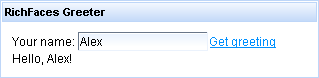
The example above generates the following HTML code:
<a href="#" onclick="A4J.AJAX.Submit(?"request parameters"); return false;"><span>Get greeting</span></a>
If you click on the generated anchor the utility method A4J.AJAX.Submit() will be fired.
Note:
Common JSF navigation could be performed after Ajax submit and partial rendering, but Navigation Case must be defined as <redirect/> in order to avoid problems with some browsers.
As any Core Ajax component that sends Ajax requests and processes server responses the <a4j:commandLink> has all attributes that provide the required behavior of requests (delay, limitation of submit area and rendering, etc.)
Information about the "process" attribute usage you can find "Decide what to process" guide section.
Visit CommandLink demo page at RichFaces live demo for examples of component usage and their sources.
Useful articles:
How to use "window.confirm" JavaScript with <a4j:commandLink> "onclick" attribute in RichFaces cookbook at JBoss portal.
...

<body onload="callScript()">

      <h:form>

             ...

            <a4j:jsFunction name="callScript" data="#{bean.someProperty1}" reRender="someComponent" oncomplete="myScript(data.subProperty1, data.subProperty2)">

                  <a4j:actionparam name="param_name" assignTo="#{bean.someProperty2}"/>

            </a4j:jsFunction>

            ...

      </h:form>

      ...

</body>

...
Information about the "process" attribute usage you can find "Decide what to process" guide section.
Visit the jsFunction page at RichFaces LiveDemo for component usage and sources for the given examples.
Useful articles:
"JsFunctionJson" article in the RichFaces Cookbook describes how to use "a4j:jsFunction" to call the jsonTest backing bean that generates some random data in a JSON String;
The <a4j:poll> componet is used for periodical polling of server data. In order to use the component it's necessary to set an update interval. The "interval" attribute defines an interval in milliseconds between the previous response and the next request. The total period beetween two requests generated by the <a4j:poll> component is a sum of an "interval" attribute value and server response time. Default value for "interval" attribute is set to "1000" milliseconds (1 second). See an example of definition in the "Creating the component with a Page Tag" section.
The "timeout" attribute defines response waiting time in milliseconds. If a response isn't received during this period a connection is aborted and the next request is sent. Default value for "timeout" attribute isn't set.
The "enabled" attribute defines should the <a4j:poll> send request or not. It's necessary to render the <a4j:poll> to apply the current value of "enabled" attribute. You can use an EL-expression for "enabled" attribute to point to a bean property. An example of usage of mentioned above attributes is placed below:
Example:
...

<a4j:region>

      <h:form>

            <a4j:poll id="poll" interval="1000" enabled="#{userBean.pollEnabled}" reRender="poll,grid"/>

      </h:form>

</a4j:region>

<h:form>

      <h:panelGrid columns="2" width="80%" id="grid">

           <h:panelGrid columns="1">

                <h:outputText value="Polling Inactive" rendered="#{not userBean.pollEnabled}" />

                <h:outputText value="Polling Active" rendered="#{userBean.pollEnabled}" />

                <a4j:commandButton style="width:120px" id="control" value="#{userBean.pollEnabled?'Stop':'Start'} Polling" reRender="poll, grid">

                     <a4j:actionparam name="polling" value="#{!userBean.pollEnabled}" assignTo="#{userBean.pollEnabled}"/>

                </a4j:commandButton>

          </h:panelGrid>

          <h:outputText id="serverDate" style="font-size:16px" value="Server Date: #{userBean.date}"/>

    </h:panelGrid>

</h:form>

...
The example shows how date and time are updated on a page in compliance with data taken from a server.
The
<a4j:poll>
componet sends requests to the server every second.
"reRender"
attribute of the
<a4j:poll>
contains poll's own Id.
Hence, it is self rendered for applying the current value of
"enabled"
attribute.
Notes:
The form around the <a4j:poll> component is required.
To make the <a4j:poll> component send requests periodically when it
limitToListis set to "true", pass the <a4j:poll> ID to itreRenderattribute.
Information about the "process" attribute usage you can find "Decide what to process" guide section.
Visit the Poll page at RichFaces LiveDemo for examples of the component usage and their sources.
Useful examples and articles:
"Create a Banner Using Effects and Poll" article at RichFaces Wiki gives an example of how to create an image banner using <rich:effect> and <a4j:poll> components;
"Create an HTML Banner Using Effects and Poll" article at RichFaces Wiki brings the code of the way of creating an HTML banner banner using <rich:effect> and <a4j:poll> components;
"RichFaces and Slideshow" thread in the RichFaces users forum contains an information and code on making a Slide Show with the help of the <a4j:poll> component;
Manage the RichFaces Users Forum for fresh issues about the component usage.
The <a4j:push> implements reverse Ajax technique.
The bean, for example, could be subscribed to Java Messaging Service (JMS) topic or it could be implemented as Message Driven Bean (MDB) in order to send a message to the <a4j:push> component about an event presence. In the presence of the event some action occurs.
Thus, a work paradigm with the <a4j:push> component corresponds to an anisochronous model, but not to pools as for <a4j:poll> component. See the simplest example below:
Example:
...

class MyPushEventListener implements PushEventListener {

    public void onEvent(EventObject evt) {

        System.out.println(evt.getSource());

            //Some action

    }

}

...
Code for EventListener registration in the bean is placed
below:
Example:
...

public void addListener(EventListener listener) {

        synchronized (listener) {

                if (this.listener != listener) {

                    this.listener = (PushEventListener) listener;

               }

        }

}

...
A page code for this example is placed below.
Example:
...

<a4j:status startText="in progress" stopText="done"/>

<a4j:form>

     <a4j:region>

           <a4j:push reRender="msg" eventProducer="#{pushBean.addListener}" interval="2000"/>

     </a4j:region>

     <a4j:outputPanel id="msg">

          <h:outputText value="#{pushBean.date}">

               <f:convertDateTime type="time"/>

          </h:outputText>

     </a4j:outputPanel>

     <a4j:commandButton value="Push!!" action="#{pushBean.push}" ajaxSingle="true"/>

</a4j:form>

...
The example shows how date is updated on a page in compliance with data taken from a server. In the example "interval" attribute has value "2000". This attribute defines an interval in milliseconds between the previous response and the next request. Default value is set to "1000" milliseconds (1 second). It's possible to set value equal to "0". In this case connection is permanent.
The "timeout" attribute defines response waiting time in milliseconds. If a response isn't received during this period a connection is aborted and the next request is sent. Default value for "timeout" attribute isn't set. Usage of "interval" and "timeout" attributes gives an opportunity to set short polls of queue state or long connections.
Note:
The form around the <a4j:push> component is required.
On RichFaces LiveDemo page you can found some additional information for <a4j:push> component usage.
Refer to Simple IRC Widget with <a4j:push> article to find out real-world usage of the <a4j:push> component.
The RichFaces Queue has four different types: global default, view scoped default, view scoped named and form-based default queue (general Queue principles are good documented in the "Queue Principles" section). The current section will take closer to the form based queue. The usage of other types is similar.
In order to disable or enable the <a4j:queue> component on the page you can use the "disabled" attribute.
The "requestDelay" attribute defines delay time for all the requests fired by the action components.
The "size" attribute specifies the number of requests that can be stored in the queue at a time. The attribute helps to prevent server overloading. It is also possible to determine queue's behaviour when it's size is exceeded. Use the "sizeExceededBehavior" for this purpose. There are four possible strategies of exceeded queue's behavior:
"dropNext" drops next request that should be fired
"dropNew" drops the incoming request
"fireNext" immediately fires the next request in line to be fired
"fireNew" immediately fires the incoming request.
Example:
<h:form>

    <a4j:queue size="2" requestDelay="500" sizeExceededBehavior="dropNext" onsizeexceeded="alert('The size of the queue is exceeded')" />

    <h:inputText value="#{bean.a}">

        <a4j:support event="onkeyup" />

    </h:inputText>

    <h:inputText value="#{bean.b}">

        <a4j:support event="onblur" />

    </h:inputText>

    <h:selectBooleanCheckbox value="#{bean.check}" id="checkboxID">

        <a4j:support id="checkboxSupport" event="onchange" />

    </h:selectBooleanCheckbox>

</h:form>
In this example if the queue has more than 2 requests waiting to be processed the next event will be dropped and a message (the "onsizeexceeded" attribute fires a JavaScript function) saying that the queues is exceeded will be displayed.
The "ignoreDupResponses" attribute that takes a boolean value can also help optimize your Ajax requests. If set to true, response processing for request will not occur if a similar request is already waiting in the queue. New request will be fired immediately when the response from the previous one returns.
Example:
<h:form>

      <a4j:queue requestDelay="500" ignoreDupResponses="true" />

      <h:inputText value="#{bean.a}">

            <a4j:support event="onkeyup" />

      </h:inputText>

</h:form>
In this example, the requests are glued together and only the last one is submitted.
Another key attribute that easies server load is "timeout" . The attribute specifies the amount of time an item can be in the queue before the sent event is be aborted and dropped from the queue.
If the request is sent and response is not returned within the time frame defined in this attribute - the request is aborted, and the next one is sent.
Example:
<h:form>

      <a4j:queue timeout="1000" />

      <h:inputText value="#{bean.a}">

            <a4j:support event="onkeyup" />

      </h:inputText>

</h:form>
In this case if the sever doesn't respond within a second the request will be aborted.
As you can see the implementation of the queue provides some custom event handlers that you may use to call JavaScript functions.
The
"oncomplete"
is fired after request completed.
In this event handler request object is be passed as a parameter.
Thus queue is be accessible using request.queue.
And the element which was a source of the request is available using this.
Example:
<h:form>

      <a4j:queue oncomplete="alert(request.queue.getSize())" requestDelay="1000" />

      <h:inputText value="#{bean.a}">

            <a4j:support event="onkeyup" />

      </h:inputText>

      <h:selectBooleanCheckbox value="#{bean.check}">

            <a4j:support event="onchange"/>

      </h:selectBooleanCheckbox>

</h:form>
In this example you can see how the number of requests waiting in the queue change. You will get a message with the number of the requests in the queue.
The "onbeforedomupdate" event handler called before updating DOM on a client side.
The "onrequestqueue" event handler called after the new request has been added to queue. And the "onrequestdequeue" event handler called after the request has been removed from queue.
The "onsubmit" event handler called after request is completed. This attribute allows to invoke JavaScript code before an Ajax request is sent.
Table of <a4j:queue> attributes.
Table 6.12. JavaScript API
| Function | Description |
|---|---|
| getSize() | Returns the current size to the queue |
| getMaximumSize() | Returns the maximum size to the queue, specified in the "size" attribute |
Visit the Queue Page at the RichFaces LiveDemo for examples of component usage and their sources.
Useful articles:
"Queue Principles" section of the RichFaces developer guide describes general Queue principles.
<a4j:status startText="Started" stopText="stopped" />
The code shown in the example above is decoded on a page as:
<span id="j_id20:status.start" style="display: none">

     Started

</span>

<span id="j_id20:status.stop">

     Stopped

</span>
and after the generation of an Ajax response is changed to:
<span id="j_id20:status.start">

     Started

</span>

<span id="j_id20:status.stop" style="display: none">

     Stopped

</span>
Table of <a4j:status> attributes.
Table 6.14. Facets
| Facet name | Description |
|---|---|
| start | Redefines the content for display on starting request |
| stop | Redefines the content for display on request complete |
Visit Status page at RichFaces Livedemo for examples of component usage and their sources.
Useful articles at JBoss portal:
RichFacesPleaseWaitBox describes how to show a "Please Wait" box and block the input while the Ajax request is processed using combination of <a4j:status> and <rich:modalPanel> .
The main purpose of the components covered in this section is to load resources (style sheets, JavaScript files and resource bundle) and to keep a state of a bean between requests.
The
<a4j:loadBundle>
usage is pretty simple.
Imagine a small application that says "Hello!" in different languages, where switching between translations (localizations, in our case) occurs when corresponding links are being clicked, like you have used to see on lots of sites.
In our JSF with RichFaces application (those who feel not strong with that should better read the "Getting started with RichFaces" chapter) create resource bundles with "Hello!" message for three different languages: English, German and Italian.
Resource bundles are represented with *.properties extention files that keep items in key(name) - value pairs.
A key for an item should be the same for all locales.
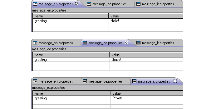
Figure 6.5.
Resource bundles *.properties files with Keys and Values for multi-language application.
Мessage resource bundles should be registered in the Faces configuration (faces-config.xml) file of your application as <message-bundle> inside the <application> element.
Name of a resource should be specified without language or country code and without .properties extension.
Supported locales should be specified inside the <supported-locale> element.
Registering resource bundles in the Faces configuration file:
<application>

      <locale-config>

            <default-locale>en</default-locale>

            <supported-locale>en</supported-locale>

            <supported-locale>de</supported-locale>

            <supported-locale>it</supported-locale>

      </locale-config>

      <message-bundle>demo.message</message-bundle>

</application>
For the application we will use JSF javax.faces.component.UIViewRoot.setLocale method that will set a needed Locale
(each link will invoke corresponding method — there are, off course, another ways to do that).
ChangeLocale Java class with three methods for setting the correponding Locale:
package demo;


 import java.util.Locale;

 import javax.faces.context.FacesContext;


 public class ChangeLocale {

    public String germanAction() {

       FacesContext context = FacesContext.getCurrentInstance();

       context.getViewRoot().setLocale(Locale.GERMAN);

       return null;

    }


    public String englishAction() {

       FacesContext context = FacesContext.getCurrentInstance();

       context.getViewRoot().setLocale(Locale.ENGLISH);

       return null;

    }


    public String italianAction() {

        FacesContext context = FacesContext.getCurrentInstance();

        context.getViewRoot().setLocale(Locale.ITALIAN);

        return null;

     }

}
Recently, the JSP page will look as following:
<h:form>

      <a4j:loadBundle var="msg" basename="demo.message"/>

      <h:outputText id="messageBundle" value="#{msg.greeting}"/>

      <a4j:commandLink value="De" action="#{changeLocale.germanAction}" reRender="messageBundle" />

      <a4j:commandLink value="Eng" action="#{changeLocale.englishAction}" reRender="messageBundle" />

      <a4j:commandLink value="It" action="#{changeLocale.italianAction}" reRender="messageBundle" />

</h:form>
As an output we will get a simple application with English "Hello!" by default.
Clicking on links "De", "Eng" and "It" will show the messages specified within the corresponding *.properties file.
To reference to a particular bundle item during an Ajax update it is necessary to point the component(s) that shold be re-rendered (in this example it is done with the help of
<a4j:commandLink>
"reRender"
attribute).

Visit the LoadBundle page at RichFaces LiveDemo for additional information on the component.
More useful examples and articles:
loadBundle tag reference at java.sun portal;
Backing a ResourceBundle with Properties Files at java.sun portal;
Internationalization and Localization of J2EE application explains main principles of the internationalization of a web application;
one more useful tutorial explains the internationalization of a web application using JSF message resource bundle;
Some special problem with JSF internationalization and solution from the i-coding.de portal.
<a4j:keepAlive beanName = "#{myClass.testBean}"/>
class MyClass{

    ...

    private TestBean testBean;

    // Getters and Setters for testBean.

    ...

}
Visit KeepAlive page at RichFaces Livedemo for examples of component usage and their sources.
Search the RichFaces Users forum for some additional information about usage of component.
Visit the Script page at RichFaces LiveDemo for examples of component usage abd their sources.
Visit the Script page at RichFaces LiveDemo for examples of component usage abd their sources.
RichFaces components library provides 3 components to validate user input data. These components enhance JSF validation capabilities with Ajax support and possibility to use Hibernate validators.
...

<rich:panel>

      <f:facet name="header">

            <h:outputText value="User Info:" />

      </f:facet>

      <h:panelGrid columns="3">

            <h:outputText value="Name:" />

            <h:inputText value="#{userBean.name}" id="name" required="true">

                  <f:validateLength minimum="3" maximum="12"/>

                  <rich:ajaxValidator event="onblur"/>

            </h:inputText>

            <rich:message for="name" />


            <h:outputText value="Age:" />

                  <h:inputText value="#{userBean.age}" id="age" required="true">

                        <f:convertNumber integerOnly="true"/>

                        <f:validateLongRange minimum="18" maximum="99"/>

                        <rich:ajaxValidator event="onblur"/>

                  </h:inputText>

                  <rich:message for="age"/>

      </h:panelGrid>

</rich:panel>

...
This is the result of the snippet.
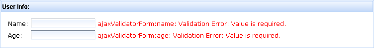
In the example above it's show how to work with standard JSF validators. The <rich:ajaxValidator> component also works perfectly with custom validators enhancing their usage with Ajax.
Custom validation can be performed in two ways:
The following example shows how the data entered by user can be validated using Hibernate Validator.
...

<rich:panel>

      <f:facet name="header">

            <h:outputText value="User Info:" />

      </f:facet>

      <h:panelGrid  columns="3">

            <h:outputText value="Name:" />

            <h:inputText value="#{validationBean.name}" id="name" required="true">

                  <rich:ajaxValidator event="onblur" />

            </h:inputText>

            <rich:message for="name" />


            <h:outputText value="Email:" />

                  <h:inputText value="#{validationBean.email}" id="email">

                        <rich:ajaxValidator event="onblur" />

                  </h:inputText>

                  <rich:message for="email" />


                  <h:outputText value="Age:" />

                  <h:inputText value="#{validationBean.age}" id="age">

                        <rich:ajaxValidator event="onblur" />

                  </h:inputText>

                  <rich:message for="age" />

      </h:panelGrid>

</rich:panel>

...
Here is the source code of the managed bean.
package org.richfaces.demo.validation;
import org.hibernate.validator.Email;
import org.hibernate.validator.Length;
import org.hibernate.validator.Max;
import org.hibernate.validator.Min;
import org.hibernate.validator.NotEmpty;
import org.hibernate.validator.NotNull;
import org.hibernate.validator.Pattern;
public class ValidationBean {
private String progressString="Fill the form please";
@NotEmpty
@Pattern(regex=".*[^\\s].*", message="This string contain only spaces")
@Length(min=3,max=12)
private String name;
@NotEmpty
private String email;
@NotNull
@Min(18)
@Max(100)
private Integer age;
public ValidationBean() {
}
/* Corresponding Getters and Setters */
}
By default the Hibernate Validator generates an error message in 10
language, though you can redefine the messages that are displayed to a
user when validation fails. In the shows example it was done by adding
(message="wrong email
                              format")
to the @Email annotation.
This is how it looks.
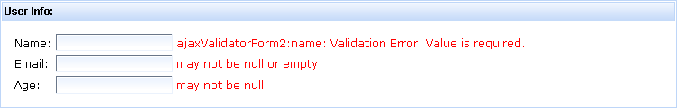
Visit the AjaxValidator page at RichFaces LiveDemo for examples of component usage and their sources.
<rich:panel>

      <f:facet name="header">

            <h:outputText value="#{validationBean.progressString}" id="progress"/>

      </f:facet>

      <h:panelGrid columns="3">

            <h:outputText value="Name:" />

            <h:inputText value="#{validationBean.name}" id="name">

                  <rich:beanValidator summary="Invalid name"/>

            </h:inputText>

            <rich:message for="name" />


            <h:outputText value="Email:" />

            <h:inputText value="#{validationBean.email}" id="email">

                  <rich:beanValidator summary="Invalid email"/>

            </h:inputText>

            <rich:message for="email" />


            <h:outputText value="Age:" />

            <h:inputText value="#{validationBean.age}" id="age">

                  <rich:beanValidator summary="Wrong age"/>

            </h:inputText>

            <rich:message for="age" />

            <f:facet name="footer">

                  <a4j:commandButton value="Submit" action="#{validationBean.success}" reRender="progress"/>

            </f:facet>

      </h:panelGrid>

</rich:panel>
package org.richfaces.demo.validation;
import org.hibernate.validator.Email;
import org.hibernate.validator.Length;
import org.hibernate.validator.Max;
import org.hibernate.validator.Min;
import org.hibernate.validator.NotEmpty;
import org.hibernate.validator.NotNull;
import org.hibernate.validator.Pattern;
public class ValidationBean {
private String progressString="Fill the form please";
@NotEmpty
@Pattern(regex=".*[^\\s].*", message="This string contain only spaces")
@Length(min=3,max=12)
private String name;
@NotEmpty
private String email;
@NotNull
@Min(18)
@Max(100)
private Integer age;
public ValidationBean() {
}
/* Corresponding Getters and Setters */
public void success() {
setProgressString(getProgressString() + "(Strored successfully)");
}
public String getProgressString() {
return progressString;
}
public void setProgressString(String progressString) {
this.progressString = progressString;
}
}
The following figure shows what happens if validation fails
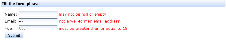
As you can see from the example that in order to validate the <rich:beanValidator> should be nested into a input JSF or RichFaces component.
The component has the only attribute - "summary" which displays validation messages about validation errors.
On RichFaces LiveDemo page you can see an example of <rich:beanValidator> usage and sources for the given example.
The following example demonstrates a pattern of how the <rich:graphValidator> can be used:
...

<rich:graphValidator>

     <h:panelGrid columns="3">

          <h:outputText value="Name:" />

          <h:inputText value="#{validationBean.name}" id="name">

               <f:validateLength minimum="2" />

          </h:inputText>

          <rich:message for="name" />

          <h:outputText value="Email:" />

          <h:inputText value="#{validationBean.email}" id="email" />

          <rich:message for="email" />

     </h:panelGrid>

</rich:graphValidator>

...
Please look at the example below.
...

<rich:graphValidator summary="Invalid values: " value="#{dayStatistics}">

     <a4j:repeat value="#{dayStatistics.dayPasstimes}" var="pt" id="table">

          <h:outputText value="#{pt.title}" />

          <rich:inputNumberSpinner minValue="0" maxValue="24" value="#{pt.time}" id="time" />

          <rich:message for="time" />

     </a4j:repeat>

</rich:graphValidator>

...
Hence, the given above code will provide the functionality that is illustrated on the images below.
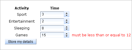
As you can see from the picture the "Games" field did not pass validation, as <rich:graphValidator> can be used to perform validation of a single input item.
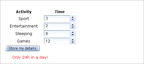
The figure above shows that the entered data was revalidated after all fields were completed, and the data did not pass revalidation since the total sum was incorrect.
Visit the GraphValidator page at RichFaces LiveDemo for examples of component usage and their sources.
The components described in this section render some content dynamically using Ajax capabilities.
The navigation rules could look as following:
...

<navigation-rule>

      <from-view-id>/pages/include/first.xhtml</from-view-id>

      <navigation-case>

            <from-outcome>next</from-outcome>

            <to-view-id>/pages/include/second.xhtml</to-view-id>

      </navigation-case>

</navigation-rule>

...
Visit the Include page for examples of component usage and their sources.
Write the following line on the page:
<a4j:mediaOutput element="img" cacheable="false" session="false" createContent="#{mediaBean.paint}" value="#{mediaData}" mimeType="image/jpeg"/>
The <a4j:mediaOutput> attribute has two main attributes:
package demo;


import java.awt.Graphics2D;

import java.awt.image.BufferedImage;

import java.io.IOException;

import java.io.OutputStream;

import java.util.Random;

import javax.imageio.ImageIO;


public class MediaBean {

    public void paint(OutputStream out, Object data) throws IOException{

        Integer high = 9999;

        Integer low = 1000;

        Random generator = new Random();

        Integer digits = generator.nextInt(high - low + 1) + low;

        if (data instanceof MediaData) {

            MediaData paintData = (MediaData) data;

            BufferedImage img = new BufferedImage(paintData.getWidth(),paintData.getHeight(),BufferedImage.TYPE_INT_RGB);

            Graphics2D graphics2D = img.createGraphics();

            graphics2D.setBackground(paintData.getBackground());

            graphics2D.setColor(paintData.getDrawColor());

            graphics2D.clearRect(0,0,paintData.getWidth(),paintData.getHeight());

            graphics2D.setFont(paintData.getFont());

            graphics2D.drawString(digits.toString(), 20, 35);

            ImageIO.write(img,"png",out);

        }

    }

}
package demo;


import java.awt.Color;

import java.awt.Font;

import java.io.Serializable;


public class MediaData implements Serializable{


    private static final long serialVersionUID = 1L;

    Integer Width=110;

    Integer Height=50;

    Color Background=new Color(190, 214, 248);

    Color DrawColor=new Color(0,0,0);

    Font font = new Font("Serif", Font.TRUETYPE_FONT, 30);


    /* Corresponding getters and setters */


}
Hence, when using the component it's possible to output your data of any type on a page with Ajax requests.
Visit the MediaOutput page at RichFaces LiveDemo for more examples of component usage and their sources.
<a4j:support reRender="mypanel"/>

...

<a4j:outputPanel id="mypanel">

      <h:panelGrid rendered="#{not empty foo.bar}">

       ...

      </h:panelGrid>

</a4j:outputPanel>
<a4j:support reRender="mypanel"/>

 ...

<a4j:outputPanel layout="none">

      <h:panelGrid id="mypanel" rendered="#{not empty foo.bar}">

       ...

      </h:panelGrid>

</a4j:outputPanel>
<a4j:outputPanel ajaxRendered="true">

      <h:messages/>

</a4j:outputPanel>
Visit OutputPanel page at RichFaces Livedemo for examples of component usage and their sources.
Useful articles:
search the RichFaces Users Forum for some additional information on component usage;
A collection of Ajax Miscellaneous components
According to the described above, the component defined at page as following
<a4j:page format="xhtml" pageTitle="myPage">

      <f:facet name="head">

            <!--Head Content here-->

      </f:facet>

      <!--Page Content Here-->

</a4j:page>
<!DOCTYPE html PUBLIC "-//W3C//DTD XHTML 1.0 Strict//EN" "http://www.w3.org/TR/xhtml1/DTD/xhtml1-strict.dtd">

<html>

    <head>

        <title>myPage</title>

        <!--Head Content here-->

    </head>

    <body>

        <!--Page Content Here-->

    </body>

</html>
Visit the AjaxPage page at RichFaces LiveDemo for examples of component usage and their sources.
Visit the Portlet page at RichFaces LiveDemo for examples of component usage and their sources.
Useful publications:
Ajax4Jsf Users Forum — check the forum for additional information about component usage;
portal-echo application — Portlet Sample, could be checked out from JBoss SVN;
First snapshot with Portal environment support contains usage instructions for the Portlet Sample demo.
On RichFaces LiveDemo page you can found some additional information for <a4j:htmlCommandLink> component usage.
On RichFaces LiveDemo page you can found some additional information about <f:param> component.
Visit the Log page at RichFaces LiveDemo for example of component usage and their sources.
You can find some cases when <a4j:log> might cause JavaScript error on Ajax Core Components Page.
- 6.6.1. < rich:column > available since 3.0.0
- 6.6.2. < rich:columnGroup > available since 3.0.0
- 6.6.3. < rich:columns > available since 3.2.0
- 6.6.4. < rich:dataDefinitionList > available since 3.0.0
- 6.6.5. < rich:dataFilterSlider > available since 3.0.0
- 6.6.6. < rich:dataGrid > available since 3.0.0
- 6.6.7. < rich:dataList > available since 3.0.0
- 6.6.8. < rich:dataOrderedList > available since 3.0.0
- 6.6.9. < rich:datascroller > available since 3.0.0
- 6.6.10. < rich:dataTable > available since 3.0.0
- 6.6.11. < rich:subTable > available since 3.0.0
- 6.6.12. < rich:extendedDataTable > available since 3.2.2
- 6.6.13. < a4j:repeat > available since 3.0.0
- 6.6.14. < rich:scrollableDataTable > available since 3.1.0
The following components iterate over a collection of data and represent it on the page.
Important
The "colspan", "rowspan", and "breakbefore" attributes only affect columns in a <rich:dataTable>, not those in a <rich:extendedDataTable>.
...

<rich:dataTable value="#{capitalsBean.capitals}" var="cap" rows="5">

     <rich:column>

          <f:facet name="header">State Flag</f:facet>

          <h:graphicImage value="#{cap.stateFlag}"/>

     </rich:column>

     <rich:column>

           <f:facet name="header">State Name</f:facet>

           <h:outputText value="#{cap.state}"/>

     </rich:column>

     <rich:column >

          <f:facet name="header">State Capital</f:facet>

          <h:outputText value="#{cap.name}"/>

     </rich:column>

     <rich:column>

          <f:facet name="header">Time Zone</f:facet>

          <h:outputText value="#{cap.timeZone}"/>

     </rich:column>

</rich:dataTable>

...
Now, in order to group columns with text information into one row in one
column with a flag, use the
"colspan"
attribute, which is similar to an HTML one, specifying
that the first column contains 3 columns. In addition, it's
necessary to specify that the next column begins from the first row
with the help of
breakBefore="true".
...

<rich:dataTable value="#{capitalsBean.capitals}" var="cap" rows="5">

     <rich:column colspan="3">

          <h:graphicImage value="#{cap.stateFlag}"/>

     </rich:column>

     <rich:column breakBefore="true">

          <h:outputText value="#{cap.state}"/>

     </rich:column>

     <rich:column >

          <h:outputText value="#{cap.name}"/>

     </rich:column>

     <rich:column>

          <h:outputText value="#{cap.timeZone}"/>

     </rich:column>

</rich:dataTable>

...
As a result the following structure is rendered:
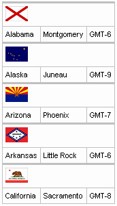
The same way is used for columns grouping with the "rowspan" attribute that is similar to an HTML one responsible for rows quantity definition occupied with the current one. The only thing to add in the example is an instruction to move onto the next row for each next row after the second column.
Example:
...

<rich:dataTable value="#{capitalsBean.capitals}" var="cap" rows="5">

     <rich:column rowspan="3">

          <f:facet name="header">State Flag</f:facet>

          <h:graphicImage value="#{cap.stateFlag}"/>

     </rich:column>

     <rich:column>

          <f:facet name="header">State Info</f:facet>

          <h:outputText value="#{cap.state}"/>

     </rich:column>

     <rich:column breakBefore="true">

          <h:outputText value="#{cap.name}"/>

     </rich:column>

     <rich:column breakBefore="true">

          <h:outputText value="#{cap.timeZone}"/>

     </rich:column>

</rich:dataTable>

...
As a result:
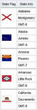
Hence, additionally to a standard output of a particular row provided with the <h:column> component, it becomes possible to group easily the rows with special HTML attribute.
The columns also could be grouped in a particular way with the help of the <h:columnGroup> component that is described in the following chapter.
In the Dynamic Columns Wiki article you can find additional information about dynamic columns.
...

<h:form>

    <rich:dataTable value="#{capitalsBean.capitals}" var="cap" width="300px">

        <f:facet name="header">

            <h:outputText value="Sorting Example"/>

        </f:facet>

        <rich:column sortBy="#{cap.state}">

            <f:facet name="header">

                <h:outputText value="State Name"/>

            </f:facet>

            <h:outputText value="#{cap.state}"/>

        </rich:column>

        <rich:column sortBy="#{cap.name}">

            <f:facet name="header">

                <h:outputText value="State Capital"/>

            </f:facet>

            <h:outputText value="#{cap.name}"/>

        </rich:column>

    </rich:dataTable>

</h:form>

...
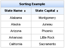
The "sortExpression" attribute defines a bean property which is used for sorting a column. This attribute can be used only with the <rich:scrollableDataTable> component. See the example of the attribute usage below.
Example:
...

<rich:scrollableDataTable

        value="#{dataTableScrollerBean.allCars}" sortMode="single"

        var="category">

        <rich:column sortExpression="#{category.make}">

            <f:facet name="header">

                <h:outputText styleClass="headerText" value="Make" />

            </f:facet>

            <h:outputText value="#{category.make}" />

        </rich:column>

        <rich:column>

            <f:facet name="header">

                <h:outputText styleClass="headerText" value="Model" />

            </f:facet>

            <h:outputText value="#{category.model}" />

        </rich:column>

        <rich:column>

            <f:facet name="header">

                <h:outputText styleClass="headerText" value="Price" />

            </f:facet>

            <h:outputText value="#{category.price}" />

        </rich:column>

</rich:scrollableDataTable>

...
The "selfSorted" attribute is meant for adding the possibility of automatic sorting by clicking on the column header. Default value is "true". In the example below the second column is unavailable for sorting.
Example:
...

<rich:dataTable value="#{capitalsBean.capitals}" var="cap">

        <rich:column>

                <f:facet name="header">

                        <h:outputText value="State Flag"/>

                </f:facet>

                <h:graphicImage value="#{cap.stateFlag}"/>

        </rich:column>

        <rich:column sortBy="#{cap.state}" selfSorted="false">

                <f:facet name="header">

                        <h:outputText value="State Name"/>

                </f:facet>

                <h:outputText value="#{cap.state}"/>

        </rich:column>

</rich:dataTable>

...
The "sortOrder" attribute is used for changing the sort order of columns by means of external controls.
Possible values are:
"ASCENDING" - column is sorted in ascending order
"DESCENDING" - column is sorted in descending order
"UNSORTED" - column isn't sorted
Example:
...

<h:form>

    <rich:dataTable value="#{capitalsBean.capitals}" var="cap" width="300px">

        <f:facet name="header">

            <h:outputText value="Sorting Example"/>

        </f:facet>

        <rich:column sortBy="#{cap.state}" sortOrder="ASCENDING">

            <f:facet name="header">

                <h:outputText value="State Name"/>

            </f:facet>

            <h:outputText value="#{cap.state}"/>

        </rich:column>

        <rich:column sortBy="#{cap.name}" sortOrder="DESCENDING">

            <f:facet name="header">

                <h:outputText value="State Capital"/>

            </f:facet>

            <h:outputText value="#{cap.name}"/>

        </rich:column>

    </rich:dataTable>

</h:form>

...
Below you can see the result:
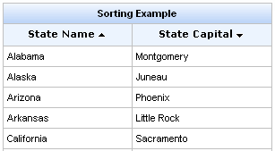
In the example above the first column is sorted in descending order. But if recurring rows appear in the table the relative second column are sorted in ascending order.
If the values of the columns are complex, the "sortOrder" attribute should point to a bean property containing the sort order. See how it's done in the LiveDemo for <rich:columns> .
You can customize the sorting's icon element using "rich-sort-icon" class.
Note
In order to sort a column with the values not in English you can add the org.richfaces.datatableUsesViewLocale context parameter in your web.xml.
Its value should be "true".
Note:
The "sortBy" and the "selfSorted" attributes used with the <rich:dataTable> component. Also the "selfSorted" can be used with the <rich:extendedDataTable> .
The "sortable" and the "sortExpression" attributes used with the <rich:scrollableDataTable> component.
There are two ways to filter the column value:
You can customize the input form using "rich-filter-input" CSS class.
Below you can see the example:
...

<rich:dataTable value="#{capitalsBean.capitals}" var="cap" width="200px">

        <f:facet name="header">

            <h:outputText value="Sorting Example"/>

        </f:facet>

        <rich:column filterBy="#{cap.state}" filterEvent="onkeyup">

                <f:facet name="header">

                    <h:outputText value="State Name"/>

                </f:facet>

               <h:outputText value="#{cap.state}"/>

        </rich:column>

        <rich:column filterBy="#{cap.name}" filterEvent="onkeyup">

            <f:facet name="header">

                <h:outputText value="State Capital"/>

            </f:facet>

            <h:outputText value="#{cap.name}"/>

        </rich:column>

</rich:dataTable>

...
See a simple example of "filterExpression" and "filterMethod" attributes usage on the RichFaces LiveDemo page.
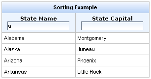
Table of <rich:column> attributes.
Table 6.31. Facets
| Facet name | Description |
|---|---|
| header | Defines the header content |
| footer | Defines the footer content |
Custom style classes as well as skin parameters for <rich:column> are the same as for the <rich:dataTable> component.
You can find all necessary information about style classes redefinition in Definition of Custom Style Classes section.
Visit the Column page at RichFaces LiveDemo for examples of the component usage and their sources.
See the example on how to use the "rendered" attribute of <rich:column> in the RichFaces Cookbook article.

...

<rich:dataTable value="#{capitalsBean.capitals}" var="cap" rows="5" id="sublist">

        <rich:column colspan="3">

                <f:facet name="header">State Flag</f:facet>

                <h:graphicImage value="#{cap.stateFlag}"/>

        </rich:column>

       <rich:columnGroup>

                <rich:column>

                    <h:outputText value="#{cap.state}"/>

                </rich:column>

               <rich:column >

                    <h:outputText value="#{cap.name}"/>

               </rich:column>

               <rich:column >

                    <h:outputText value="#{cap.timeZone}"/>

               </rich:column>

        </rich:columnGroup>

</rich:dataTable>

...
And here is a representation without a grouping:
...

<rich:dataTable value="#{capitalsBean.capitals}" var="cap" rows="5" id="sublist">

        <rich:column colspan="3">

                <f:facet name="header">State Flag</f:facet>

                <h:graphicImage value="#{cap.stateFlag}"/>

        </rich:column>

        <rich:column breakBefore="true">

                <h:outputText value="#{cap.state}"/>

        </rich:column>

        <rich:column>

                <h:outputText value="#{cap.name}"/>

        </rich:column>

        <rich:column>

                <h:outputText value="#{cap.timeZone}"/>

        </rich:column>

</rich:dataTable>

....
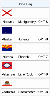
It's also possible to use the component for output of complex headers in a table. For example, adding of a complex header to a facet for the whole table looks the following way:
Example:
...

<rich:dataTable value="#{capitalsBean.capitals}" var="cap" rows="5" id="sublist">

        <f:facet name="header">

            <rich:columnGroup>

                <rich:column rowspan="2">

                    <h:outputText value="State Flag"/>

                </rich:column>

                <rich:column colspan="3">

                    <h:outputText value="State Info"/>

                </rich:column>

                <rich:column breakBefore="true">

                    <h:outputText value="State Name"/>

                </rich:column>

                <rich:column>

                    <h:outputText value="State Capital"/>

                </rich:column>

                <rich:column>

                    <h:outputText value="Time Zone"/>

                </rich:column>

            </rich:columnGroup>

        </f:facet>

        <rich:column>

                <h:graphicImage value="#{cap.stateFlag}"/>

        </rich:column>

        <rich:column>

                <h:outputText value="#{cap.state}"/>

        </rich:column>

        <rich:column>

                <h:outputText value="#{cap.name}"/>

        </rich:column>

        <rich:column>

                <h:outputText value="#{cap.timeZone}"/>

        </rich:column>

</rich:dataTable>

...
The generated table on a page looks as follows:
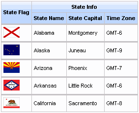
Table of <rich:columnGroup> attributes.
Custom style classes as well as skin parameters for <rich:columnGroup> are the same as for the <rich:dataTable> component.
You can find all necessary information about style classes redefinition in Definition of Custom Style Classes section.
On the component LiveDemo page you can find the example of the <rich:columnGroup> usage and sources as well.
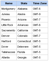
The "value" and "var" attributes are used to access the values of collection.
The simple example is placed below.
...

<rich:dataTable value="#{dataTableScrollerBean.model}" var="model" width="750">

            <rich:columns value="#{dataTableScrollerBean.columns}" var="columns"

                index="ind" id="column#{ind}">

                <f:facet name="header">

                    <h:outputText value="#{columns.header}" />

                </f:facet>


                <h:outputText value="#{model[ind].model} " />

                <h:outputText value="#{model[ind].mileage} miles " />

                <h:outputText value="#{model[ind].price}$" />

            </rich:columns>

</rich:dataTable>

...
The "columns" attribute defines the count of columns.
The "begin" attribute contains the first iteration item. Note, that iteration begins from zero.
The "end" attribute contains the last iteration item.
...

<rich:dataTable value="#{dataTableScrollerBean.model}" var="model" width="500px" rows="5">

        <f:facet name="header">

                <h:outputText value="Cars Available"></h:outputText>

        </f:facet>

        <rich:columns value="#{dataTableScrollerBean.columns}" var="columns" index="ind">

                <f:facet name="header">

                        <h:outputText value="#{columns.header}" />

                </f:facet>

                <h:outputText value="#{model[ind].model} " />

        </rich:columns>

        <rich:column>

                <f:facet name="header">

                        <h:outputText value="Price" />

                </f:facet>

               <h:outputText value="Price" />

        </rich:column>

        <rich:columns value="#{dataTableScrollerBean.columns}" var="columns" index="ind">

                <f:facet name="header">

                        <h:outputText value="#{columns.header}" />

                </f:facet>

                <h:outputText value="#{model[ind].mileage}$" />

        </rich:columns>

</rich:dataTable>

...
The grouping some columns into one column or one row with the help of the "colspan", "rowspan" and "breakBefore" attributes can be perform for <rich:columns> the same way as for the <rich:columnt> component.
Note:
The <rich:columns> tag is initialized during components tree building process. This process precedes page rendering at "Render Response" JSF phase. To be rendered properly the component needs all it variables to be initialized while the components tree is being building. A javax.servlet.jsp.JspTagException occurs if <rich:columns> uses variables passed from other components, if these variables are initialized during rendering. Thus, when <rich:columns> is asking for such variables they do not already exist. Use <c:forEach> JSP standard tag as workaround. Compare two examples below.
This code calls the exception:
...

<rich:dataTable value="#{bean.data}" var="var">

        <rich:columns value="#{var.columns}">

                ...

        </rich:columns>

</rich:dataTable>

...
This code works properly:
...

<c:forEach items="#{bean.data}" var="var">

        <rich:columns value="#{var.columns}">

                ...

        </rich:columns>

</c:forEach>

...
Note:
Since 3.3.0GA <rich:columns> requires explicit definition of "id" for children components to ensure that decode process works properly. The example of how you can define unique "id" for children component:
...

<rich:columns value="#{bean.columns}" var="col" index="ind" ... >

        <h:inputText id="input#{ind}" value="">

                <a4j:support id="support#{ind}" event="onchange" reRender="someId" />

        </h:inputText>

</rich:columns>

...
Only if "id" defined as shown above Ajax after onchange event will be processed as expected.
Sorting and filtering for the <rich:columns> component works the same as for <rich:column> . See the "Sorting and Filtering" section.
Table of <rich:columns> attributes.
Table 6.34. Facets
| Facet name | Description |
|---|---|
| header | Defines the header content |
| footer | Defines the footer content |
Custom style classes as well as skin parameters for <rich:columns> are the same as for the <rich:dataTable> component.
You can find all necessary information about style classes redefinition in Definition of Custom Style Classes section.
On the component LiveDemo page you can find an additional information on the <rich:columns> component usage.

The <rich:dataDefinitionList> component allows to generate a definition list from a model.
...

<h:form>

        <rich:dataDefinitionList var="car" value="#{dataTableScrollerBean.allCars}" rows="5" first="4" title="Cars">

                <f:facet name="term">

                    <h:outputText value="#{car.make} #{car.model}"></h:outputText>

                </f:facet>

                <h:outputText value="Price:" styleClass="label"></h:outputText>

                <h:outputText value="#{car.price}" /><br/>

                <h:outputText value="Mileage:" styleClass="label"></h:outputText>

                <h:outputText value="#{car.mileage}" /><br/>

        </rich:dataDefinitionList>

</h:form>

...
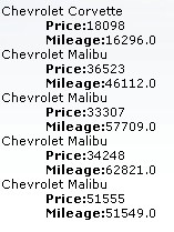
In the example the "rows" attribute limits a number of output elements of the list.
The "first" attribute defines the first element for output. "title" is used for a popup title.
The <rich:dataDefinitionList> component could be partially updated with Ajax. The "ajaxKeys" attribute points to an Object (java.util.Set) that should contain row keys to be updated after an Ajax request. See an example of usage the "ajaxKeys" attribute for the <rich:dataList> component in the RichFacs Cookbook article.
Table of <rich:dataDefinitionList> attributes.
Table 6.36. Style classes (selectors) without skin parameters
| Class name | Description |
|---|---|
| .rich-deflist | Defines styles for an html <dl> element |
| .rich-definition | Defines styles for an html <dd> element |
| .rich-definition-term | Defines styles for an html <dt> element |
You can find all necessary information about style classes redefinition in Definition of Custom Style Classes section.
On the component LiveDemo page you can see the example of <rich:dataDefinitionList> usage and sources for the given example.
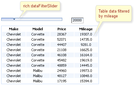
...

<rich:dataFilterSlider sliderListener="#{mybean.doSlide}"

                        startRange="0"

                        endRange="50000"

                        increment="10000"

                        handleValue="1"

                        for="carIndex"

                        forValRef="inventoryList.carInventory"

                        filterBy="getMileage" />

...

<h:dataTable id="carIndex">

        ...

</h:dataTable>

...
In this example other two attributes are used for filtering:
Information about the "process" attribute usage you can find in the "Decide what to process " guide section.
Table of <rich:dataFilterSlider> attributes.
Table 6.38. Style classes (selectors) with the corresponding skin parameters
| Class (selector) name | Description | Skin Parameters | CSS properties mapped |
|---|---|---|---|
| .range, .rich-dataFilterSlider-range | Define styles for the component range | subBorderColor, panelBorderColor | border-color |
| .slider-input-field, .rich-dataFilterSlider-input-field | Define styles for the component input field | controlBackgroundColor | background-color |
| generalFamilyFont | font-family | ||
| generalSizeFont | font-size | ||
| controlTextColor | color | ||
| panelBorderColor | border-color | ||
| subBorderColor | border-bottom-color, border-right-color |
Table 6.39. Style classes (selectors) without skin parameters
| Class name | Description |
|---|---|
| .trailer, .rich-dataFilterSlider-trailer | Define styles for the component trailer |
| .track, .rich-dataFilterSlider-track | Define styles for the component track |
You can find all necessary information about style classes redefinition in Definition of Custom Style Classes section.
On the component LiveDemo page you can see the example of <rich:dataFilterSlider> usage and sources for the given example.
...

<rich:panel style="width:150px;height:200px;">

        <h:form>

                <rich:dataGrid value="#{dataTableScrollerBean.allCars}" var="car" columns="2" elements="4" first="1">

                    <f:facet name="header">

                            <h:outputText value="Car Store"></h:outputText>

                        </f:facet>

                        <rich:panel>

                            <f:facet name="header">

                                    <h:outputText value="#{car.make} #{car.model}"></h:outputText>

                            </f:facet>

                            <h:panelGrid columns="2">

                                    <h:outputText value="Price:" styleClass="label"></h:outputText>

                                    <h:outputText value="#{car.price}"/>

                                    <h:outputText value="Mileage:" styleClass="label"></h:outputText>

                                    <h:outputText value="#{car.mileage}"/>

                            </h:panelGrid>

                        </rich:panel>

                        <f:facet name="footer">

                            <rich:datascroller></rich:datascroller>

                        </f:facet>

                </rich:dataGrid>

        </h:form>

</rich:panel>

...
The component was created basing on the <a4j:repeat> component and as a result it could be partially updated with Ajax. "ajaxKeys" attribute allows to define row keys that are updated after an Ajax request.
Here is an example:
Example:
...

<rich:dataGrid value="#{dataTableScrollerBean.allCars}" var="car" ajaxKeys="#{listBean.list}"

                        binding="#{listBean.dataGrid}" id="grid" elements="4" columns="2">

        ...

</rich:dataGrid>

...

<a4j:commandButton action="#{listBean.action}" reRender="grid" value="Submit"/>

...
In the example "reRender" attribute contains value of "id" attribute for <rich:dataGrid> component. As a result the component is updated after an Ajax request.
Table of <rich:dataGrid> attributes.
Table 6.41. Facets
| Facet name | Description |
|---|---|
| header | Defines the header content |
| footer | Defines the footer content |
| caption | Defines the caption content |
Custom style classes as well as skin parameters for <rich:dataGrid> are the same as for the <rich:dataTable> component.
You can find all necessary information about style classes redefinition in Definition of Custom Style Classes section.
On the component LiveDemo page you can see the example of <rich:dataGrid> usage and sources for the given example.
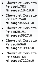
The <rich:dataList> component allows to generate a list from a model.
...

<h:form>

        <rich:dataList var="car" value="#{dataTableScrollerBean.allCars}" rows="5" type="disc" title="Car Store">

                <h:outputText value="#{car.make} #{car.model}"/><br/>

                <h:outputText value="Price:" styleClass="label"></h:outputText>

                <h:outputText value="#{car.price} "/><br/>

                <h:outputText value="Mileage:" styleClass="label"></h:outputText>

                <h:outputText value="#{car.mileage} "/><br/>

        </rich:dataList>

</h:form>

...
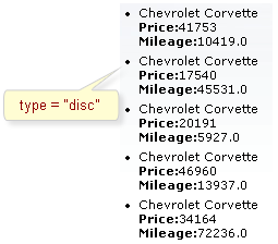
In the example the "rows" attribute limits a number of output elements of the list.
The "first" attribute defines the first element for output. "title" is used for a popup title. See the picture below:
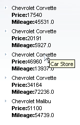
The <rich:dataList> component could be partially updated with Ajax. The "ajaxKeys" attribute points to an Object (java.util.Set) that contains row keys to be updated after an Ajax request. See an example of usage the attribute in the Using the ajaxKeys attribute for <rich:dataList> article in the RichFaces Cookbook.
Table of <rich:dataList> attributes.
Table 6.43. Style classes (selectors) without skin parameters
| Class name | Description |
|---|---|
| .rich-datalist | Defines styles for an html <ul> element |
| .rich-list-item | Defines styles for an html <li> element |
You can find all necessary information about style classes redefinition in Definition of Custom Style Classes section.
On the component LiveDemo page you can see the example of <rich:dataList> usage and sources for the given example.

The <rich:dataOrderedList> component allows to generate an ordered list from a model.
...

<h:form>

        <rich:dataOrderedList var="car" value="#{dataTableScrollerBean.allCars}" rows="5" type="1"  title="Car Store">

                <h:outputText value="#{car.make} #{car.model}"/><br/>

                <h:outputText value="Price:" styleClass="label"></h:outputText>

                <h:outputText value="#{car.price}" /><br/>

                <h:outputText value="Mileage:" styleClass="label"></h:outputText>

                <h:outputText value="#{car.mileage}" /><br/>

        </rich:dataOrderedList>

</h:form>

...
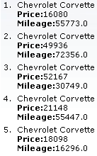
In the example the "rows" attribute limits a number of output elements of the list.
The "first" attribute defines the first element for output. "title" is used for a popup title.
The <rich:dataOrderedList> component could be partially updated with Ajax. The "ajaxKeys" attribute points to an Object (java.util.Set) that should contain row keys to be updated after an Ajax request. See an example of usage the "ajaxKeys" attribute for the <rich:dataList> component in the RichFacs Cookbook article.
Table of <rich:dataOrderedList> attributes.
Table 6.45. Style classes (selectors) without skin parameters
| Class name | Description |
|---|---|
| .rich-orderedlist | Defines styles for an html <ol> element |
| .rich-list-item | Defines styles for an html <li> element |
You can find all necessary information about style classes redefinition in Definition of Custom Style Classes section.
On the component LiveDemo page you can see the example of <rich:dataOrderedList > usage and sources for the given example.
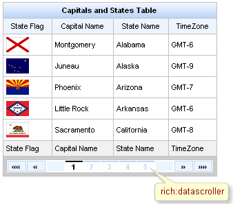
Component provides two controllers groups for switching:
The controls of fast switching are created adding the facets component with the corresponding name:
 ...

<rich:datascroller for="table" maxPages="10">

          <f:facet name="first">

                    <h:outputText value="First"/>

          </f:facet>

          <f:facet name="last">

                    <h:outputText value="Last"/>

          </f:facet>

</rich:datascroller>

...
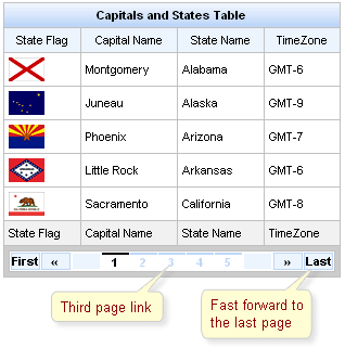
The screenshot shows one controller from each group.
There are also facets used to create the disabled states:
"first_disabled",
"last_disabled",
"next_disabled",
"previous_disabled",
"fastforward_disabled",
"fastrewind_disabled".
For the
"fastforward"/"fastrewind"
controls customization the additional
"fastStep"
attribute is used. The attribute indicates pages quantity
to switch onto when fast scrolling is used.
The "page" is a value-binding attribute used to define and save the current page number. The example is placed below.
Example:
...

<h:form id="myForm">

    <rich:dataTable id="carList" rows="7" value="#{dataTableScrollerBean.allCars}" var="category">

        <f:facet name="header">

            <rich:columnGroup>

                <h:column>

                    <h:outputText value="Make" />

                </h:column>

                <h:column>

                    <h:outputText value="Model" />

                </h:column>

                <h:column>

                    <h:outputText value="Price" />

                </h:column>

            </rich:columnGroup>

        </f:facet>

        <h:column>

            <h:outputText value="#{category.make}" />

        </h:column>

        <h:column>

            <h:outputText value="#{category.model}" />

        </h:column>

        <h:column>

            <h:outputText value="#{category.price}" />

        </h:column>

    </rich:dataTable>

    <rich:datascroller id="sc2" for="carList" reRender="sc1" maxPages="7" page="#{dataTableScrollerBean.scrollerPage}" />

    <h:panelGrid>

        <h:panelGroup>

            <h:outputText value="Set current page number:" />

            <h:inputText value="#{dataTableScrollerBean.scrollerPage}" id="sc1" size="1"/>

            <h:commandButton value="Set" />

        </h:panelGroup>

    </h:panelGrid>

</h:form>

...
In the example above you can enter the page number you want and set it by clicking on the <h:commandButton> . By the way, if you use <rich:datascroller> page links the input field rerenders and current page number changes.
The result should be like below:
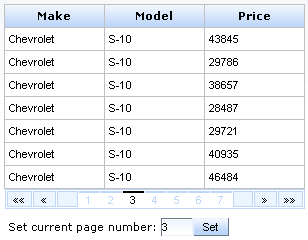
The "pageIndexVar" and "pagesVar" attributes define a request scope variables and provide an ability to show the current page and the number of pages in the <rich:datascroller> .
These attributes are used for definition the names of variables, that is used in the facet with name "pages" . An example can be found below:
Example:
...

<h:form>

    <rich:dataTable value="#{capitalsBean.capitals}" var="cap" rows="5">

        <rich:column>

            <h:outputText value="#{cap.name}" />

        </rich:column>

        <f:facet name="footer">

            <rich:datascroller pageIndexVar="pageIndex" pagesVar="pages">

                <f:facet name="pages">

                    <h:outputText value="#{pageIndex} / #{pages}" />

                </f:facet>

            </rich:datascroller>

        </f:facet>

    </rich:dataTable>

</h:form>

...
It's possible to insert optional separators between controls. For this purpose use a "controlsSeparator" facet. An example is placed below.
 ...

<f:facet name="controlsSeparator">

          <h:graphicImage value="/image/sep.png"/>

</f:facet>

...
Starting from 3.2.1 of RichFaces multiple <rich:datascroller> instances behavior and page bindings are corrected. Incorrect page after model changes handling is added. Phase Listener called before RenderResponce scans the page for the <rich:datascroller> and performs the following operations:
Checks if the <rich:datascroller> is rendered. (If the checking generates an exception, the <rich:datascroller> is considered to be not rendered )
If the <rich:datascroller> is rendered - the table to which the <rich:datascroller> is attached gets the value of the page attribute of <rich:datascroller> .
Information about the "process" attribute usage you can find in the " Decide what to process " guide section.
Note:
Make sure, that all <rich:datascroller> components, defined for a table, have same values for all "page" attributes. The page, specified in the last "page" , will be rendered in browser.
Table of <rich:datascroller> attributes.
Table 6.47. JavaScript API
| Function | Description |
|---|---|
| switchToPage(page) | Switches to the defined page, "page" is Number or String |
| next() | Navigates to the next page |
| previous() | Navigates to the previous page |
| first() | Navigates to the first page |
| last() | Navigates to the last page |
| fastForward() | Navigates ahead over a certain number of pages. The number of pages to traverse is defined with fastStep attribute |
| fastRewind() | Navigates backwards over a certain number of pages. The number of pages to traverse is defined with fastStep attribute |
Table 6.48. Facets
| Facet | Description |
|---|---|
| controlsSeparator | Redefines optional separators between controls |
| first | Redefines the "first" button with the content set |
| first_disabled | Redefines the disabled "first" button with the content set |
| last | Redefines the "last" button with the content set |
| last_disabled | Redefines the disabled "last" button with the content set |
| fastrewind | Redefines the "fastrewind" button with the content set |
| fastrewind_disabled | Redefines the disabled "fastrewind" button with the content set |
| fastforward | Redefines the "fastforward" button with the content set |
| fastforward_disabled | Redefines the disabled "fastforward" button with the content set |
| previous | Redefines the "previous" button with the content set |
| previous_disabled | Redefines the disabled "previous" button with the content set |
| next | Redefines the "next" button with the content set |
| next_disabled | Redefines the disabled "next" button with the content set |
| pages | Redefines the pages buttons with the content set |
Table 6.49. Style classes (selectors) with the corresponding skin parameters
| Class (selector) name | Description | Skin Parameters | CSS properties mapped |
|---|---|---|---|
| .rich-datascr-button | Defines styles for a button | additionalBackgroundColor | background-color |
| panelBorderColor | border-color | ||
| panelBorderColor | border-color | ||
| generalFamilyFont | font-family | ||
| generalSizeFont | font-size | ||
| .rich-datascr-ctrls-separator | Defines styles for a separator between buttons | additionalBackgroundColor | background-color |
| panelBorderColor | border-color | ||
| panelBorderColor | border-color | ||
| generalFamilyFont | font-family | ||
| generalSizeFont | font-size | ||
| .rich-datascr-button-dsbld | Defines styles for a disabled button | panelBorderColor | color |
| .rich-datascr-act | Defines styles for an active button | generalTextColor | border-top-color, color |
| generalFamilyFont | font-family | ||
| generalSizeFont | font-size | ||
| .rich-datascr-inact | Defines styles for an inactive button | headerBackgroundColor | border-top-color, color |
| generalFamilyFont | font-family | ||
| generalSizeFont | font-size | ||
| .rich-dtascroller-table | Defines styles for a wrapper <table> element of a datascroller | panelBorderColor | border-color |
| tableBackgroundColor | background-color |
Table 6.50. Style classes (selectors) without skin parameters
| Class name | Description |
|---|---|
| .rich-datascr | Defines styles for a wrapper <div> element of a datascroller |
You can find all necessary information about style classes redefinition in Definition of Custom Style Classes section.
On the component LiveDemo page you can see the example of <rich:datascroller> usage and sources for the given example.
The solution about how to do correct pagination using datascroller (load a part of data from database) can be found on the RichFaces Users Forum.
How to use <rich:dataTable> and <rich:datascroller> in a context of Extended Data Model see on the RichFaces Users Forum.
This article describes how to solve <rich:datatable> update problem when <rich:datascroller> used.
Here you can find out how to use pair of <rich:datascrollers> outside the any dataTable.
The solution about how to make <rich:datascroller> be updated after sorting/filtering can be found on Data Iteration Components FAQ.
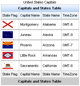
Extended table features, such as scrollable data, row selection, and column re-ordering, require the use of the <rich:extendedDataTable> component instead of <rich:dataTable>. Refer to the <rich:extendedDataTable> section for details on the differences between the two components.
The <rich:dataTable> component is similar to the <h:dataTable> one, except Ajax support and skinnability. Ajax support is possible, because the component was created basing on the <a4j:repeat> component and as a result it could be partially updated with Ajax. The "ajaxKeys" attribute allows to define row keys which are updated after an Ajax request. You can find an example which demonstrate the usage of the "ajaxKeys" attributes for data iteration components in the RichFaces Cookbook article.
Note:
If you need to render a table with some extended features like data scrolling, hiding the columns with the help of the context menu and some others, then use the <rich:extendedDataTable> component instead.
...

<rich:dataTable value="#{capitalsBean.capitals}" var="cap" rows="5">

        <f:facet name="caption">

                <h:outputText value="United States Capitals" />

        </f:facet>

        <f:facet name="header">

                <h:outputText value="Capitals and States Table" />

        </f:facet>

        <rich:column>

                <f:facet name="header">State Flag</f:facet>

                        <h:graphicImage value="#{cap.stateFlag}"/>

                <f:facet name="footer">State Flag</f:facet>

        </rich:column>

        <rich:column>

                <f:facet name="header">State Name</f:facet>

                        <h:outputText value="#{cap.state}"/>

                <f:facet name="footer">State Name</f:facet>

        </rich:column>

        <rich:column >

                <f:facet name="header">State Capital</f:facet>

                        <h:outputText value="#{cap.name}"/>

                <f:facet name="footer">State Capital</f:facet>

        </rich:column>

        <rich:column>

                <f:facet name="header">Time Zone</f:facet>

                    <h:outputText value="#{cap.timeZone}"/>

                <f:facet name="footer">Time Zone</f:facet>

        </rich:column>

        <f:facet name="footer">

                <h:outputText value="Capitals and States Table" />

        </f:facet>

</rich:dataTable>

...
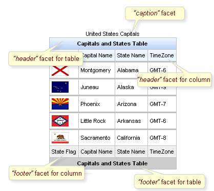
Information about sorting and filtering you can find in the corresponding section.
You can find information how to remove header's gradient in the "How to remove rich:dataTable header background " article.
Table of <rich:dataTable> attributes.
Table 6.52. Facets
| Facet | Description |
|---|---|
| header | Redefines the header content |
| footer | Redefines the footer content |
| caption | Defines the caption content |
Table 6.53. Style classes (selectors) with the corresponding skin parameters
| Class (selector) name | Description | Skin Parameters | CSS properties mapped |
|---|---|---|---|
| .rich-table | Defines styles for a table | tableBackgroundColor | background-color |
| .rich-table-cell | Defines styles for a table cell | generalSizeFont | font-size |
| generalTextColor | color | ||
| generalFamilyFont | font-family | ||
| .rich-table-header | Defines styles for a table header row | headerBackgroundColor | background-color |
| .rich-table-header-continue | Defines styles for all header lines after the first | headerBackgroundColor | background-color |
| .rich-table-headercell | Defines styles for a header cell | tableBorderWidth, tableBorderColor | border-right, border-bottom |
| headerTextColor | color | ||
| headerWeightFont | font-weight | ||
| generalSizeFont | font-size | ||
| generalFamilyFont | font-family | ||
| .rich-table-subheader | Defines styles for a column header | additionalBackgroundColor | background-color |
| .rich-table-thead | tableBorderWidth, tableBorderColor | border-bottom | |
| .rich-table-subheadercell | Defines styles for a column header cell | tableBorderWidth, tableBorderColor | border-right |
| generalTextColor | color | ||
| generalSizeFont | font-size | ||
| generalFamilyFont | font-family | ||
| .rich-table-footer | Defines styles for a footer row | tableFooterBackgroundColor | background-color |
| .rich-table-footer-continue | Defines styles for all footer lines after the first | tableFooterBackgroundColor | background-color |
| .rich-table-footercell | Defines styles for a footer cell | tableBorderWidth, tableBorderColor | border-right, border-bottom |
| generalTextColor | color | ||
| headerWeightFont | font-weight | ||
| generalSizeFont | font-size | ||
| generalFamilyFont | font-family | ||
| .rich-table-subfooter | Defines styles for a column footer | tableSubfooterBackgroundColor | background-color |
| .rich-table-subfootercell | Defines styles for a column footer cell | tableBorderWidth, tableBorderColor | border-right, border-bottom |
| generalTextColor | color | ||
| generalSizeFont | font-size | ||
| generalFamilyFont | font-family |
Table 6.54. Style classes (selectors) without skin parameters
| Class name | Description |
|---|---|
| .rich-table-caption | Defines styles for a "caption" facet element |
| .rich-table-row | Defines styles for a table row |
| .rich-table-firstrow | Defines styles for a table's first row |
You can find all necessary information about style classes redefinition in Definition of Custom Style Classes section.
On the component LiveDemo page you can see the example of <rich:dataTable> usage and sources for the given example.
The article about <rich:dataTable> flexibility can be found in the "rich:dataTable Flexibility " article .
Article on dataTable skinability provides you a simple example of skinnability.
More information about using <rich:dataTable> and <rich:subTable> could be found on the RichFaces Users Forum.
How to use <rich:dataTable> and <rich:datascroller> in a context of Extended Data Model see on the RichFaces Users Forum.
From "rich:dataTable border to 0px " article you'll figure out how to set rich:dataTable border to 0px
dataTable Background Out tells you how to remove rich:dataTable header background
"Richfaces Datatable Checkbox" article helps you to create a Richface Datatable with Checkbox Column and an CheckAll Checkbox in Header.
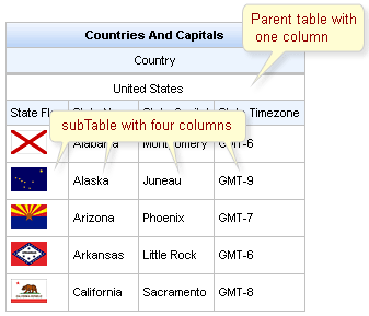
The <rich:subTable> component is similar to the <h:dataTable> one, except Ajax support and skinnability. One more difference is that the component doesn't add the wrapping <table> and <tbody> tags. Ajax support is possible, because the component was created basing on the <a4j:repeat> component and as a result it could be partially updated with Ajax. The "ajaxKeys" attribute allows to define row keys which are updated after an Ajax request. You can find an example which demonstrate the usage of the "ajaxKeys" attributes for data iteration components in the RichFaces Cookbook article.
The component allows to use "header" and "footer" facets for output. See an example for <rich:dataTable> component.
Table of <rich:subTable> attributes.
Table 6.56. Facets
| Facet name | Description |
|---|---|
| header | Defines the header content |
| footer | Defines the footer content |
Table 6.57. Style classes (selectors) with the corresponding skin parameters
| Class (selector) name | Description | Skin Parameters | CSS properties mapped |
|---|---|---|---|
| .rich-subtable-cell | Defines styles for a subtable cell | generalSizeFont | font-size |
| generalTextColor | color | ||
| generalFamilyFont | font-family | ||
| .rich-subtable-headercell | Defines styles for a subtable header cell | tableBorderWidth, tableBorderColor | border-right, border-bottom |
| generalTextColor | color | ||
| generalSizeFont | font-size | ||
| generalFamilyFont | font-family | ||
| .rich-subtable-header | Defines styles for a subtable header row | additionalBackgroundColor | background-color |
| .rich-subtable-footer | Defines styles for a subtable footer row | tableSubfooterBackgroundColor | background-color |
| .rich-subtable-footercell | Defines styles for a subtable footer cell | tableBorderWidth, tableBorderColor | border-right, border-bottom |
Table 6.58. Style classes (selectors) without skin parameters
| Class name | Description |
|---|---|
| .rich-subtable | Defines styles for all subtable |
| .rich-subtable-caption | Defines styles for a "caption" facet element |
| .rich-subtable-header-continue | Defines styles for all subtable header lines after the first |
| .rich-subtable-subheader | Defines styles for a column header of subtable |
| .rich-subtable-subfooter | Defines styles for a column footer of subtable |
| .rich-subtable-footer-continue | Defines styles for all subtable footer lines after the first |
| .rich-subtable-subheadercell | Defines styles for a column header cell of subtable |
| .rich-subtable-row | Defines styles for a subtable row |
| .rich-subtable-firstrow | Defines styles for a subtable start row |
| .rich-subtable-subfootercell | Defines styles for a column footer cell of subtable |
You can find all necessary information about style classes redefinition in Definition of Custom Style Classes section.
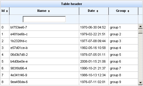
<rich:extendedDataTable> includes the following attributes not included with <rich:dataTable>:
<rich:extendedDataTable> does not include the following attributes available with <rich:dataTable>:
...

<rich:extendedDataTable id="edt" value="#{extendedDT.dataModel}" var="edt" width="500px" height="500px" selectedClass="dataTableSelectedRow" sortMode="single" selectionMode="multi" selection="#{extendedDT.selection}" rowKeyVar="rkvar" tableState="#{extendedDT.tableState}">

       <rich:column id="id" headerClass="dataTableHeader" width="50" label="Id" sortable="true" sortBy="#{edt.id}" sortIconAscending="dataTableAscIcon" sortIconDescending="dataTableDescIcon">

              <f:facet name="header">

                     <h:outputText value="Id" />

              </f:facet>

              <h:outputText value="#{edt.id}" />

       </rich:column>

       <rich:column id="name" width="300" headerClass="dataTableHeader" label="Name" sortable="true" sortBy="#{edt.name}" sortIconAscending="dataTableAscIcon" sortIconDescending="dataTableDescIcon" filterBy="#{edt.name}" filterEvent="onkeyup" visible="false">

              <f:facet name="header">

                     <h:outputText value="Name" />

              </f:facet>

              <h:outputText value="#{edt.name}" />

       </rich:column>

       <rich:column id="date" width="100" headerClass="dataTableHeader" label="Date" sortable="true" comparator="#{extendedDT.dateComparator}" sortIconAscending="dataTableAscIcon" sortIconDescending="dataTableDescIcon">

              <f:facet name="header">

                     <h:outputText value="Date" />

              </f:facet>

              <h:outputText value="#{edt.date}"><f:convertDateTime pattern="yyyy-MM-dd HH:mm:ss" />

              </h:outputText>

       </rich:column>

       <rich:column id="group" width="50" headerClass="dataTableHeader" label="Group" sortable="true" sortBy="#{edt.group}" sortIconAscending="dataTableAscIcon" sortIconDescending="dataTableDescIcon">

              <f:facet name="header">

                     <h:outputText value="Group" />

              </f:facet>

              <h:outputText value="#{edt.group}" />

       </rich:column>

</rich:extendedDataTable>

...
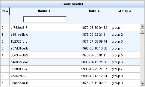
Information about sorting and filtering can be found in RichFaces Developer Guide section on sorting.
For external filtering the <rich:extendedDataTable> component supports the "filter" facet for <rich:column> . In this facet you can define your own controls for filtering which will be positioned like built-in filter controls. Rest of the filter scenario is the same as described in the RichFaces Developer Guide section on filtering.
In the example the "selection" attribute contains an object with selected rows.
Note:
The "height" attribute is mandatory. The default value is "500px" .
Menu on the right side of the column header is used to perform actions like sorting, grouping, hiding columns.
This is an example:
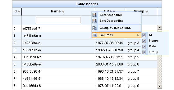
After selecting a "Group by this column" option, you can see the data grouped. You can collapse and expand groups by clicking on a group header.
This is an example:
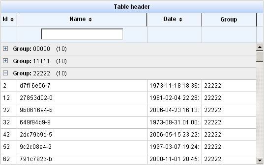
The "label" attribute in <rich:column> sets the name of the column, which is used when dragging columns (in drag window) and in context menu, in "Columns" submenu.
Example:
...

<rich:column id="name" label="#{msg['name']}"

...
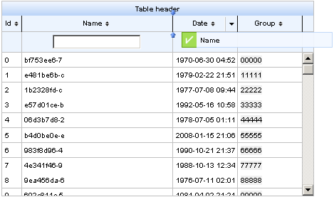
The <rich:extendedDataTable> component columns can be hidden:
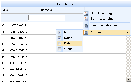
The "tableState" attribute can be used to bind state of the table (column width, column position, visible, sequence, grouping...) to a backing-bean string property, for a later used. This state can be for example saved to a database, and it is different from standard JSF state saving mechanisms.
Example:
...

<rich:extendedDataTable tableState="#{extendedDT.tableState}">

...
Table of <rich:extendedDataTable> attributes.
Table 6.60. Facets
| Facet | Description |
|---|---|
| header | Redefines the header content |
| footer | Redefines the footer content |
| caption | Redefines the caption content |
Table 6.61. Style classes (selectors) with the corresponding skin parameters
| Class (selector) name | Description | Skin Parameters | CSS properties mapped |
|---|---|---|---|
| .extdt-empty-cell | Defines styles for empty cells of the component | tableBorderWidth, tableBorderColor | border-bottom |
| .extdt-table-layout | Defines styles for the table layout | tableBackgroundColor | background-color |
| .extdt-cell | Defines styles for the table cells | tableBorderWidth, tableBorderColor | border-right, border-bottom |
| generalSizeFont | font-size | ||
| generalTextColor | color | ||
| generalFamilyFont | font-family | ||
| .extdt-header | Defines styles for the header | headerBackgroundColor | background-color |
| .extdt-header-continue | Defines styles for all header lines after the first | headerBackgroundColor | background-color |
| .extdt-headercell | Defines styles for the header cells | tableBorderWidth, tableBorderColor | border-right, border-bottom |
| generalSizeFont | font-size | ||
| headerTextColor | color | ||
| headerWeightFont | font-weight | ||
| generalFamilyFont | font-family | ||
| .extdt-subheader | Defines styles for the subheader | additionalBackgroundColor | background-color |
| .extdt-table-filterrow | Defines styles for the filter row | additionalBackgroundColor | background-color |
| tableBorderWidth, tableBorderColor | border-top | ||
| .extdt-subheadercell | Defines styles for the subheader cells | tableBorderWidth, tableBorderColor | border-right, border-bottom |
| generalSizeFont | font-size | ||
| generalTextColor | color | ||
| generalFamilyFont | font-family | ||
| .extdt-caption | Defines styles for the table caption | tableBorderWidth, tableBorderColor | border-bottom |
| generalSizeFont | font-size | ||
| headerWeightFont | font-weight | ||
| generalTextColor | color | ||
| generalFamilyFont | font-family | ||
| additionalBackgroundColor | background-color | ||
| .extdt-footercell | Defines styles for the footer cell | tableBorderWidth, tableBorderColor | border-right, border-bottom |
| generalSizeFont | font-size | ||
| generalTextColor | color | ||
| headerWeightFont | font-weight | ||
| generalFamilyFont | font-family | ||
| .extdt-subfootercell | Defines styles for the subfooter cell | tableBorderWidth, tableBorderColor | border-right, border-bottom |
| generalSizeFont | font-size | ||
| generalTextColor | color | ||
| generalFamilyFont | font-family | ||
| .extdt-row-selected | Defines styles for the selected row | additionalBackgroundColor | background-color |
| .extdt-row-active | Defines styles for the active row | tabDisabledTextColor | color |
Table 6.62. Style classes (selectors) without skin parameters
| Class name | Description |
|---|---|
| .rich-extdt | Defines styles for all table |
| .rich-extdt-caption | Defines styles for a "caption" facet element |
| .rich-extdt-header | Defines styles for a table header row |
| .rich-extdt-header-continue | Defines styles for all header lines after the first |
| .rich-extdt-subheader | Defines styles for a column header |
| .rich-extdt-footer | Defines styles for a footer row |
| .rich-extdt-footer-continue | Defines styles for all footer lines after the first |
| .rich-extdt-subfooter | Defines styles for a column footer |
| .rich-extdt-headercell | Defines styles for a header cell |
| .rich-extdt-subheadercell | Defines styles for a column header cell |
| .rich-extdt-cell | Defines styles for a table cell |
| .rich-extdt-row | Defines styles for a table row |
| .rich-extdt-firstrow | Defines styles for a table start row |
| .rich-extdt-footercell | Defines styles for a footer cell |
| .rich-extdt-subfootercell | Defines styles for a column footer cell |
| .rich-extdt-group-cell | Defines styles for a grouping row cell |
You can find all necessary information about style classes redefinition in Definition of Custom Style Classes section.
...

<table>

      <tbody>

            <a4j:repeat value="#{repeatBean.items}" var="item" ajaxKeys="#{updateBean.updatedRow}">

                  <tr>

                        <td><h:outputText value="#{item.code}" id="item1" /></td>

                        <td><h:outputText value="#{item.price}" id="item2" /></td>

                  </tr>

            </a4j:repeat>

      </tbody>

</table>

 ...
The example above points to a method that contains row keys to be updated.
If you want to output a collection as a plain HTML list, use the following structure:
...

<ul>

      <a4j:repeat ...>

        <li>...<li/>

                   ...

        <li>...<li/>

      </a4j:repeat>

</ul>

...
Visit the Repeat page at RichFaces LiveDemo for examples of component usage and their sources.
Here you can find information why you can't use <a4j:repeat> to iterate the menuItems, tabs and way to solve this problem.
<rich:scrollableDataTable> includes the following attributes not included with <rich:dataTable>:
- activeClass
- activeRowKey
- bypassUpdates
- data
- eventsQueue
- frozenColCount
- height
- hideWhenScrolling
- ignoreDupResponses
- onselectionchange
- requestDelay
- scriptVar
- selectedClass
- selection
- selectionMode
- similarityGroupingId
- sortOrder
- status
- timeout
<rich:scrollableDataTable> does not include the following attributes available with <rich:dataTable>:
- align
- bgcolor
- border
- captionClass
- captionStyle
- cellpadding
- cellspacing
- columns
- columnsWidth
- dir
- frame
- lang
- onRowContextMenu
- onRowMouseMove
- onRowMouseOut
- onRowMouseOver
- onclick
- ondblclick
- onkeydown
- onkeypress
- onkeyup
- onmousedown
- onmousemove
- onmouseout
- onmouseover
- onmouseup
- rules
- sortPriority
- title
Using <rich:column>
The relative width of <rich:column> is not supported by <rich:scrollableDataTable>. It is, however, supported by <rich:dataTable> and <rich:extendedDataTable>.
...

<rich:scrollableDataTable value="#{modelBuilder.model}" var="issues"

            frozenColCount="1"

            first="0"

            rows="40"

            width="300px"

            height="396px">

    <rich:column width="100px">

        <f:facet name="header" >

            <h:outputText value="State"/>

        </f:facet>

        <h:outputText value="#{issues.cell1}"/>

        <f:facet name="footer">

            <h:outputText value="State"/>

        </f:facet>

    </rich:column>

    <!--Set of columns and header/footer facets-->

</rich:scrollableDataTable>

...
The "selection" attribute allows to get the row data when using one and multi-selection rows mode.
This attribute is a reference to object to the instance of
org.richfaces.model.selection.Selection
interface, containing the current collection of objects selected by you.
In the following example when you submit the form, the current collection of the selected objects is placed in the object's property. Then on complete action the <rich:modalPanel> with selected data is shown.
Example:
...

<h:form>

        <rich:spacer height="30" />

                <rich:scrollableDataTable rowKeyVar="rkv" frozenColCount="1" height="200px"

                        width="300px" id="carList" rows="40" columnClasses="col"

                        value="#{dataTableScrollerBean.allCars}" var="category" sortMode="single"

                        selection="#{dataTableScrollerBean.selection}">

                        <rich:column id="make">

                                <f:facet name="header"><h:outputText styleClass="headerText" value="Make" /></f:facet>

                                <h:outputText value="#{category.make}" />

                        </rich:column>

                        <rich:column id="model">

                                <f:facet name="header"><h:outputText styleClass="headerText" value="Model" /></f:facet>

                                <h:outputText value="#{category.model}" />

                        </rich:column>

                        <rich:column id="price">

                                <f:facet name="header"><h:outputText styleClass="headerText" value="Price" /></f:facet>

                                <h:outputText value="#{category.price}" />

                        </rich:column>

                </rich:scrollableDataTable>

                <rich:spacer height="20px"/>

                <a4j:commandButton value="Show Current Selection" reRender="table"

                        action="#{dataTableScrollerBean.takeSelection}"

                        oncomplete="javascript:Richfaces.showModalPanel('panel');"/>

</h:form>

<rich:modalPanel id="panel" autosized="true">

        <f:facet name="header">

                <h:outputText value="Selected Rows"/>

        </f:facet>

        <f:facet name="controls">

                <span style="cursor:pointer" onclick="javascript:Richfaces.hideModalPanel('panel')">X</span>

        </f:facet>

        <rich:dataTable value="#{dataTableScrollerBean.selectedCars}" var="sel" id="table">

                <rich:column>

                        <f:facet name="header"><h:outputText value="Make" /></f:facet>

                        <h:outputText value="#{sel.make}" />

                </rich:column>

                <rich:column id="model">

                        <f:facet name="header"><h:outputText value="Model" /></f:facet>

                <h:outputText value="#{sel.model}" />

                </rich:column>

                <rich:column id="price">

                        <f:facet name="header"><h:outputText value="Price" /></f:facet>

                        <h:outputText value="#{sel.price}" />

                </rich:column>

        </rich:dataTable>

</rich:modalPanel>

...
This is a result:
On RichFaces LiveDemo page you can find the fuller example of usage of this attribute as well as the example bean.
The <rich:scrollableDataTable> component has the following extra attributes for event processing on the client:
"onselectionchange"
"onRowClick"
"onRowDblClick"
"onRowMouseUp"
"onRowMouseDown"
Starting with the 3.3.1 version of the components framework it becomes possible to switch selection mode with the "selectionMode" attribute.
Information about sorting and filtering you can find in the RichFaces Developer guide section about sorting.
Information on the "process" attribute usage you can find in the "Decide what to process" guide section.
Note:
If you want to use specific features such as pagination on database level you should pass to the
"value"
of the
<rich:scrollableDataTable>
component
an object which class extends org.richfaces.model.ScrollableTableDataModel.
Table of <rich:scrollableDataTable> attributes.
Table 6.66. Style classes (selectors) with the corresponding skin parameters
| Class (selector) name | Description | Skin Parameters | CSS properties mapped |
|---|---|---|---|
| .rich-sdt | Defines styles for a component appearance | tableBackgroundColor | background-color |
| tableBorderColor | border-color | ||
| tableBorderWidth | border-width | ||
| .rich-std-header-row | Defines styles for a header raw | headerBackgroundColor | background-color |
| .rich-sdt-header-cell | Defines styles for header cells | tableBorderWidth | border-bottom-width, border-right-width |
| tableBorderColor | border-bottom-color, border-right-color | ||
| headerTextColor | color | ||
| generalFamilyFont | font-family | ||
| generalSizeFont | font-size | ||
| .rich-sdt-hsplit | tipBorderColor | border-right-color | |
| .rich-std-footer-row | Defines styles for a footer raw | tableSubfooterBackgroundColor | background-color |
| .rich-sdt-footer-cell | Defines styles for footer cells | tableBorderColor | border-right-color |
| .rich-sdt-column-cel | Defines styles for column cells | tableBorderColor | border-bottom-color, border-right-color |
| .rich-sdt-row-selected | Defines styles for a selected row | additionalBackgroundColor | background-color |
| .rich-sdt-row-active | Defines styles for an active row | tabDisabledTextColor | color |
| .rich-sdt-header-cell-body, .rich-sdt-column-cell-body, .rich-sdt-footer-cell-body | Define styles for the component cells body | generalFamilyFont | font-family |
| generalSizeFont | font-size |
Table 6.67. Style classes (selectors) without skin parameters
| Class name | Description |
|---|---|
| .rich-sdt-hsep | Defines styles for header separators |
| .rich-sdt-column-sort-up | Defines styles for ascending sorted column |
| .rich-sdt-column-sort-down | Defines styles for descending sorted column |
You can find all necessary information about style classes redefinition in Definition of Custom Style Classes section.
On the component LiveDemo page you can see the example of <rich:scrollableDataTable> usage.
Cookbook article Scrollable dataTable Selection Usage provides a simple example of how you can use the "selection" attribute in order to get row selection in <rich:scrollableDataTable>.
In this section you will find components that help you build drag-and-drop controls, manage their behaviour and define the area on the page to be used as a drop zone.

In the simplest way the component could be defined empty - in that case a default indicator is shown like this:

For indicator customization you need to define one of the following facets:
"single" — indicator shown when dragging a single item;
"multiple" — indicator shown when dragging several items.
Note:
The current implementation of the <rich:dragIndicator> component does not support multiple items selection. The feature is described for future releases.
Thus for specify a look-and-feel you have to define one of these facets and include into it a content that should be shown in indicator.
...

<rich:dropSupport...>

        <rich:dndParam name="testDrop">

                <h:graphicImage value="/images/file-manager.png" />

        </rich:dndParam>

</rich:dropSupport>

...
Is placed into indicator as follows:
...

<f:facet name="single">

        {testDrop}

</f:facet>

...
On the component LiveDemo page you can see the example of <rich:dragIndicator> usage and sources for the given example.
...

<h:column>

        <rich:dragSupport dragIndicator=":form:iii" dragType="text">

                <a4j:actionparam value="#{caps.name}" name="name"/>

        </rich:dragSupport>

        <h:outputText value="#{caps.name}"/>

</h:column>

...
...

<h:column>

        <a4j:outputPanel>

                <rich:dragSupport dragIndicator=":form:iii" dragType="text">

                        <a4j:actionparam value="#{caps.name}" name="name"/>

                </rich:dragSupport>

                <h:outputText value="#{caps.name}"/>

        </a4j:outputPanel>

</h:column>

...
This code makes all rows of this column draggable.
...

<h:panelGrid id="drag1">

        <rich:dragSupport dragType="singleItems" .../>

        <!--Some content to be dragged-->

</h:panelGrid>

...

<h:panelGrid id="drag2">

        <rich:dragSupport dragType="groups" .../>

        <!--Some content to be dragged-->

</h:panelGrid>

...

<h:panelGrid id="drop1">

        <rich:dropSupport acceptedTypes="singleItems" .../>

        <!--Drop zone content-->

</h:panelGrid>

...
Finally, the component has the following extra attributes for event processing on the client:
You can use your own custom JavaScript functions to handle these events.
On the component Live Demo page you can see the example of <rich:dragSupport> usage and sources for the given example.
Attribute
"type"
defines the fully qualified Java class name for a listener.
This class should implement
org.richfaces.event.DropListener
interface.
The typical variant of using:
...

<h:panelGrid id="dragPanel">

    <rich:dragSupport dragType="item">

        <rich:dragListener type="demo.ListenerBean"/>

    </rich:dragSupport>

    <!--Some content to be dragged-->

</h:panelGrid>

...
Java bean source:
package demo;


import org.richfaces.event.DragEvent;


public class ListenerBean implements org.richfaces.event.DragListener{

...

    public void processDrag(DragEvent arg0){

        //Custom Developer Code

    }

...

}
Attribute
"type"
defines the fully qualified Java class name for the
listener. This class should implement
org.richfaces.event.DropListener
interface.
.
The typical variant of using:
...

<rich:panel style="width:100px;height:100px;">

    <f:facet name="header">Drop Zone</f:facet>

    <rich:dropSupport acceptedTypes="text">

        <rich:dropListener type="demo.ListenerBean"/>

    </rich:dropSupport>

</rich:panel>

...
Java bean source:
package demo;


import org.richfaces.event.DropEvent;


public class ListenerBean implements org.richfaces.event.DropListener{

...

    public void processDrop(DropEvent arg0){

        //Custom Developer Code

    }

...

}
<rich:panel styleClass="dropTargetPanel">

     <f:facet name="header">

          <h:outputText value="PHP Frameworks" />

     </f:facet>


     <rich:dropSupport id="php" acceptedTypes="PHP" dropValue="PHP" dropListener="#{eventBean.processDrop}" reRender="phptable, src">

     </rich:dropSupport>

     ...

</rich:panel>
and here is what happens on the page:
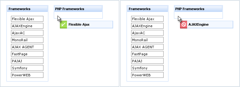
Using the "typeMapping" attribute. Previous example shows that a drop zone could accept a dragable item or not. Special markers, which are placed at <rich:dragIndicator> , inform user about drop zone’s possible behaviors: "checkmark" appears if drop is accepted and "No" symbol if it is not. Moreover, some extra information (e.g. text message) could be put into the Indicator to reinforce the signal about drop zone’s behavior or pass some other additional sense. This reinforcement could be programmed and attributed to drop zone via "typeMapping" attribute using JSON syntax. The type of dragged zone (dragType) should be passed as "key" and name of <rich:dndParam> that gives needed message to Indicator as "value":
<rich:panel styleClass="dropTargetPanel">

     <f:facet name="header">

          <h:outputText value="PHP Frameworks" />

     </f:facet>


     <rich:dropSupport id="php" acceptedTypes="PHP" dropValue="PHP" dropListener="#{eventBean.processDrop}" reRender="phptable, src"

                              typeMapping="{PHP: text_for_accepting, DNET: text_for_rejecting}">

          <rich:dndParam name="text_for_accepting" value="Drop accepted!" />

          <rich:dndParam name="text_for_rejecting" value="Drop is not accepted!" />

     </rich:dropSupport>

     ...

</rich:panel>
What happens on the page:
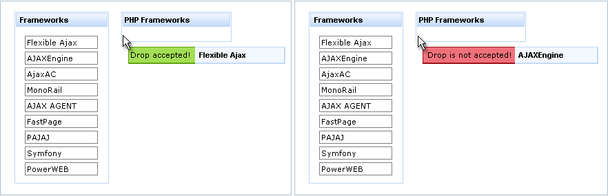
Here is an example of moving records between tables. The example describes all the pieces for drag-and-drop.
As draggable items, this table contains a list of such items designated as being of type "text" :
<rich:dataTable value="#{capitalsBean.capitals}" var="caps">

        <f:facet name="caption">Capitals List</f:facet>

        <h:column>

                <a4j:outputPanel>

                        <rich:dragSupport dragIndicator=":form:ind" dragType="text">

                                <a4j:actionparam value="#{caps.name}" name="name"/>

                        </rich:dragSupport>

                        <h:outputText value="#{caps.name}"/>

                </a4j:outputPanel>

        </h:column>

</rich:dataTable>
As a drop zone, this panel will accept draggable items of type text and then rerender an element with the ID of box :
<rich:panel style="width:100px;height:100px;">

        <f:facet name="header">Drop Zone</f:facet>

        <rich:dropSupport acceptedTypes="text" reRender="box"

                        dropListener="#{capitalsBean.addCapital2}"/>

</rich:panel>
As a part of the page that can be updated in a partial page update, this table has an ID of box :
<rich:dataTable value="#{capitalsBean.capitals2}" var="cap2" id="box">

        <f:facet name="caption">Capitals chosen</f:facet>

        <h:column>

                <h:outputText value="#{cap2.name}"/>

        </h:column>

</rich:dataTable>
And finally, as a listener, this listener will implement the dropped element:
public void addCapital2(DropEvent event) {

        FacesContext context = FacesContext.getCurrentInstance();

        Capital cap = new Capital();

        cap.setName(context.getExternalContext().getRequestParameterMap().get("name").toString());

        capitals2.add(cap);

}
Here is the result after a few drops of items from the first table:
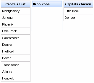
In this example, items are dragged element-by-element from the rendered list in the first table and dropped on a panel in the middle. After each drop, a drop event is generated and a common Ajax request is performed that renders results in the third table.
As with every Ajax action component, <rich:dropSupport> has all the common attributes ( "timeout" , "limitToList" , "reRender" , etc.) for Ajax request customization.
Finally, the component has the following extra attributes for event processing on the client:
"ondragenter"
"ondragexit"
"ondrop"
"ondropend"
Developers can use their own custom JavaScript functions to handle these events.
Information about the "process" attribute usage you can find in the "Decide what to process" guide section .
On the component Live Demo page you can see the example of <rich:dropSupport> usage and sources for the given example.
...

      <rich:dragSupport ... >

        <rich:dndParam type="drag" name="dragging">

                <h:graphicImage value="/img/product1_small.png"/>

        </rich:dndParam>

        <h:graphicImage value="product1.png"/>

</rich:dragSupport>

...
...

<rich:dragSupport ... >

        <rich:dndParam type="drag" name="label" value="#{msg.subj}"/>

        ...

</rich:dragSupport>

...
...

<rich:dropSupport ... >

        <rich:dndParam type="drop" name="comp" >

                <h:graphicImage height="16" width="16" value="/images/comp.png"/>

        </rich:dndParam>

        ...

</rich:dropSupport >

...
This section tells how you can create menus on your page: either navigational ones or context.
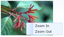
<rich:menuGroup> , <rich:menuItem> and <rich:menuSeparator> components can be used as nested elements for <rich:contextMenu> in the same way as for <rich:dropDownMenu> .
By default, the <rich:contextMenu> disables right mouse click on a page in the context menu area only. But if you want to disable browser's context menu completely you should set the "disableDefaultMenu" attribute value to "true".
If "attached" value is "true" (default value), component is attached to the parent component or to the component, which "id" is specified in the "attachTo" attribute:
<rich:contextMenu event="oncontextmenu" attachTo="pic1" submitMode="none">

      <rich:menuItem value="Zoom In" onclick="enlarge();" id="zin"/>

      <rich:menuItem value="Zoom Out" onclick="decrease();" id="zout"/>

</rich:contextMenu>

<h:panelGrid columns="1" columnClasses="cent">

      <h:panelGroup id="picture">

            <h:graphicImage value="/richfaces/jQuery/images/pic1.png" id="pic"/>

      </h:panelGroup>

</h:panelGrid>

<h:panelGrid columns="1" columnClasses="cent">

      <h:panelGroup id="picture1">

            <h:graphicImage value="/richfaces/jQuery/images/pic2.png" id="pic1"/>

       </h:panelGroup>

</h:panelGrid>
The "enlarge()" and
"decrease()" functions definition is placed
below.
<script type="text/javascript">

        function enlarge(){

                document.getElementById('pic').width=document.getElementById('pic').width*1.1;

               document.getElementById('pic').height=document.getElementById('pic').height*1.1;

        }

        function decrease(){

                document.getElementById('pic').width=document.getElementById('pic').width*0.9;

               document.getElementById('pic').height=document.getElementById('pic').height*0.9;

        }

</script>
In the example a picture zooming possibility with
<rich:contextMenu>
component usage was shown. The picture is placed on the
<h:panelGroup>
component. The
<rich:contextMenu>
component is not nested to
<h:panelGroup>
and has a value of the
"attachTo"
attribute defined as "pic1". Thus,
the context menu is attached to the component, which
"id"
is "pic1".
The context menu has two items to zoom in (zoom out) a picture by
"onclick"
event.
For earch item corresponding JavaScript function is defined to provide necessary action
as a result of the clicking on it. For the menu is defined an
"oncontextmenu"
event to call the context menu on a right click mouse event.
In the example the context menu is defined for the parent
<h:panelGroup>
component with a value of
"id"
attribute equal to "picture" You
should be careful with such definition, because a client context menu is looked for a
DOM element with a client Id of a parent component on a server. If a parent component
doesn't encode an Id on a client, it can't be found by the
<rich:contextMenu>
and it's attached to its closest parent in a DOM tree.
If the "attached" attribute has "false" value, component activates via JavaScript API with assistance of <rich:componentControl> . An example is placed below.
<h:form id="form">

      <rich:contextMenu attached="false" id="menu" submitMode="ajax">

            <rich:menuItem ajaxSingle="true">

                  <b>{car} {model}</b> details

                  <a4j:actionparam name="det" assignTo="#{ddmenu.current}" value="{car} {model} details"/>

            </rich:menuItem>

            <rich:menuGroup value="Actions">

                  <rich:menuItem ajaxSingle="true">

                        Put <b>{car} {model}</b> To Basket

                        <a4j:actionparam name="bask" assignTo="#{ddmenu.current}" value="Put {car} {model} To Basket"/>

                  </rich:menuItem>

                  <rich:menuItem value="Read Comments" ajaxSingle="true">

                        <a4j:actionparam name="bask" assignTo="#{ddmenu.current}" value="Read Comments"/>

                  </rich:menuItem>

                  <rich:menuItem ajaxSingle="true">

                        Go to <b>{car}</b> site

                        <a4j:actionparam name="bask" assignTo="#{ddmenu.current}" value="Go to {car} site"/>

                  </rich:menuItem>

            </rich:menuGroup>

      </rich:contextMenu>


      <h:panelGrid columns="2">

            <rich:dataTable value="#{dataTableScrollerBean.tenRandomCars}" var="car" id="table" onRowMouseOver="this.style.backgroundColor='#F8F8F8'" onRowMouseOut="this.style.backgroundColor='#{a4jSkin.tableBackgroundColor}'" rowClasses="cur">

                  <rich:column>

                        <f:facet name="header">Make</f:facet>

                        <h:outputText value="#{car.make}"/>

                  </rich:column>

                  <rich:column>

                        <f:facet name="header">Model</f:facet>

                        <h:outputText value="#{car.model}"/>

                  </rich:column>

                  <rich:column>

                        <f:facet name="header">Price</f:facet>

                        <h:outputText value="#{car.price}" />

                  </rich:column>

                  <rich:componentControl event="onRowClick" for="menu" operation="show">

                        <f:param value="#{car.model}" name="model"/>

                        <f:param value="#{car.make}" name="car"/>

                  </rich:componentControl>

            </rich:dataTable>

            <a4j:outputPanel ajaxRendered="true">

                  <rich:panel>

                        <f:facet name="header">Last Menu Action</f:facet>

                        <h:outputText value="#{ddmenu.current}"></h:outputText>

                  </rich:panel>

            </a4j:outputPanel>

      </h:panelGrid>

</h:form>
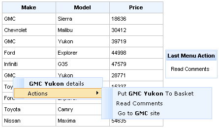
In the example the context menu is activated (by clicking on the left mouse button) on
the table via JavaScript API with assistance of
<rich:componentControl>
. The attribute
"for"
contains a value of the
<rich:contextMenu>
Id. For menu appearance Java Script API function
"show()" is used. It is defined with
"operation"
attribute for the
<rich:componentControl>
component. Context menu is recreated after the every call on a client and
new {car} and {model} values are inserted in it. In the example for a menu customization
macrosubstitutions were used.
The <rich:contextMenu> component can be defined once on a page and can be used as shared for different components (this is the main difference from the <rich:dropDownMenu> component). It's necessary to define it once on a page (as it was shown in the example above) and activate it on required components via JavaScript API with assistance of <rich:componentControl> .
The <rich:contextMenu> "submitMode" attribute can be set to three possible parameters:
Server— default value, uses regular form submition request;
Ajax— Ajax submission is used for switching;
None— neitherServernorAjaxis used.
The "action" and "actionListener" item's attributes are ignored. Menu items don't fire any submits themselves. The behavior is fully defined by the components nested inside items.
Notes:
When nesting <rich:contextMenu> into JSF <h:outputText> , specify an
idfor <h:outputText> , otherwise, do not nest the <rich:contextMenu> to make it work properly.
As the <rich:contextMenu> component doesn't provide its own form, use it between <h:form> and </h:form> tags.
Table of <rich:contextMenu> attributes.
Table 6.75. JavaScript API
| Function | Description | Apply to |
|---|---|---|
| hide() | Hides component or group | Component, group |
| show(event, context) | Shows component or group | Component, group |
Table 6.76. Classes names that define the contextMenu element
| Class name | Description |
|---|---|
| rich-menu-list-border | Defines styles for borders |
| rich-menu-list-bg | Defines styles for a general background list |
| rich-menu-list-strut | Defines styles for a wrapper <div> element for a strut of a popup list |
You can find all necessary information about style classes redefinition in Definition of Custom Style Classes section.
Visit the ContextMenu page at RichFaces LiveDemo for examples of component usage and their sources.
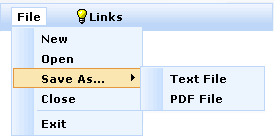
...

<f:facet name="label">

    <h:graphicImage value="/images/img1.png"/>

</f:facet>

...
...
<rich:dropDownMenu event="onclick" value="Item1">
<!--Nested menu components-->
</rich:dropDownMenu>
...
The <rich:dropDownMenu> "submitMode" attribute can be set to three possible parameters:
Regular form submission request is used.
Ajax submission is used for switching.
The "direction" and "jointPoint" attributes are used for defining aspects of menu appearance.
Possible values for the "direction" attribute are:
Possible values for the "jointPoint" attribute are:
By default, the "direction" and "jointPoint" attributes are set to "auto".
...
<rich:dropDownMenu value="File" direction="bottom-right" jointPoint="bl">
<rich:menuItem submitMode="ajax" value="New" action="#{ddmenu.doNew}"/>
<rich:menuItem submitMode="ajax" value="Open" action="#{ddmenu.doOpen}"/>
<rich:menuGroup value="Save As...">
<rich:menuItem submitMode="ajax" value="Text File" action="#{ddmenu.doSaveText}"/>
<rich:menuItem submitMode="ajax" value="PDF File" action="#{ddmenu.doSavePDF}"/>
</rich:menuGroup>
<rich:menuItem submitMode="ajax" value="Close" action="#{ddmenu.doClose}"/>
<rich:menuSeparator id="menuSeparator11"/>
<rich:menuItem submitMode="ajax" value="Exit" action="#{ddmenu.doExit}"/>
</rich:dropDownMenu>
...

You can correct an offset of the pop-up list relative to the label using the following attributes: "horizontalOffset" and "verticalOffset" .
Here is an example:
Example:
...
<rich:dropDownMenu value="File" direction="bottom-right" jointPoint="tr" horizontalOffset="-15" verticalOffset="0">
<rich:menuItem submitMode="ajax" value="New" action="#{ddmenu.doNew}"/>
<rich:menuItem submitMode="ajax" value="Open" action="#{ddmenu.doOpen}"/>
<rich:menuGroup value="Save As...">
<rich:menuItem submitMode="ajax" value="Text File" action="#{ddmenu.doSaveText}"/>
<rich:menuItem submitMode="ajax" value="PDF File" action="#{ddmenu.doSavePDF}"/>
</rich:menuGroup>
<rich:menuItem submitMode="ajax" value="Close" action="#{ddmenu.doClose}"/>
<rich:menuSeparator id="menuSeparator11"/>
<rich:menuItem submitMode="ajax" value="Exit" action="#{ddmenu.doExit}"/>
</rich:dropDownMenu>
...
This is the result:
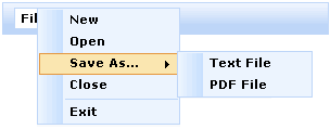
The "disabled" attribute is used for disabling whole <rich:dropDownMenu> component. In this case it is necessary to define "disabled" attribute as "true". An example is placed below.
Example:
...
<rich:dropDownMenu value="File" disabled="true">
...
</rich:dropDownMenu>
...
Table of <rich:dropDownMenu> attributes.
Table 6.78. Facets
| Facet | Description |
|---|---|
| label | Redefines the content set of label |
| labelDisabled | Redefines the content set of disabled label |
Table 6.79. Classes names that define a label
| Class name | Description |
|---|---|
| rich-label-text-decor | Defines text style for a representation element |
| rich-ddmenu-label | Defines styles for a wrapper <div> element of a representation element |
| rich-ddmenu-label-select | Defines styles for a wrapper <div> element of a selected representation element |
| rich-ddmenu-label-unselect | Defines styles for a wrapper <div> element of an unselected representation element |
| rich-ddmenu-label-disabled | Defines styles for a wrapper <div> element of a disabled representation element |
Table 6.80. Classes names that define a popup element
| Class name | Description |
|---|---|
| rich-menu-list-border | Defines styles for borders |
| rich-menu-list-bg | Defines styles for a general background list |
| rich-menu-list-strut | Defines styles for a wrapper <div> element for a strut of a popup list |
You can find all necessary information about style classes redefinition in Definition of Custom Style Classes section.
On the component LiveDemo page you can see the example of <rich:dropDownMenu> usage and sources for the given example.

The "value" attribute defines the text representation of a group element in the page.
...
<f:facet name="icon">
<h:selectBooleanCheckbox value="#{bean.property}"/>
</f:facet>
...
"left - down" - a submenu is attached to the left side of the menu and is dropping down
"left - up" - a submenu is attached to the left side of the menu and is dropping up
"right - down" - a submenu is attached to the right side of the menu and is dropping down
"right - up" - a submenu is attached to the right side of the menu and is dropping up
By default, the "direction" attribute is set to "auto".
...
<rich:menuGroup value="Save As..." direction="left-down">
<rich:menuItem submitMode="ajax" value="Text File" action="#{ddmenu.doSaveText}"/>
<rich:menuItem submitMode="ajax" value="PDF File" action="#{ddmenu.doSavePDF}"/>
</rich:menuGroup>
...
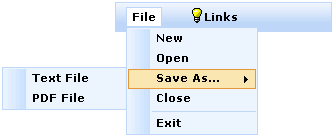
Note:
The <rich:menuGroup> component was designed to be used only for pop-up menu list creation.
Table of <rich:menuGroup> attributes.
Table 6.82. Facets
| Facet | Description |
|---|---|
| icon | Redefines the icon for the enabled item state. Related attribute is "icon" |
| iconFolder | Redefines the folder icon for the enabled item state. Related attribute is "iconFolder" |
Table 6.83. Classes names that define an appearance of group elements
| Class name | Description |
|---|---|
| rich-menu-group | Defines styles for a wrapper <div> element for a group |
| rich-menu-item-label | Defines styles for a label of an item |
| rich-menu-item-icon | Defines styles for the left icon of an item |
| rich-menu-item-folder | Defines styles for the right icon of an item |
Table 6.84. Classes names that define different states
| Class name | Description |
|---|---|
| rich-menu-item-label-disabled | Defines styles for a label of a disabled item |
| rich-menu-item-icon-disabled | Defines styles for the left icon of a disabled item |
| rich-menu-item-folder-disabled | Defines styles for the right icon of a disabled item |
| rich-menu-group-hover | Defines styles for a wrapper <div> element of a hover group |
| rich-menu-item-icon-enabled | Defines styles for the left icon of an enabled item |
| rich-menu-item-icon-selected | Defines styles for the left icon of a selected item |
You can find all necessary information about style classes redefinition in Definition of Custom Style Classes section.
On the component LiveDemo page you can see the example of <rich:menuGroup> usage and sources for the given example.

The "value" attribute defines the text representation for an item element.
...
<f:facet name="icon">
<h:selectBooleanCheckbox value="#{bean.property}"/>
</f:facet>
...
The <rich:menuItem> "submitMode" attribute can be set to three possible parameters:
Regular form submission request is used.
Ajax submission is used for switching.
...
<rich:dropDownMenu>
...
<rich:menuItem submitMode="none">
<h:outputLink value="www.jboss.org"/>
</rich:menuItem>
...
<rich:dropDownMenu>
...
You can use the "disabled" attribute to set the item state.
...
<rich:dropDownMenu>
<rich:menuItem value="Disable" disabled="true"/>
<rich:dropDownMenu>
...
Information about the "process" attribute usage you can find RichFaces Developer Guide section about "process" attribute .
Table of <rich:menuItem> attributes.
Table 6.86. Facets
| Facet | Description |
|---|---|
| icon | Redefines the icon for the enabled item state. Related attribute is "icon" |
| iconDisabled | Redefines the folder icon the disabled item state. Related attribute is "iconDisabled" |
Table 6.87. Classes names that define an appearance of item elements
| Class name | Description |
|---|---|
| rich-menu-item | Defines styles for a wrapper <div> element for an item |
| rich-menu-item-label | Defines styles for a label of an item |
| rich-menu-item-icon | Defines styles for the left icon of an item |
Table 6.88. Classes names that define different states
| Class name | Description |
|---|---|
| rich-menu-item-disabled | Defines styles for a wrapper <div> element of an item |
| rich-menu-item-enabled | Defines styles for a wrapper <div> element of an enabled item |
| rich-menu-item-hover | Defines styles for a wrapper <div> element of a hover item |
| rich-menu-item-label-disabled | Defines styles for a label of a disabled item |
| rich-menu-item-icon-disabled | Defines styles for the left icon of a disabled item |
| rich-menu-item-label-enabled | Defines styles for a label of an enabled item |
| rich-menu-item-icon-enabled | Defines styles for the left icon of an enabled item |
| rich-menu-item-label-selected | Defines styles for a label of a selected item |
| rich-menu-item-icon-selected | Defines styles for the left icon of a selected item |
You can find all necessary information about style classes redefinition in Definition of Custom Style Classes section.
On the component LiveDemo page you can see the example of <rich:menuItem> usage and sources for the given example.

Table of <rich:menuSeparator> attributes.
Table 6.90. Classes names that define separator element appearance.
| Class name | Description |
|---|---|
| rich-menu-separator | Defines styles for a wrapper <div> element for a separator |
You can find all necessary information about style classes redefinition in Definition of Custom Style Classes section.
On the component LiveDemo page you can see the example of <rich:menuSeparator> usage and sources for the given example.
- 6.9.1. < rich:tree > available since 3.0.0
- 6.9.2. < rich:treeNode > available since 3.0.0
- 6.9.3. < rich:treeNodesAdaptor > available since 3.1.0
- 6.9.4. < rich:recursiveTreeNodesAdaptor > available since 3.1.0
- 6.9.5. < rich:changeExpandListener > available since 3.1.0
- 6.9.6. < rich:nodeSelectListener > available since 3.1.0
In this section you will learn how to build hierarchical data presentation using the <rich:tree> component.
As it has been mentioned above the <rich:tree> component allows rendering any tree-like data model.
You can build your
<rich:tree>
using model (org.richfaces.model.TreeNode or
javax.swing.tree.TreeNode). In this case the
<rich:tree>
component interacts with data model via
"TreeNode" interface ( org.richfaces.model.TreeNode ) that is used for
the
<rich:tree>
nodes representation.
Actually you can develop and use your own implementation of the
"TreeNode" interface or use a
default one, which is defined with a default class
"TreeNodeImpl" ( org.richfaces.model.TreeNodeImpl ).
The "value" attribute of the <rich:tree> component contains a nodes structure defined in a bean property.
When the
<rich:tree>
component is being rendered it iterates over the model
nodes and renders them using one of its immediate
<rich:treeNode>
children. Data property of the current model
TreeNode is exposed using
"var"
attribute, so if
var="station" you can refer
to that data using #{station} syntax.
In the following example the
<rich:tree>
is built from a simple
org.richfaces.model.TreeNode model:
...
private TreeNodeImpl<String> stationRoot = new TreeNodeImpl<String>();
private TreeNodeImpl<String> stationNodes = new TreeNodeImpl<String>();
private String[] kickRadioFeed = { "Hall & Oates - Kiss On My List",
"David Bowie - Let's Dance", "Lyn Collins - Think (About It)",
"Kim Carnes - Bette Davis Eyes",
"KC & the Sunshine Band - Give It Up" };
...
stationRoot.setData("KickRadio");
stationNodes.addChild(0, stationRoot);
for (int i = 0; i < kickRadioFeed.length; i++){
TreeNodeImpl<String> child = new TreeNodeImpl<String>();
child.setData(kickRadioFeed[i]);
stationRoot.addChild(i, child);
}
...
As it is mentioned before you need to pass
#{stations.stationNodes} property to the
"value"
attribute and define the
"var"
attribute in order to refer to the data:
...
<rich:tree value="#{stations.stationNodes}" var="station">
<rich:treeNode>
<h:outputText value="#{station}" />
</rich:treeNode>
</rich:tree>
...
This is a result:
Implementation of the
<rich:tree>
component provides another way to build a tree. This
approach implies using a
"XmlTreeDataBuilder" class
( org.richfaces.component.xml.XmlTreeDataBuilder )
that allows to transform XML into structures of objects containing
"XmlNodeData" ( org.richfaces.component.xml.XmlNodeData )
instances as data, which could be represented by the
<rich:tree>
component.
Let's try to build a simple <rich:tree> from a local XML file. In the following example a simple XML file (stations.xml) is used as a radio station playlist:
<?xml version="1.0"?>
<station name="KickRadio">
<feed date="today">
<song time="07:00">Hall & Oates - Kiss On My List</song>
<song time="07:03">David Bowie - Let's Dance</song>
<song time="07:06">Lyn Collins - Think (About It)</song>
<song time="07:10">Kim Carnes - Bette Davis Eyes</song>
<song time="07:15">KC & the Sunshine Band - Give It Up</song>
</feed>
</station>
Now you need to create a bean that holds a model nodes:
...
private TreeNode data;
...
FacesContext context = FacesContext.getCurrentInstance();
data = XmlTreeDataBuilder.build(new InputSource(getClass().getResourceAsStream("stations.xml")));
...
Finally you should set the
"value"
attribute to the data bean property and
define the
"var"
attribute in order to refer to the data of nodes:
...
<rich:tree id="treeXML" value="#{stations.data}" var="vardata">
<rich:treeNode>
<h:outputText value="#{vardata.attributes['name']}" />
<h:outputText value="#{vardata.attributes['date']}" />
<h:outputText value="#{vardata.attributes['time']}" />
<h:outputText value=" #{vardata.text}" />
</rich:treeNode>
</rich:tree>
...
This is a result:
It's possible to define a visual representation of a node data model (to define a node icon) and its behavior in correspondence with the data contained in this node (with a value of the "var" attribute). The node behavior is defined by the components nested into the <rich:treeNode> (e.g. links or buttons). For these purposes you should use "nodeFace" attribute. For each tree node a value of "nodeFace" attribute is evaluated and <rich:treeNode> with a value of "type" attribute equal to a value of "nodeFace" is used for node representation. See an example below.
...
<h:form>
<rich:tree style="width:300px" value="#{library.data}" var="item" nodeFace="#{item.type}">
<rich:treeNode type="artist" iconLeaf="/images/tree/singer.png" icon="/images/tree/singer.png">
<h:outputText value="#{item.name}" />
</rich:treeNode>
<rich:treeNode type="album" iconLeaf="/images/tree/disc.png" icon="/images/tree/disc.png">
<h:outputText value="#{item.title}" />
</rich:treeNode>
<rich:treeNode type="song" iconLeaf="/images/tree/song.png" icon="/images/tree/song.png">
<h:outputText value="#{item.title}" />
</rich:treeNode>
</rich:tree>
</h:form>
...
In the example above, when each node of data model is processed, data
contained in the "data" property of
"TreeNode" interface
is assigned to a request scope variable, which name is defined with
"var"
attribute. The value of the
"nodeFace"
attribute is evaluated in correspondence with the data
assigned to the
"var"
attribute. The corresponding
<rich:treeNode>
component (with a value of
"type"
attribute equal to a value of
"nodeFace"
) is used for the node representation. For example, during
data model processing, an object with a name "Chris
Rea" was inserted in the
"var"
attribute. Then the value of
"nodeFace"
attribute was evaluated as
"artist". Thus, for the node
representation the
<rich:treeNode>
with
"type"
equal to "artist" was
used.
You can also assign an EL-expression as value of the "nodeFace" attribute. See an example below:
Example:
nodeFace="#{data.name != 'param-value' ? 'artist' : 'album'}"
There are some essential points in a "nodeFace" attribute usage: you need to define notions for typeless and a default nodes.
The typeless node is the first <rich:treeNode> component (from all children nodes nested to the <rich:tree> component) with not defined "type" attribute and defined "rendered" attribute. The typeless node is used for representation when "nodeFace" attribute is null.
Default node has the following interior presentation:
Example:
...
<h:outputText value="#{varAttributeName}">
...
"varAttributeName" is a value for "var" attribute.
Default node is used in the following cases:
"nodeFace" attribute is defined, but its value isn't equal to any "type" attribute value from all children nodes;
"nodeFace" attribute is defined and its value is equal to a value of some "type" attribute from all children nodes, but the value of "rendered" attribute for this node is "false".
There is also one thing that has to be remembered using "type" and "rendered" attributes: it's possible to define several <rich:treeNode> components with equal values of "type" attribute and different values of "rendered" attribute. It provides a possibility to define different representation styles for the same node types. In the example with artists and their albums (see above) it's possible to represent albums that are available for sale and albums that are not available. Please study the example below:
Example:
...
<h:form>
<rich:tree style="width:300px" value="#{library.data}" var="item" nodeFace="#{item.type}">
...
<rich:treeNode type="album" iconLeaf="/images/tree/album.gif" icon="/images/tree/album.gif"
rendered="#{item.exist}">
<h:outputText value="#{item.name}" />
</rich:treeNode>
<rich:treeNode type="album" iconLeaf="/images/tree/album_absent.gif" icon="/images/tree/album_absent.gif"
rendered="#{not item.exist}">
<h:outputText value="#{item.name}" />
</rich:treeNode>
...
</rich:tree>
</h:form>
...
This is a result of the code:
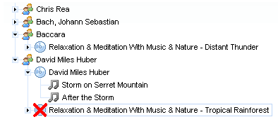
In the example the <rich:treeNode> components has equal values of the "type" attribute. Depending on value of the "rendered" attribute the corresponding <rich:treeNode> component is selected for node representation. If an album is available for sale the value of the "rendered" for the first <rich:treeNode> component is "true", for the second one is "false". Thus, the first <rich:treeNode> is selected for node representation.
Tree node can be run in tree modes. Modes can be specified with "switchType" attribute for <rich:tree> component.
Ajax(default value) - Ajax submission is used performing the functionality. Note, that for collapse/expand operations an Ajax request is sent to the server and it can cause a short delay.Server- regular form of submission request is used.Client– all operations are performed totally on the client; no interaction with a server is involved. Full page content is reloaded after every action.
The "icon" , "iconCollapsed" , "iconExpanded" , "iconLeaf" attributes set the icons' images for the component. You can also define icons using facets with the same names. If the facets are defined, the corresponding attributes are ignored and facets' content is used as icons. By default the width of a rendered facet area is 16px.
Example:
...
<rich:tree value="#{library.data}" var="item">
...
<f:facet name="icon">
<h:graphicImage value="/images/tree/singer.png "/>
</f:facet>
<f:facet name="iconCollapsed">
<h:graphicImage value="/images/tree/singer.png" />
</f:facet>
<f:facet name="iconExpanded">
<h:graphicImage value="/images/tree/singer.png" />
</f:facet>
<f:facet name="iconLeaf">
<h:graphicImage value="/images/tree/song.png" />
</f:facet>
...
</rich:tree>
...
The <rich: tree> component can be used together with <rich: treeNodeAdaptor> . In this case there is no need to specify the attributes "value" and "var" . Besides, visual representation shouldn't be defined right in the tree. In this case a <rich: tree> tag is applied mainly for defining common attributes such as "ajaxSubmitSelection" etc.
Information about the "process" attribute usage you can find in the "Decide what to process" guide section.
As it's mentioned before, the <rich:tree> component uses a data model to represent the tree-like nodes structure on the page. To identify a particular node during a client request, the model provides a set of unique keys for tree nodes. The <rich:tree> can use strings as keys values which may contain special characters not allowed by browsers, such as the left angle bracket (<), ampersand (&), ant etc. Thus, to have a possibility to use unallowed characters in the tree nodes keys, the following converters are provided:
org.richfaces.TreeRowKeyConverterthat is used for "TreeNode" based trees. The key should be of ajava.lang.Stringtype.org.richfaces.TreeAdaptorRowKeyConverterthat is used for adaptor-based trees (see <rich:treeNodesAdaptor> , <rich:recursiveTreeNodesAdaptor> ). The key should be of ajava.lang.Stringtype.org.richfaces.TreeAdaptorIntegerRowKeyConverterwhich is provided for adaptor-based trees. The key should be of ajava.lang.Integertype.
The converters can be extended in order to have a possibility for implementing custom converters.
To apply a converter to the <rich:tree> component, you should define it as a value of the "rowKeyConverter" attribute.
Have a look at the example of a tree which contains the RichFaces
components as its nodes and the components attributes as the nodes
child elements. As the components have unallowed characters (<
and >) in their names, the org.richfaces.TreeRowKeyConverter is used here.
Example:
...
<rich:tree value="#{treeBean.data}" var="node" switchType="ajax" rowKeyConverter="org.richfaces.TreeRowKeyConverter">
<rich:treeNode ajaxSingle="true">
<h:outputText value="#{node}"/>
</rich:treeNode>
</rich:tree>
...
In the example the tree uses the following data model:
...
String[ ] components = {"< a4j:ajaxListener >", "< a4j:keepAlive >", "< a4j:actionparam >" };
String[ ][ ] attributes = {{"type"},
{"ajaxOnly", "beanName"},
{"actionListener", "assignTo", "binding", "converter", "id", "name", "noEscape", "value"}};
data = new TreeNodeImpl<String>();
for (int i = 0; i < components.length; i++) {
TreeNode<String> child = new TreeNodeImpl<String>();
child.setData(components[i]);
data.addChild(components[i], child);
for (int j = 0; j < attributes[i].length; j++) {
TreeNode<String> grandChild = new TreeNodeImpl<String>();
grandChild.setData(attributes[i][j]);
child.addChild(attributes[i][j], grandChild);
}
}
...
Table 6.92. Drop group
| Attribute Name | Description |
|---|---|
| dropValue | Element value drop passed into processing after Drop events |
| dropListener | A listener that processes a Drop event. |
| acceptedTypes | Drag zone names are allowed to be processed with a Drop zone |
| typeMapping | Drag zones names mapping on the corresponding drop zone parameters |
Consider drag-and-drop inside a tree. All zones, which are assumed to be dragged, must be marked. In terms of <rich:tree> these zones completely correspond to tree nodes. So, all dragging nodes should be marked with "dragType" attribute. Then, to mark zone(-s), where the dragging node could be dropped, pass the type of dragging node to the "acceptedTypes" attribute of the drop zone. It would be good to itemize, that each tree node in the <rich:tree> component’s structure has its own key. Depending on how the component is used, these keys can be generated by the component itself or can be taken from the component’s data model. Keys help to identify each node in a tree; key is what exactly being passing from one node to another in drag-and-drop operations. Finally, the method binding, that will process drag-and-drop operation, should be pointed via "dropListener" attribute of the <rich:tree> .
Chapters "6.40 <dragIndicator>" and "6.39 <dndParam>" describes how to apply visual element, that show some additional information (e.g. dragging item name) while operating with drag-and-drop.
Page code, that describes a tree with built in drag-and-drop in the way it is considered, is shown below.
Example:
...
<h:form>
<rich:tree style="width:300px" value="#{libraryAjaxTree.data}" nodeFace="#{item.type}" var="item" dragIndicator=":treeDragIndicator" dropListener="#{libraryAjaxTree.processDrop}">
<rich:treeNode type="artist" icon="/images/tree/group.png" iconLeaf="/images/tree/group.png" acceptedTypes="album">
<h:outputText value="#{item.name}" />
</rich:treeNode>
<rich:treeNode type="album" icon="/images/tree/cd.png" iconLeaf="/images/tree/cd.png" dragType="album" acceptedTypes="song">
<h:outputText value="#{item.title}" />
<rich:dndParam name="label" type="drag" value="Album: #{item.title}" />
</rich:treeNode>
<rich:treeNode type="song" icon="/images/tree/music.png" iconLeaf="/images/tree/music.png" dragType="song">
<h:outputText value="#{item.title}" />
<rich:dndParam name="label" type="drag" value="Song: #{item.title}" />
</rich:treeNode>
</rich:tree>
</h:form>
...
This code renders following tree:
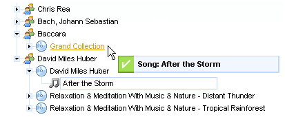
Listeners classes that process events on the server side are defined with the help of:
Listener methods can be defined using the following attributes or using nested tags.
Client event attributes are:
"onexpand" is a script expression to invoke when a node is expanded
"oncollapse" is a script expression to invoke when a node is collapsed
"ondragexit" is a script expression to invoke when an element passing out from a tree zone
"ondragstart" is a script expression to invoke when dragging starts
"ondragend" is a script expression to invoke when dragging ends (a drop event)
"ondragenter" is a script expression to invoke when a dragged element appears on a tree
They can be used to add some JavaScript effects.
Standart HTML event attributes like "onclick" , "onmousedown" , "onmouseover" etc. can be also used. Event handlers of a <rich:tree> component capture events occured on any tree part. But event handlers of treeNode capture events occured on treeNode only, except for children events.
Table of <rich:tree> attributes.
Table 6.94. Facets
| Facet name | Description |
|---|---|
| icon | Redefines the icon for node. Related attribute is "icon" |
| iconCollapsed | Redefines the icon for collapsed node. Related attribute is "iconCollapsed" |
| iconExpanded | Redefines the icon for expanded node. Related attribute is "iconExpanded" |
| iconLeaf | Redefines the icon for component leaves. Related attribute is "iconLeaf" |
Table 6.95. Classes names that define a component appearance
| Class name | Description |
|---|---|
| rich-tree | Defines styles for a wrapper <div> element of a tree |
You can find all necessary information about style classes redefinition in Definition of Custom Style Classes section.
On the component LiveDemo page you can see the example of <rich:tree> usage and sources for the given example.
How to Expand/Collapse Tree Nodes from code, see in thiswiki article.
Read RichFaces Tree FAQ to know how to avoid problem with showing only two levels of node when tree actually contains more.
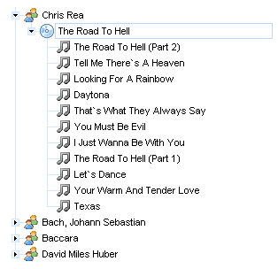
...
<rich:tree ...>
...
<rich:treeNode>
<f:facet name="icon">
<outputText value="A"/>
</f:facet>
<f:facet name="iconCollapsed">
<outputText value="B"/>
</f:facet>
<f:facet name="iconExpanded">
<outputText value="C"/>
</f:facet>
<f:facet name="iconLeaf">
<outputText value="D"/>
</f:facet>
</rich:treeNode>
...
</rich:tree>
...
As it has been mentioned above,
<rich:treeNode>
defines a template for nodes
rendering in a tree. Thus, during XML document rendering (a web.xml application) as a tree,
the following nodes output (passed via var="data" on a tree) happens:
Example:
...
<rich:tree faceNode="simpleNode" value="#{bean.data}" var="data">
<rich:treeNode type="simpleNode">
<h:outputText value="context-param:"/>
<h:inputText value="#{data.name}"/>
</rich:treeNode>
</rich:tree>
...
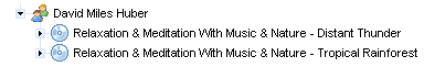
Hence,
<h:outputText />
tag outputs the "context-param" string and
then the
<h:inputText />
outputs the data.name element of this node.
Different nodes for rendering could be defined depending on some conditions on the tree level. Each condition represents some rendering template. To get more information on various treeNodesAdaptorAdaptor definition for nodes, see the tree component chapter.
Switching between expanded/collapsed modes is also managed on the tree level and defined in the corresponding section.
Default nodes of the tree level as well as the ones defined with the treeNodesAdaptorAdaptor component could send Ajax requests when selected with the mouse, it's managed with the "ajaxSubmitSelection" attribute (true/false).
Information about the "process" attribute usage you can find " Decide what to process " guide section.
The main information on Drag and Drop operations is given in the corresponding paragraph of the tree component chapter. It's only necessary to mention that each node could also be a Drag element as well as a Drop container, i.e. the container and the element have all attributes, listeners and ways of behavior similar to the ones of the <rich:dragSupport > and <rich:dropSupport > components simultaneously.
Just as Drag and Drop operations it corresponds to the one described on the tree component level for a default Node.
Table of <rich:treeNode> attributes.
Table 6.97. Facets
| Facet name | Description |
|---|---|
| icon | Redefines the icon for node. Related attribute is "icon" |
| iconCollapsed | Redefines the icon for collapsed node. Related attribute is "iconCollapsed" |
| iconExpanded | Redefines the icon for expanded node. Related attribute is "iconExpanded" |
| iconLeaf | Redefines the icon for component leaves. Related attribute is "iconLeaf" |
Table 6.98. Classes names that define a node element
| Class name | Description |
|---|---|
| rich-tree-node | Defines styles for a tree node |
| rich-tree-node-handle | Defines styles for a tree node handle |
| rich-tree-node-handleicon | Defines styles for a tree node handle icon |
| rich-tree-node-children | Defines styles for all tree node subnodes |
| rich-tree-node-text | Defines styles for a tree node text |
| rich-tree-node-icon | Defines styles for a tree node icon |
| rich-tree-h-ic-img | Defines styles for an image of a tree node |
| rich-tree-node-icon-leaf | Defines styles for a tree node icon leaf |
Table 6.99. Classes names that define states for a node element
| Class name | Description |
|---|---|
| rich-tree-node-selected | Defines styles for a selected tree node |
| rich-tree-node-highlighted | Defines styles for a highlighted tree node |
| rich-tree-node-handleicon-collapsed | Defines styles for a collapsed tree node handleicon |
| rich-tree-node-handleicon-expanded | Defines styles for a expanded tree node handleicon |
You can find all necessary information about style classes redefinition in Definition of Custom Style Classes section.
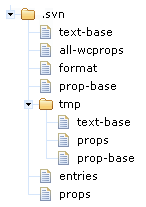
The "var" attribute is used to access to the current collection element.
...
<rich:tree adviseNodeOpened="#{treeModelBean.adviseNodeOpened}" switchType="client">
<rich:treeNodesAdaptor id="project" nodes="#{loaderBean.projects}" var="project">
<rich:treeNode>
<h:commandLink action="#{project.click}" value="Project: #{project.name}" />
</rich:treeNode>
<rich:treeNodesAdaptor id="srcDir" var="srcDir" nodes="#{project.srcDirs}">
<rich:treeNode>
<h:commandLink action="#{srcDir.click}" value="Source directory: #{srcDir.name}" />
</rich:treeNode>
<rich:treeNodesAdaptor id="pkg" var="pkg" nodes="#{srcDir.packages}">
<rich:treeNode>
<h:commandLink action="#{pkg.click}" value="Package: #{pkg.name}" />
</rich:treeNode>
<rich:treeNodesAdaptor id="class" var="class" nodes="#{pkg.classes}">
<rich:treeNode>
<h:commandLink action="#{class.click}" value="Class: #{class.name}" />
</rich:treeNode>
</rich:treeNodesAdaptor>
</rich:treeNodesAdaptor>
</rich:treeNodesAdaptor>
</rich:treeNodesAdaptor>
</rich:tree>
...
On the component LiveDemo page you can see the example of <rich:treeNodesAdaptor > usage and sources for the given example.
The "nodes" attribute defines collection to use on another recursion levels.
The "var" attribute is used to access to the current collection element.
...
<rich:tree adviseNodeOpened="#{treeModelBean.adviseNodeOpened}" switchType="client">
<rich:treeNodesAdaptor id="project" nodes="#{loaderBean.projects}" var="project">
<rich:treeNode>
<h:commandLink action="#{project.click}" value="Project: #{project.name}" />
</rich:treeNode>
<rich:recursiveTreeNodesAdaptor id="dir" var="dir" root="#{project.dirs}" nodes="#{dir.directories}">
<rich:treeNode>
<h:commandLink action="#{dir.click}" value="Directory: #{dir.name}" />
</rich:treeNode>
<rich:treeNodesAdaptor id="file" var="file" nodes="#{dir.files}">
<rich:treeNode>
<h:commandLink action="#{file.click}" value="File: #{file.name}" />
</rich:treeNode>
</rich:treeNodesAdaptor>
<rich:treeNodesAdaptor id="file1" var="file" nodes="#{dir.files}">
<rich:treeNode>
<h:commandLink action="#{file.click}" value="File1: #{file.name}" />
</rich:treeNode>
</rich:treeNodesAdaptor>
<rich:recursiveTreeNodesAdaptor id="archiveEntry" var="archiveEntry"
roots="#{dir.files}" nodes="#{archiveEntry.archiveEntries}"
includedRoot="#{archiveEntry.class.simpleName == 'ArchiveFile'}"
includedNode="#{archiveEntry.class.simpleName == 'ArchiveEntry'}">
<rich:treeNode id="archiveEntryNode">
<h:commandLink action="#{archiveEntry.click}" value="Archive entry: #{archiveEntry.name}" />
</rich:treeNode>
</rich:recursiveTreeNodesAdaptor>
</rich:recursiveTreeNodesAdaptor>
</rich:treeNodesAdaptor>
</rich:tree>
...
On the component Live Demo page you can see the example of <rich:recursiveTreeNodesAdaptor> usage.
Attribute
"type"
defines the fully qualified Java class name for the listener.
This class should implement
org.richfaces.event.NodeExpandedListener
interface.
The typical variant of using:
...
<rich:tree switchType="server" value="#{project.data}" var="item" nodeFace="#{item.type}">
<rich:changeExpandListener type="demo.ListenerBean"/>
...
<!-- Tree nodes -->
...
</rich:tree>
...
Java bean source:
package demo;
import org.richfaces.event.NodeExpandedEvent;
public class ListenerBean implements org.richfaces.event.NodeExpandedListener{
...
public void processExpansion(NodeExpandedEvent arg0){
//Custom Developer Code
}
...
}
...
Attribute
"type"
defines the fully qualified Java class name for listener.
This class should implement
org.richfaces.event.NodeSelectedListener
.
interface
The typical variant of using:
...
<rich:tree switchType="server" value="#{project.data}" var="item" nodeFace="#{item.type}">
<rich:nodeSelectListener type="demo.ListenerBean"/>
...
<!-- Tree nodes -->
...
</rich:tree>
...
Java bean source:
package demo;
import org.richfaces.event.NodeSelectedEvent;
public class ListenerBean implements org.richfaces.event.NodeSelectedListener{
...
public void processSelection(NodeSelectedEvent arg0){
//Custom Developer Code
}
...
}
- 6.10.1. <rich:modalPanel> available since 3.0.0
- 6.10.2. < rich:paint2D > available since 3.0.0
- 6.10.3. < rich:panel > available since 3.0.0
- 6.10.4. < rich:panelBar > available since 3.0.0
- 6.10.5. <rich:panelBarItem> available since 3.0.0
- 6.10.6. <rich:panelMenu> available since 3.1.0
- 6.10.7. <rich:panelMenuGroup> available since 3.1.0
- 6.10.8. <rich:panelMenuItem> available since 3.1.0
- 6.10.9. < rich:progressBar > available since 3.2.0
- 6.10.10. < rich:separator > available since 3.0.0
- 6.10.11. < rich:simpleTogglePanel > available since 3.0.0
- 6.10.12. < rich:spacer > available since 3.0.0
- 6.10.13. <rich:tabPanel> available since 3.0.0
- 6.10.14. <rich:tab> available since 3.0.0
- 6.10.15. < rich:togglePanel > available since 3.0.0
- 6.10.16. < rich:toggleControl > available since 3.0.0
- 6.10.17. < rich:toolBar > available since 3.0.0
- 6.10.18. < rich:toolBarGroup > available since 3.0.0
- 6.10.19. < rich:toolTip > available since 3.1.0
This section covers the components that are designed to be used as output and UI elements.
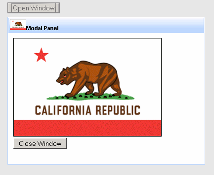
Important:
In order to avoid a bug in IE, the root node of the dialog is moved on the top of a DOM tree.
To open and close the <rich:modalPanel> use one of three JS API functions (offset to the "Reference Data" below in this chapter):
<a onclick="Richfaces.showModalPanel('pnl');" href="#">Show ModalPanel</a>
<a4j:form>
<rich:modalPanel id="pnl" >
<a onclick="Richfaces.hideModalPanel('pnl');" href="#">Hide ModalPanel</a>
</rich:modalPanel>
</a4j:form>
The result:
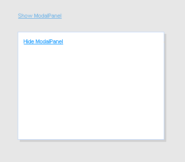
Besides client ID it is possible to pass other parameters while opening and closing the <rich:modalPanel> with the JS API function. For example, you can pass top and left indents or panel size:
<a onclick="Richfaces.showModalPanel('pnl', {top:'10px', left:'10px', height:'400px'});">Show ModalPanel</a>
Also the <rich:modalPanel> allows to handle its own opening and closing events on the client side. Custom parameters passed with JS API are also obtained in this case:
<rich:modalPanel onshow="alert(event.parameters.param1)">
...
</rich:modalPanel>
The component can restore its previous state (including position on the screen) after submitting and reloading.
Set "keepVisualState" to true to submit and pass <rich:modalPanel> current parameters to a new page.
The "showWhenRendered" boolean attribute is used in cases when component should be rendered after first page loading.
The "trimOverlayedElements" boolean attribute can be used to determine if the modal panel will expand to show other components inside it. Set the attribute to false to ensure components are not cut off.
To understand sense of the "domElementAttachment" attribute it is necessary to understand
what is stacking context and how it works in the HTML makeup.
Since each positioned or z-indexed element (CSS position:absolute or relative and z-index:*any integer different from 0*)
form their own stacking context the <rich:modalPanel> rendered as a child of such element may be overlapped with an element
that appears later in HTML hierarchy or assimilated with <body> stacking context (basic for HTML page).
Not so fast!
To make the <rich:modalPanel> rendered in "closest" to an observer layer and avoid such overlapping,
the component was designed in way when it is always being automatically assimilated with <body> with a very high rendering layer (z-index).
But our panel should be assimilated with <body> not always, because of some side effects that take place in this case.
The "domElementAttachment" attribute helps to reassign the panel to its parent or form element.
If form is used and no parent form is available the panel is functioning as if it is assimilated with <body>.
Notes:
If the "domElementAttachment" value is not body then some overlapping may occur.
To avoid overlapping by an embed object (inserted with HTML <embed> tag)
set the "overlapEmbedObjects" to true.
The "label" attribute is a generic one.
It provides an association between a component and message the component produces.
This attribute defines parameters of localized error and informational messages that occur as a result of conversion, validation or other application actions during the request processing lifecycle.
With this attribute you can replace the last parameter substitution token shown in the message.
For example, DoubleRangeValidator.MAXIMUM or ShortConverter.SHORT.
The <rich:modalPanel> supports two facets.
The header facet defines header and text label on it:
...
<rich:modalPanel id="pnl">
<f:facet name="header">
<h:outputText value="I'm panel header" />
</f:facet>
<p>The <rich:modalPanel> accepts different types of information: from simple text to iterative components such as <rich:dataTable>, etc.
</p>
<a onclick="Richfaces.hideModalPanel('pnl');" href="#">Hide ModalPanel</a>
</rich:modalPanel>
...
The result:
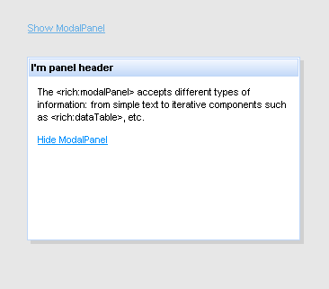
The controls facet places any control on a header, defines image, style and function for it. For example, "Close" control:
<rich:modalPanel id="pnl">
...
<f:facet name="controls">
<h:graphicImage value="/pages/close.png" style="cursor:pointer" onclick="Richfaces.hideModalPanel('pnl')" />
</f:facet>
...
</rich:modalPanel>
The result:
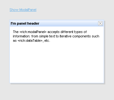
An example of using <h:commandButton> within the <rich: modalPanel>:
<a4j:form>
<rich:modalPanel>
<h:form>
<h:commandButton value="Test" action="#{TESTCONTROLLER.test}" />
</h:form>
</rich:modalPanel>
</a4j:form>
Table of <rich:modalPanel> attributes.
Table 6.105. JavaScript API functions
| Function | Description |
|---|---|
| Richfaces.showModalPanel('ID'); | Opens the modal panel with specified ID |
| Richfaces.hideModalPanel('ID'); | Closes the modal panel with specified ID |
| Richfaces.hideTopModalPanel('ID'); | Closes the current top visible modal panel with specified ID |
Table 6.106. Facets
| Facet | Description |
|---|---|
| header | Defines header content |
| controls | Defines a control on the header |
Table 6.107. Style classes (selectors) and mapped skin parameters
| Class name | Description | Skin Parameter | CSS property |
|---|---|---|---|
| .rich-mpnl-body | Defines styles for modalPanel content | generalSizeFont | font-size |
| generalFamilyFont | font-family | ||
| generalTextColor | color | ||
| .rich-mpnl-content | Defines style for modalPanel content area | generalBackgroundColor | background-color |
| panelBorderColor | border-color | ||
| .rich-mpnl-header | Defines styles for modalPanel header | headerBackgroundColor | background-color |
| headerBackgroundColor | border-color | ||
| .rich-mpnl-shadow | Defines styles for a modalPanel shadow | shadowBackgroundColor | background-color |
| .rich-mpnl-text | Defines styles for a wrapper <div> element of a header text | headerSizeFont | font-size |
| headerWeightFont | font-weight | ||
| headerFamilyFont | font-family | ||
| headerTextColor | color |
Table 6.108. Internal style classes (selectors)
| Class name (selector) | Description |
|---|---|
| .rich-modalpanel | Defines styles for a wrapper <div> element of a modalPanel |
| .rich-mpnl-body | Defines styles for modalPanel content |
| .rich-mpnl-button | Defines styles for modalPanel button |
| .rich-mpnl-controls | Defines styles for a wrapper <div> element of a modalPanel control |
| .rich-mpnl-header-cell | Defines styles for a header cell |
| .rich-mpnl-header | Defines styles for modalPanel header |
| .rich-mpnl-iframe | Defines styles for modalPanel <iframe> container |
| .rich-mpnl-mask-div | Defines styles for blocking <div> element |
| .rich-mpnl-mask-div-opaque | Defines opacity for blocking <div> element |
| .rich-mpnl-mask-div-transparent | Defines transparency for blocking <div> element |
| .rich-mpnl-ovf-hd | Defines style for block element content |
| .rich-mpnl-panel | Defines styles for a modalPanel |
| .rich-mpnl-trim | Defines styles for a modalPanel |
| .rich-mpnl-resizer | Defines styles for a wrapper <div> where cursor changes it state for resizing |
| .rich-mpnl-shadow | Defines styles for a modalPanel shadow |
You can find all necessary information about style classes redefinition in Definition of Custom Style Classes section.
Visit ModalPanel page at RichFaces Livedemo for examples of component usage and their sources.
Useful articles:
"ModalPanelWizards" describes how to create a wizard using <rich:modalPanel> (the same in the RichFaces FAQ "section");
"An Introduction To JBoss RichFaces" by Max Katz describes the way the <rich:modalPanel> edits and saves changes for table entries;
"How to do a detail view modalPanel in a table" describes how to load an information from a table to the modal panel;
"ModalPanelValidation" gives examples of validation in the <rich:modalPanel> (the same in the RichFaces UsersForum topic);
"RichFacesPleaseWaitBox" describes how to show "Please wait" box and block the input while an Ajax request is being processed using the combination of <a4j:status> and <rich:modalPanel>;
If you have any questions or ideas regarding the <rich:modalPanel> tell about them at the RichFaces Users Forum.

The example shows two main attributes of the component:
The "format" attribute of the component defines a format of visual data passing to the server.
paintBean.java:
public void paint(Graphics2D g2, Object obj) {
// code that gets data from the data Bean (PaintData)
PaintData data = (PaintData) obj;
...
// a code drawing a rectangle
g2.drawRect(0, 0, data.Width, data.Height);
...
// some more code placing graphical data into g2 stream below
}
dataBean.java:
public class PaintData implements Serializable{
private static final long serialVersionUID = 1L;
Integer Width=100;
Integer Height=50;
...
}
page.xhtml:
...
<rich:paint2D paint="#{paint2D.paint}" data="#{paint2DModel.data}"/>
...
On the component LiveDemo page you can see the example of <rich:paint2D> usage and sources for the given example.
<rich:panel />

The <rich:panel> supports header facet that defines header and text label on it.
Besides that there is "header" attribute that does the same job.
The following two entries
<-- A -->
<rich:panel header="I'm panel header" />
<-- B -->
<rich:panel>
<f:facet name="header">
<h:outputText value="I'm panel header"/>
</f:facet>
</rich:panel>
have the same output:

Table of <rich:panel> attributes.
Table 6.112. Style classes (selectors) and mapped skin parameters
| Class name | Description | Skin parameter | CSS property |
|---|---|---|---|
| .rich-panel | Defines styles for a wrapper <div> element of a component | generalBackgroundColor | background-color |
| panelBorderColor | border-color | ||
| .rich-panel-body | Defines styles for a body element | generalFamilyFont | font-family |
| generalSizeFont | font-size | ||
| generalTextColor | color | ||
| .rich-panel-header | Defines styles for a header element | headerFamilyFont | font-family |
| headerSizeFont | font-size | ||
| headerWeightFont | font-weight | ||
| headerTextColor | color | ||
| headerBackgroundColor | background-color | ||
| headerBackgroundColor | border-color |
Table 6.113. Internal style classes (selectors)
| Class name (selector) | Description |
|---|---|
| .rich-panel | Defines styles for a wrapper <div> element of a component |
| .rich-panel-body | Defines styles for a body element |
| .rich-panel-header | Defines styles for a header element |
You can find all necessary information about style classes redefinition in Definition of Custom Style Classes section.
Visit Panel page at RichFaces LiveDemo for examples of component usage and their sources.
If you have any questions or ideas regarding the <rich:panel> tell about them at the RichFaces Users Forum.
The component is designed to group one or more <rich:panelBarItem> components into one interactive panel.
Table of <rich:panelBar> attributes.
Table 6.115. Style classes (selectors) and mapped skin parameters
| Class name | Description | Skin parameter | CSS property |
|---|---|---|---|
| .rich-panelbar | Defines styles for wrapper <div> element of a component | headerBackgroundColor | border-color |
| .rich-panelbar-content | Defines styles for panelBar content | preferableDataFamilyFont | font-family |
| preferableDataSizeFont | font-size | ||
| generalTextColor | color | ||
| .rich-panelbar-header | Defines styles for panelBar header | headerBackgroundColor | background-color |
| headerFamilyFont | font-family | ||
| headerSizeFont | font-size | ||
| headerWeightFont | font-weight | ||
| headerTextColor | color | ||
| .rich-panelbar-header-act | Defines styles for panelBar active header | headerBackgroundColor | background-color |
| headerFamilyFont | font-family | ||
| headerSizeFont | font-size | ||
| headerWeightFont | font-weight | ||
| headerTextColor | color | ||
| .rich-panelbar-interior | Defines styles for panelBar content | generalBackgroundColor | background-color |
Table 6.116. Internal style classes (selectors)
| Class name (selector) | Description |
|---|---|
| .rich-panel-b | Defines styles for panelBar content |
| .rich-panel-header | Defines styles for active header element |
| .rich-panel-header-act | Defines styles for header element |
| .rich-panelbar-content | Defines styles for panelBar content |
| .rich-panelbar-interior | Defines styles for panelBar content |
You can find all necessary information about style classes redefinition in Definition of Custom Style Classes section.
Visit PanelBar page at RichFaces LiveDemo for examples of component usage and their sources.
If you have any questions or ideas regarding the <rich:panel> tell about them at the RichFaces Users Forum.
The component is designed to be used as a part of <rich:panelBar>. The <rich:panelBarItem> used separately from <rich:panelBar> will not be rendered.
Table of <rich:panelBarItem> attributes.
Table 6.119. Style classes (selectors) and mapped skin parameters
| Class name | Description | Skin parameter | CSS property |
|---|---|---|---|
| .rich-panelbar-content | Defines styles for panelBar content | preferableDataFamilyFont | font-family |
| preferableDataSizeFont | font-size | ||
| generalTextColor | color | ||
| .rich-panelbar-header | Defines styles for panelBar header | headerBackgroundColor | background-color |
| headerFamilyFont | font-family | ||
| headerSizeFont | font-size | ||
| headerWeightFont | font-weight | ||
| headerTextColor | color | ||
| .rich-panelbar-header-act | Defines styles for panelBar active header | headerBackgroundColor | background-color |
| headerFamilyFont | font-family | ||
| headerSizeFont | font-size | ||
| headerWeightFont | font-weight | ||
| headerTextColor | color |
You can find all necessary information about style classes redefinition in Definition of Custom Style Classes section.
Visit PanelBar page at RichFaces LiveDemo for example of the <rich:panelBarItem>component usage and it source.
If you have any questions or ideas regarding the <rich:panel> tell about them at the RichFaces Users Forum.
The <rich:panelMenu> component defines vertical menu on a page. Used together with <rich:panelMenuItem> and <rich:panelMenuGroup>, which form <rich:panelMenu> content.
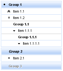
<rich:panelMenu event="onmouseover">
...
</rich:panelMenu>
...
<rich:panelMenu mode="server">
<rich:panelMenuGroup label="test Group" action="#{bean.action}">
<rich:panelMenuItem label="test" action="#{capitalsBean.action}">
<f:param value="test value" name="test"/>
</rich:panelMenuItem>
</rich:panelMenuGroup>
</rich:panelMenu>
...
...
<rich:panelMenu mode="ajax">
<rich:panelMenuGroup label="test Group" action="#{bean.action}">
<rich:panelMenuItem label="test" reRender="test" action="#{capitalsBean.action}">
<f:param value="test value" name="test"/>
</rich:panelMenuItem>
</rich:panelMenuGroup>
</rich:panelMenu>
...
...
<rich:panelMenu event="onclick" submitMode="none">
<rich:panelMenuItem label="Link to external page">
<h:outputLink ... >
<rich:panelMenuItem>
</rich:panelMenu>
...
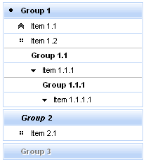
The "selectedChild" attribute is used for defining the name of the selected group or item. An example for group is placed below:
Here is an example:
...
<rich:panelMenu selectedChild="thisChild">
<rich:panelMenuGroup label="Group1" name="thisChild">
<!--Nested panelMenu components-->
</rich:panelMenuGroup>
</rich:panelMenu>
...
The
"label"
attribute is a generic attribute. The
"label"
attribute provides an association between a component, and the message that the component (indirectly) produced. This attribute defines the parameters of localized error and informational messages that occur as
a result of conversion, validation, or other application actions during the request processing lifecycle. With the help of this attribute you can replace the last parameter substitution token shown in the messages. For
example, {1} for "DoubleRangeValidator.MAXIMUM", {2} for "ShortConverter.SHORT".
Table of <rich:panelMenu> attributes.
Table 6.121. JavaScript API
| Function | Description |
|---|---|
| expand() | Expands group element |
| collapse() | Collapses group element |
Table 6.122. Style classes (selectors) and mapped skin parameters
| Class name | Description | Skin parameter | CSS property |
|---|---|---|---|
| .rich-pmenu-disabled-element | Defines styles for panel menu disabled element | tabDisabledTextColor | color |
| .rich-pmenu-group | Defines styles for panel menu group | generalTextColor | color |
| headerFamilyFont | font-family | ||
| headerSizeFont | font-size | ||
| headerWeightFont | font-weight | ||
| tableBorderColor | border-top-color | ||
| .rich-pmenu-hovered-element | Defines styles for panel menu hevered element | additionalBackgroundColor | background-color |
| .rich-pmenu-item | Defines styles for panel menu item | generalTextColor | color |
| generalFamilyFont | font-family | ||
| genealSizeFont | font-size | ||
| generalWeightFont | font-weight | ||
| tableBorderColor | border-top-color | ||
| .rich-pmenu-top-group | Defines styles for a top group element of a component | generalFamilyFont | font-family |
| headerSizeFont | font-size | ||
| headerTextColor | color | ||
| headerWeightFont | font-weight | ||
| headerBackgroundColor | background-color | ||
| .rich-pmenu-top-group-div | Defines styles for a top group div element of a component | panelBorderColor | border-color |
Table 6.123. Internal style classes (selectors)
| Class name (selector) | Description |
|---|---|
| .rich-pmenu | Defines styles for panel menu |
| .rich-pmenu-disabled-element | Defines styles for panel menu disabled element |
| .rich-pmenu-group | Defines styles for panel menu group |
| .rich-pmenu-group-self-label | Defines styles for panel menu group label |
| .rich-pmenu-item | Defines styles for panel menu item |
| .rich-pmenu-nowrap | Defines styles for panel menu wrapper |
| .rich-pmenu-selected-element | Defines styles for panel menu selected element |
| .rich-pmenu-top-group | Defines styles for panel menu top group element |
| .rich-pmenu-top-group-div | Defines styles for panel menu top group div element |
You can find all necessary information about style classes redefinition in Definition of Custom Style Classes section.
Visit panelMenu page at RichFaces LiveDemo for examples of component usage and their sources.
If you have any questions or ideas regarding the <rich:panelMenu> tell about them at the RichFaces Users Forum.
The <rich:panelMenuGroup> defines an expandable group of <rich:panelMenuItem> components inside the <rich:panelMenu>.

All attributes except "label" are optional. The "label" attribute defines text to be represented.

Here is an example:
...
<rich:panelMenu>
<rich:panelMenuGroup label="Group1" iconExpanded="disc" iconCollapsed="chevron">
<!--Nested panelMenu components-->
</rich:panelMenuGroup>
</rich:panelMenu>
...
As the result the pictures are shown below. The first one represents the collapsed state, the second one - expanded state:
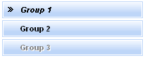
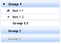
It's also possible to define a path to the icon. Simple code is placed below.
...
<rich:panelMenu>
<rich:panelMenuGroup label="Group1" iconExpanded="\images\img1.png" iconCollapsed="\images\img2.png">
<!--Nested menu components-->
</rich:panelMenuGroup>
</rich:panelMenu>
...
Information about the "process" attribute usage you can find "Decide what to process" guide section.
Table of <rich:panelMenuGroup> attributes.
Table 6.126. Style classes (selectors) and mapped skin parameters
| Class name | Description | Skin parameter | CSS property |
|---|---|---|---|
| .rich-pmenu-disabled-element | Defines styles for panel menu disabled element | tabDisabledTextColor | color |
| .rich-pmenu-group | Defines styles for panel menu group | generalTextColor | color |
| headerFamilyFont | font-family | ||
| headerSizeFont | font-size | ||
| headerWeightFont | font-weight | ||
| tableBorderColor | border-top-color | ||
| .rich-pmenu-hovered-element | Defines styles for panel menu hevered element | additionalBackgroundColor | background-color |
| .rich-pmenu-top-group | Defines styles for a top group element of a component | generalFamilyFont | font-family |
| headerSizeFont | font-size | ||
| headerTextColor | color | ||
| headerWeightFont | font-weight | ||
| headerBackgroundColor | background-color | ||
| .rich-pmenu-top-group-div | Defines styles for a top group div element of a component | panelBorderColor | border-color |
Table 6.127. Internal style classes (selectors)
| Class name (selector) | Description |
|---|---|
| .rich-pmenu-disabled-element | Defines styles for panel menu disabled element |
| .rich-pmenu-group | Defines styles for panel menu group |
| .rich-pmenu-group-self-label | Defines styles for panel menu group label |
| .rich-pmenu-nowrap | Defines styles for panel menu wrapper |
| .rich-pmenu-top-group | Defines styles for panel menu top group element |
| .rich-pmenu-top-group-div | Defines styles for panel menu top group div element |
You can find all necessary information about style classes redefinition in Definition of Custom Style Classes section.
Visit panelMenuGroup page at RichFaces LiveDemo for examples of component usage and their sources..
If you have any questions or ideas regarding the <rich:panelMenuGroup> tell about them at the RichFaces Users Forum.

All attributes except "label" are optional. The "label" attribute defines text to be represented.
The "mode" attribute could be used with three possible parameters:
...
<rich:panelMenu>
...
<rich:panelMenuItem mode="none" onclick="document.location.href='http://labs.jboss.com/jbossrichfaces/">
<h:outputLink value="http://labs.jboss.com/jbossrichfaces/">
<h:outputText value="RichFaces Home Page"></h:outputText>
</h:outputLink>
</rich:panelMenuItem>
...
</rich:panelMenu>
...
Default icons are shown on the picture below:
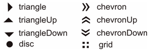
...
<rich:panelMenu>
...
<rich:panelMenuItem value="Item 1.1" icon="chevronUp" />
...
</rich:panelMenu>
...
As the result the picture is shown below:
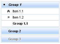
It's also possible to define a path to the icon. Simple code is placed below.
...
<rich:panelMenu>
...
<rich:panelMenuItem value="Item 1.1" icon="\images\img1.png" />
...
</rich:panelMenu>
...
Information about the "process" attribute usage you can find in the "Decide what to process" guide section.
Table of <rich:panelMenuItem> attributes.
Table 6.129. Style classes (selectors) and mapped skin parameters
| Class name | Description | Skin parameter | CSS property |
|---|---|---|---|
| .rich-pmenu-disabled-element | Defines styles for panel menu disabled element | tabDisabledTextColor | color |
| .rich-pmenu-hovered-element | Defines styles for panel menu hevered element | additionalBackgroundColor | background-color |
| .rich-pmenu-item | Defines styles for panel menu item | generalTextColor | color |
| generalFamilyFont | font-family | ||
| genealSizeFont | font-size | ||
| generalWeightFont | font-weight | ||
| tableBorderColor | border-top-color |
Table 6.130. Internal style classes (selectors)
| Class name (selector) | Description |
|---|---|
| .rich-pmenu-disabled-element | Defines styles for panel menu disabled element |
| .rich-pmenu-group-self-label | Defines styles for panel menu group label |
| .rich-pmenu-item | Defines styles for panel menu item |
| .rich-pmenu-selected-element | Defines styles for panel menu selected element |
You can find all necessary information about style classes redefinition in Definition of Custom Style Classes section.
Visit panelMenuItem page at RichFaces LiveDemo for examples of component usage and their sources.
If you have any questions or ideas regarding the <rich:panelMenu> tell about them at the RichFaces Users Forum.

The
<rich:progressBar>
component can run in two modes: Ajax (default) and Client.
In order to define the mode you need to use "mode" attribute.
Polling is active while the "enabled" attribute is "true".
...
<rich:progressBar value="#{bean.incValue}" id="progrs" interval="900" enabled="true"/>
...
Status of the process is calculated basing on values of the following attributes:
...
<rich:progressBar value="#{bean.incValue}" minValue="50" maxValue="400"/>
...

There are two ways to display information on a progress bar:
Using "label" attribute
Example:
...
<rich:progressBar value="#{bean.incValue}" id="progrs" label="#{bean.incValue}"/>
...
Using any child(nested) components. One of the components that can be used is <h:outputText />
Example:
...
<rich:progressBar value="#{bean.incValue}">
<h:outputText value="#{bean.incValue} %"/>
</rich:progressBar>
...
The <rich:progressBar> component provides 3 predefined macrosubstitution parameters:
{value}contains the current value{minValue}contains min value{maxValue}contains max value
You can use them as follows:
Example:
...
<rich:progressBar value="#{bean.incValue1}" minValue="400" maxValue="900">
<h:outputText value="Min value is {minValue}, current value is {value}, max value is {maxValue}"/>
</rich:progressBar>
...
This is the result:

The
"parameters"
is also a special attribute which defines parameters that can be to get additional data from server (e.g. additional info about process status).
All you need is to define the value of your own parameter
(e.g parameters="param:'#{bean.incValue1}'")
and you can use it to pass the data.
Example:
...
<rich:progressBar value="#{bean.incValue}" parameters="param:'#{bean.dwnlSpeed}'">
<h:outputText value="download speed {param} KB/s"/>
</rich:progressBar>
...
This is the result:

The "progressVar" attribute (deprecated) defines request scoped variable that could be used for substitution purpose. This variable contains the data taken from "value" attribute. Please, study carefully the following example.
Example:
...
<rich:progressBar value="#{bean.incValue1}" enabled="#{bean.enabled1}" id="progrs1" progressVar="progress">
<h:outputText value="{progress}%"/>
</rich:progressBar>
...
In the shown example "progressVar" attribute defines a variable "progress" with the value taken from "value" attribute of the <rich:progressBar> component. The "progress" variable performs substitution passing the current progress value to the "value" attribute of the <h:outputText> . This is how the current value of a progress appears on the label of <rich:progressBar> .
As the
"progressVar"
attribute is deprecated, it's better to use
the predefined macrosubstitution parameter {value} instead. See how you can rewrite the above example with the help of {value}.
Example:
...
<rich:progressBar value="#{bean.incValue1}" enabled="#{bean.enabled1}" id="progrs1">
<h:outputText value="{value}%"/>
</rich:progressBar>
...
The component can also employ "initial" and "complete" facets to display the states of the process: "initial" facet is displayed when the progress value is less or equal to "minValue" , and the "complete" facet is shown when the value is greater or equal to "maxValue" . Please see an example below.
Example:
...
<rich:progressBar value="#{bean.incValue1}">
<f:facet name="initial">
<h:outputText value="Process not started"/>
</f:facet>
<f:facet name="complete">
<h:outputText value="Process completed"/>
</f:facet>
</rich:progressBar>
...
Information about the "process" attribute usage you can find " Decide what to process " guide section.
Table of <rich:progressBar> attributes.
Table 6.132. JavaScript API
| Function | Description |
|---|---|
| enable() | Begins polling for Ajax mode |
| disable() | Stops polling for Ajax mode |
| setValue(value) | Updates the progress of the process |
| setLabel(label) | Update the label for the process |
Table 6.133. Facets
| Facet name | Description |
|---|---|
| initial | Defines the information content about the state of the process if the progress value is less or equal to "minValue" |
| complete | Defines the information content about the state of the process if the value is greater or equal to "maxValue" |
Table 6.134. Classes names for the progressBar without a label
| Class name | Description |
|---|---|
| rich-progress-bar-shell | Defines styles for a wrapper <div> element of a progressBar |
| rich-progress-bar-uploaded | Defines styles for the completed progress area |
| rich-progress-bar-height | Defines height for a progressBar |
| rich-progress-bar-width | Defines width for a progressBar |
Table 6.135. Classes names for the progressBar with a label
| Class name | Description |
|---|---|
| rich-progress-bar-shell-dig | Defines styles for a wrapper <div> element of a progressBar |
| rich-progress-bar-uploaded-dig | Defines styles for the label |
| rich-progress-bar-remained | Defines styles for the remained progress area |
| rich-progress-bar-completed | Defines styles for the completed progress area |
| rich-progress-bar-height-dig | Defines height for a progressBar |
| rich-progress-bar-width | Defines width for a progressBar |
Note:
It's necessary to define width of the component in pixels only.
On the component Live Demo page you can see the example of <rich:progressBar> usage and sources for the given example.
Read "Simple Ping Application with <rich:progressBar>" article to find out how to show the progress of server ping process.
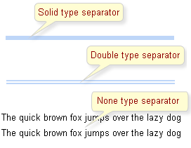
Table of <rich:separator> attributes.
Table 6.137. Classes names that define a component appearance
| Class name | Description |
|---|---|
| rich-separator | Defines styles for a component appearance |
You can find all necessary information about style classes redefinition in Definition of Custom Style Classes section.
On the component LiveDemo page you can see the example of <rich:separator> usage and sources for the given example.
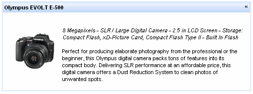
Switching mode could be defined with the "switchType" attribute with three possible parameters.
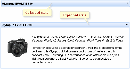
With help of "openMarker" and "closeMarker" facets you can set toggle icon for simpleTogglePanel .
Information about the "process" attribute usage you can find " Decide what to process " guide section.
Table of <rich:simpleTogglePanel> attributes.
Table 6.139. Facets
| Facet name | Description |
|---|---|
| openMarker | Redefines the icon for expanding the panel |
| closeMarker | Redefines the icon for collapsing the panel |
Table 6.140. Classes names that define a component appearance
| Class name | Class description |
|---|---|
| rich-stglpanel | Defines styles for a wrapper <div> element of a component |
| rich-stglpanel-header | Defines styles for header element of a component |
| rich-stglpnl-marker | Defines styles for a wrapper <div> element of a marker |
| rich-stglpanel-body | Defines styles for a component content |
Table 6.141. Style component classes
| Class name | Class description |
|---|---|
| styleClass | The class defines panel common style. It's used in the outside <div> element |
| bodyClass | applicable to panels body elements |
| headerClass | applicable to header elements |
You can find all necessary information about style classes redefinition in Definition of Custom Style Classes section.
On the component LiveDemo page you can see the example of <rich:simpleTogglePanel> usage and sources for the given example.
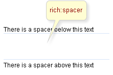
In addition, the attributes are responsible for the component size: "width" and "height".
Moreover, to add e.g. some JavaScript effects, events defined on it are used.
On the component LiveDemo page you can see the example of <rich:spacer> usage and sources for the given example.
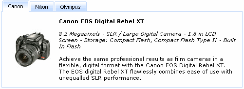
As it was mentioned above, tabPanel groups content on panels and performs switching from one to another. Hence, modes of switching between panels are described first of all.
Note:
All tabPanels should be wrapped into a form element so as content is correctly submitted inside. If a form is placed into each tab, the Action elements of Tab controls appear to be out of the form and content submission inside the panels could be performed only for Action components inside tabs.
Switching mode could be chosen with the tabPanel attribute "switchType" with three possible parameters.
server(DEFAULT)The common submission is performed around tabPanel and a page is completely rendered on a called panel. Only one at a time tabPanel is uploaded onto the client side.
ajaxAJAX form submission is performed around the tabPanel, content of the called tabPanel is uploaded on Ajax request. Only one at a time tabPanel is uploaded on the client.
clientAll tabPanels are uploaded on the client side. The switching from the active to the hidden panel is performed with client JavaScript.
As a result, the tabPanel is switched to the second tab according to the action returning outcome for moving onto another page and switching from the second to the first tab is performed.
There is also the "selectedTab" attribute. The attribute keeps an active tab name; therefore, an active tabPanel could be changed with setting a name of the necessary tab to this attribute.
There is also the "headerAlignment" attribute responsible for rendering of tabPanel components. The attribute has several values: "left" (Default), "right", "center", which specify Tabs components location on the top of the tabPanel.
Example:
...
<rich:tabPanel width="40%" headerAlignment="right">
<rich:tab label="Canon">
...
</rich:tab>
<rich:tab label="Nikon">
...
</rich:tab>
<rich:tab label="Olympus">
...
</rich:tab>
</rich:tabPanel>
...
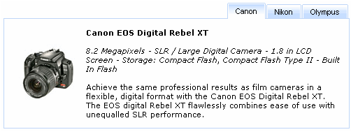
The
"label"
attribute is a generic attribute. The
"label"
attribute provides an association between a component, and
the message that the component (indirectly) produced. This attribute
defines the parameters of localized error and informational messages
that occur as a result of conversion, validation, or other application
actions during the request processing lifecycle. With the help of this
attribute you can replace the last parameter substitution token shown
in the messages. For example, {1} for
"DoubleRangeValidator.MAXIMUM",
{2} for "ShortConverter.SHORT".
Except the specific attributes, the component has all necessary attributes for JavaScript events definition.
"onmouseover"
"onmouseout"
etc.
Table of <rich:tabPanel> attributes.
Table 6.144. Classes names that define a component appearance
| Class name | Description |
|---|---|
| rich-tabpanel | Defines styles for all tabPanel |
| rich-tabpanel-content | Defines styles for an internal content |
| rich-tabpanel-content-position | Defines styles for a wrapper element of a tabPanel content. It should define a shift equal to borders width in order to overlap panel tabs |
| rich-tabhdr-side-border | Defines styles for side elements of a tabPanel header |
| rich-tabhdr-side-cell | Defines styles for a header internal element |
| rich-tab-bottom-line | Defines styles for a tab bottom line element of a tabPanel |
Table 6.145. Classes names that define different tab header states (corresponds to rich-tabhdr-side-cell)
| Class name | Description |
|---|---|
| rich-tabhdr-cell-active | Defines styles for an internal element of an active header |
| rich-tabhdr-cell-inactive | Defines styles for an internal element of an inactive label |
| rich-tabhdr-cell-disabled | Defines styles for an internal element of a disabled label |
You can find all necessary information about style classes redefinition in Definition of Custom Style Classes section.
Visit TabPanel page at RichFaces LiveDemo for examples of component usage and their sources.
If you have any questions or ideas regarding the <rich:tab> tell about them at the RichFaces Users Forum.
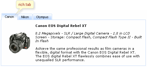
<rich:tab>
<f:facet name="label">
<h:graphicImage value="/images/img1.png"/>
</f:facet>
<!--Any Content inside-->
</rich:tab>
<rich:tabPanel width="20%">
<tabs:tab label="Canon">
<h:outputText value="Canon EOS Digital Rebel XT" />
...
</tabs:tab>
<tabs:tab label="Nikon">
<h:outputText value="Nikon D70s" />
...
</tabs:tab>
<tabs:tab label="Olympus">
<h:outputText value="Olympus EVOLT E-500" />
...
</tabs:tab>
<tabs:tab disabled="true" name="disabled" label="Disabled"/>
</rich:tabPanel>
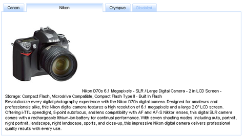
Switching mode could be defined not only for the whole panel tab, but also for each particular tab, i.e. switching onto one tab could be performed right on the client with the corresponding JavaScript and onto another tab with an Ajax request on the server. Tab switching modes are the same as tabPanel ones.
Each tab also has an attribute name (alias for "id" attribute). Using this attribute value it's possible e.g. to set an active tab on a model level specifying this name in the corresponding attribute of the whole tab.
Except the specific component attributes it has all necessary attributes for JavaScript event definition.
onmouseoveronmouseoutetc.
Some event could be performed on the tab which has been entered/left using ""ontabenter"" and "ontableave" attributes. See the example below:
<rich:tabPanel>
<rich:tab label="Tab1" ontabenter="alert()">
...
</rich:tab>
...
</rich:tabPanel>
The following example shows how on the client side to get the names of entered/left tabs.
ontabenter="alert(leftTabName)"
Information about the "process" attribute usage you can find in the "Decide what to process" guide section.
Table of <rich:tab> attributes.
Table 6.148. Style classes (selectors) and mapped skin parameters
| Class name | Description | Skin parameter | CSS property |
|---|---|---|---|
| .rich-tab-active | Defines styles for an active tab | generalTextColor | color |
| generalBackgroundColor | background-color | ||
| subBorderColor | border-color | ||
| .rich-tab-bottom-line | Defines styles for a tab bottom line | panelBorderColor | border-bottom-color |
| .rich-tab-disabled | Defines styles for a disabled tab | subBorderColor | border-color |
| tabBackgroundColor | background-color | ||
| tabDisabledTextColor | color | ||
| .rich-tab-header | Defines styles for a tab header | generalFamilyFont | font-family |
| generalSizeFont | font-size | ||
| generalTextColor | color | ||
| .rich-tab-inactive | Defines styles for an inactive tab | subBorderColor | border-color |
| tabBackgroundColor | background-color |
Table 6.149. Internal style classes (selectors)
| Class name (selector) | Description |
|---|---|
| .rich-tab-active | Defines styles for an active tab |
| .rich-tab-disabled | Defines styles for a disabled tab |
| .rich-tab-header | Defines styles for a tab header |
You can find all necessary information about style classes redefinition in Definition of Custom Style Classes section.
Visit TabPanel page at RichFaces LiveDemo for examples of component usage and their sources.
If you have any questions or ideas regarding the <rich:tab> tell about them at the RichFaces Users Forum.
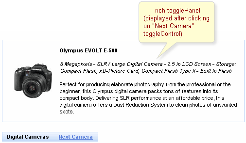
As it was mentioned above, togglePanel splits content into named facets that become rendered and processed when a click performed on controls linked to this togglePanel (either switched on the client or send requests on the server for switching).
The initial component state is defined with "initialState" attribute, where a facet name that is shown at first is defined.
Note:
It's also possible to define an "empty" facet to implement the functionality as drop-down panels have and make the facet active when no content is required to be rendered.
Switching mode could be defined with the "switchType" attribute with three possible parameters:
Server(DEFAULT)The common submission is performed around togglePanel and a page is completely rendered on a called panel. Only one at a time the panel is uploaded onto the client side.
AjaxAJAX form submission is performed around the panel, content of the called panel is uploaded on an Ajax request . Only one at a time the panel is uploaded on the client side.
ClientAll panels are uploaded on the client side. The switching from the active to the hidden panel is performed with client JavaScript.
"Facets" switching order could be defined on the side of <rich:toggleControl> component or on the panel. On the side of the togglePanel it's possible to define facets switching order with the "stateOrder" attribute. The facets names are enumerated in such an order that they are rendered when a control is clicked, as it's not defined where to switch beforehand.
Example:
...
<rich:togglePanel id="panel" initialState="panelB" switchType="client"
stateOrder="panelA,panelB,panelC">
<f:facet name="panelA">
...
</f:facet>
<f:facet name="panelB">
...
</f:facet>
<f:facet name="panelC">
...
</f:facet>
</rich:togglePanel>
<rich:toggleControl for="panel" value="Switch"/>
...
The example shows a togglePanel initial state when
the second facet (panelB) is rendered and successive
switching from the first to the second happens.
The
"label"
attribute is a generic attribute. The
"label"
attribute provides an association between a component, and
the message that the component (indirectly) produced. This attribute
defines the parameters of localized error and informational messages
that occur as a result of conversion, validation, or other application
actions during the request processing lifecycle. With the help of this
attribute you can replace the last parameter substitution token shown
in the messages. For example, {1} for
"DoubleRangeValidator.MAXIMUM",
{2} for "ShortConverter.SHORT".
Table of <rich:togglePanel> attributes.
Table 6.151. Classes names that define a component appearance
| Class name | Description |
|---|---|
| rich-toggle-panel | Defines styles for all component |
| rich-tglctrl | Defines styles for a toggle control |
You can find all necessary information about style classes redefinition in Definition of Custom Style Classes section.
On the component LiveDemo page you can see the example of <rich:togglePanel> usage and sources for the given example.
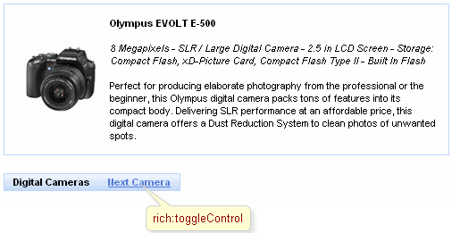
As it was mentioned above, the control could be in any place in layout and linked to a switching panel that is managed with "for" attribute (in the "for" attribute the full component "id" is specified according to naming containers).
The togglePanel could be also switched from the side of the control instead of being strictly defined in "switchOrder" attribute of <rich:togglePanel>.
Example:
...
<rich:togglePanel id="panel" initialState="empty" switchType="client">
<f:facet name="first">
<h:panelGroup>
<rich:toggleControl for="helloForm:panel" value="Empty" switchToState="empty"/>
<rich:toggleControl for="helloForm:panel" value=" Second" switchToState="second"/>
<!--Some content-->
</h:panelGroup>
</f:facet>
<f:facet name="second">
<h:panelGroup>
<rich:toggleControl for="helloForm:panel" value="Empty" switchToState="empty"/>
<rich:toggleControl for="helloForm:panel" value=" first" switchToState="first"/>
<!--Some content-->
</h:panelGroup>
</f:facet>
<f:facet name="empty">
<h:panelGroup>
<rich:toggleControl for="helloForm:panel" value="first" switchToState="first"/>
<rich:toggleControl for="helloForm:panel" value=" second" switchToState="second"/>
</h:panelGroup>
</f:facet>
</rich:togglePanel>
...
In this example the switching is performed on facets specified in the "switchToState" attribute.
Information about the "process" attribute usage you can find " Decide what to process " guide section.

Grouping and an input side definition is described for toolBarGroup that defines this functionality.
For example, when setting a separator of a disc type, the following result is produced:
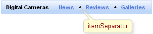
Moreover, for toolBar style "width" and "height" attributes are placed above all.
A custom separator can be added with the help of "itemSeparator" facet.
Example:
...
<f:facet name="itemSeparator">
<rich:separator width="2" height="14" />
</f:facet>
...
Custom separator can be also specified by URL to the separator image in the attribute "itemSeparator" of the <rich:toolBar> .
Example:
...
<rich:toolBar id="toolBar" width="#{bean.width}" height="#{bean.height}" itemSeparator="/images/separator_img.jpg"/>
...
This is a result:

Table of <rich:toolBar> attributes.
Table 6.155. Facets
| Facet name | Description |
|---|---|
| itemSeparator | Defines the custom separator. Related attribute is "itemSeparator" |
Table 6.156. Classes names that define a component appearance
| Class name | Description |
|---|---|
| rich-toolbar | Defines styles for a toolbar element |
| rich-toolbar-item | Defines styles for a toolbar item |
You can find all necessary information about style classes redefinition in Definition of Custom Style Classes section.
On the component LiveDemo page you can see the example of <rich:toolBar> usage and sources for the given example.
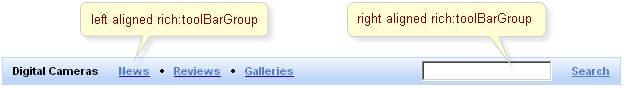
...
<rich:toolBar itemSeparator="disc" width="500">
<rich:toolBarGroup itemSeparator="line">
<h:commandLink value="Command 1.1"/>
<h:commandLink value="Command 2.1"/>
</rich:toolBarGroup>
<rich:toolBarGroup itemSeparator="line" location="right">
<h:commandLink value="Command 1.2"/>
<h:commandLink value="Command 2.2"/>
</rich:toolBarGroup>
</rich:toolBar>
...
The code result is the following:

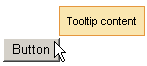
There are three ways to attach the <rich:toolTip> to a page element. The first and simplest one is when the <rich:toolTip> is nested into a page element the tooltip is applied to. This way is shown on example in the Creating the Component with a Page Tag section. The "attached" attribute is "true" by default in this case, which means that the tolltip will be invoked automatically when the mouse cursor is hovered above the parent component.
The second one uses <rich:toolTip> "for" attribute. In this case the <rich:toolTip> is defined separately from a component it is applied to.
Example:
<rich:panel id="panelId">
...
</rich:panel>
<rich:toolTip value="This is a tooltip." for="panelId"/>
These two ways are also applicable for HTML elements that are not presented in components tree built by facelets. Use "for" attribute to attach the <rich:toolTip> in both cases.
Example:
<!-- The <rich:toolTip> is nested into the parent HTML element -->
<div id="para1">
<p>This paragraph and tooltip are nested into the same <div> element.</p>
<rich:toolTip for="para1">This is a tooltip.</rich:toolTip>
</div>
<!-- The <rich:toolTip> is defined separately -->
<div id="para2">
<p>The tooltip for this paragraph is defined separately.</p>
</div>
<rich:toolTip for="para2">This is a tooltip.</rich:toolTip>
The third way to invoke the <rich:toolTip> uses JS API function. List of JS API functions available for <rich:toolTip> is listed below. JS API functions are defined for a component the <rich:toolTip> is applied to. The <rich:toolTip> "attached" attribute should be set to "false" in this case.
Example:
<rich:panel id="panelId" onclick="#{rich:component("tooltipId")}.show(event);" />
<a4j:form>
<rich:toolTip id="tooltipId" attached="false" value="This is a tooltip."/>
</a4j:form>
Notes:
To provide <rich:toolTip> component proper work in complex cases do the following:
specify "id's" for both <rich:toolTip> and component it is applied to;
define the <rich:toolTip> as last child, when nesting it into the component the <rich:toolTip> is applied to;
put the <rich:toolTip> into <a4j:form> when invoking it with JS API function.
The "mode" attribute is provided you to control the way of data loading to <rich:toolTip> . The component works properly in client and Ajax modes. In client mode <rich:toolTip> content is rendered once on the server and could be rerendered only via external submit. In Ajax mode <rich:toolTip> content is requested from server for every activation. For Ajax mode there is possibility to define a facet "defaultContent" , which provides default <rich:toolTip> content to be displayed, while main content is loading into the <rich:toolTip> (see the example below).
Example:
...
<h:commandLink value="Simple Link" id="link">
<rich:toolTip followMouse="true" direction="top-right" mode="ajax" value="#{bean.toolTipContent}" horizontalOffset="5"
verticalOffset="5" layout="block">
<f:facet name="defaultContent">
<f:verbatim>DEFAULT TOOLTIP CONTENT</f:verbatim>
</f:facet>
</rich:toolTip>
</h:commandLink>
...
This is the result:
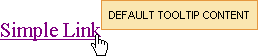
And after <rich:toolTip> loaded it is changed to next one:
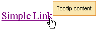
<rich:toolTip>
appears attached to the corner
dependent on the
"direction"
attribute.
By default it is positioned bottom-right.
<rich:toolTip>
activation occurs after an event,
defined on the parent component, takes into consideration the "delay" attribute
or after calling JS API function show().
"hideEvent"
attribute defines the way
how
<rich:toolTip>
disappears.
It default value is "none", so the
<rich:toolTip>
does not disappears.
Deactivation may be set for example on
mouseout
event on the parent component
(excepting the situation when the mouse is hovered onto the
<rich:toolTip>
itself)
or after calling JS API function hide().
By default, <rich:toolTip> appears smart positioned. But as you can see from the previous example, you can define an appearance direction via the corresponding attribute "direction" . And also it's possible to define vertical and horizontal offsets relatively to a mouse position.
Disabled
<rich:toolTip>
is rendered to a page as usual but JS that responds for its activation is disabled until enable() is called.
Moreover, to add some JavaScript effects, client events defined on it are used:
Standart:
"onclick"
"ondblclick"
"onmouseout"
"onmousemove"
"onmouseover"
Special:
"onshow" - Called after the tooltip is called (some element hovered) but before its request
"oncomplete" - Called just after the tooltip is shown
"onhide" - Called after the tooltip is hidden
Table of <rich:toolTip> attributes.
Table 6.159. JavaScript API
| Function | Description |
|---|---|
| show() | Shows the corresponding toolTip |
| hide() | Hides the corresponding toolTip |
| enable() | Enables the corresponding toolTip |
| disable() | Disables the corresponding toolTip |
Table 6.160. Facets
| Facet name | Description |
|---|---|
| defaultContent | Defines the default content for toolTip. It is used only if mode = "ajax" |
Table 6.161. Classes names that define a component appearance
| Class name | Description |
|---|---|
| rich-tool-tip | Defines styles for a wrapper <span> or <div> element of a toolTip |
You can find all necessary information about style classes redefinition in Definition of Custom Style Classes section.
On the component LiveDemo page you can see the example of <rich:toolTip> usage and sources for the given example.
- 6.11.1. < rich:calendar > available since 3.1.0
- 6.11.2. < rich:colorPicker > available since 3.3.1
- 6.11.3. < rich:comboBox > available since 3.2.0
- 6.11.4. < rich:editor > available since 3.3.0
- 6.11.5. < rich:fileUpload > available since 3.2.0
- 6.11.6. < rich:inplaceInput > available since 3.2.0
- 6.11.7. < rich:inplaceSelect > available since 3.2.0
- 6.11.8. < rich:inputNumberSlider > available since 3.0.0
- 6.11.9. < rich:inputNumberSpinner > available since 3.0.0
- 6.11.10. < rich:suggestionbox > available since 3.0.0
In this section you will find the components that help you deal with various kinds of user inputs from picking a date, WYSIWYG text editing to uploading a file.
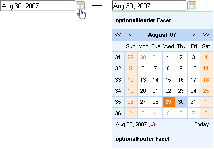
ajax— in this mode the <rich:calendar> requests portions of data for element rendering from special Data Model. The default calendar Data Model could be redefined with the help of dataModel attribute that points to the object that implementsCalendarDataModelinterface. If "dataModel" attribute has "null" value, data requests are not sent. In this case the "ajax" mode is equal to the "client".
The <rich:calendar> could be represented on a page in two ways (a) the calendar itself without input field and button and (b) date input with button and popping-up calendar. This is defined with "popup" attribute, which is "true" by default. For popup rendering a "lazy" loading is implemented: a client side script method builds the popup after request is completed. Such improvement speeds up page loading time.

By default the <rich:calendar> is rendered as input filed with a button and calendar hidden in a pop-up. The button is represented with calendar pictogramm. This pictogramm could be easily changed with the help of "buttonIcon" and "buttonIconDisabled" attributes, which specify the icon for button enabled and disabled states respectively. To change the button appearance from icon to usual button define the value for the "buttonLabel" attribute. In this case "buttonIcon" and "buttonIconDisabled" attributes are ignored.
There are two attributes that specify the place where the popup calendar is rendered relative to the input field and icon: "jointPoint" and "direction" attributes. By default the pop-up calendar appears under input and aligned with it left border (see Fig. 6.211, b). Speaking in terms of RichFaces it means that <rich:calendar> jointPoint="bottom-left" and direction="bottom-right". There are four possible joint-points and four possible directions for each joint-point. Besides that, the values of "jointPoint" and "direction" could be set to "auto" that activates smart pop-up positioning.
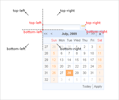
Figure 6.119. Four possible positions of joint-points (red) and four possible directions (black) shown for bottom-left joint-point.
Usage "currentDate" attribute isn't available in the popup mode.
With help of the "currentDate" attribute you can define month and year which will be displayed currently.
The "value" attribute stores selected date currently.
The difference between the value and currentDate attributes
The "todayControlMode" attribute defines the mode for "today" control. Possible values are:
"hidden" - in this mode "Today" button will not be displayed
"select" - (default) in this state "Today" button activation will scroll the calendar to the current date and it become selected date
"scroll" - in this mode "Today" activation will simply scroll the calendar to current month without changing selected day.
With the help of the "readonly" attribute you can make date, time and input field unavailable, but you can look through the next/previous month or the next/previous year.
In order to disable the component, use the "disabled" attribute. With its help both controls are disabled in the "popup" mode.
The "onchanged" attribute is used to define an event that is triggered from date selection, as shown in the example below:
...
<rich:calendar id="date" value="#{bean.dateTest}">
<a4j:support event="onchanged" reRender="mainTable"/>
</rich:calendar>
...
The "ondateselect" attribute is used to define an event that is triggered before date selection. It could be used for possibility of date selection canceling. See an example below:
...
<rich:calendar id="date" value="#{bean.dateTest}" ondateselect="if (!confirm('Are you sure to change date?')){return false;}"/>
...
The "ondateselected" attribute is used to define an event that is triggered after date selection.
"oncurrentdateselected" event is fired when the "next/previous month" or "next/previous year" button is pressed, and the value is applied.
"oncurrentdateselect" event is fired when the "next/previous month" or "next/previous year" button is pressed, but the value is not applied yet (you can change the logic of applying the value). Also this event could be used for possibility of "next/previous month" or "next/previous year" selection canceling. See an example below:
Example:
...
<rich:calendar id="date" value="#{bean.dateTest}" oncurrentdateselect="if (!confirm('Are you sure to change month(year)?')){return false;}"
oncurrentdateselected="alert('month(year) select:'+event.rich.date.toString());"/>
...
How to use these attributes see also on the RichFaces Users Forum.
Information about the "process" attribute usage you can find in the corresponding section .
The
"label"
attribute is a generic attribute. The
"label"
attribute provides an association between a component, and
the message that the component (indirectly) produced. This attribute
defines the parameters of localized error and informational messages
that occur as a result of conversion, validation, or other application
actions during the request processing lifecycle. With the help of this
attribute you can replace the last parameter substitution token shown
in the messages. For example, {1} for
"DoubleRangeValidator.MAXIMUM",
{2} for "ShortConverter.SHORT".
The "defaultTime" attribute to set the default time value for the current date in two cases:
If time is not set
If another date is selected and the value of the "resetTimeOnDateSelect" attribute is set to "true"
The
"enableManualInput"
attribute enables/disables input field, so when
enableManualInput = "false" , user
can only pick the date manually and has no possibility to type in the
date (default value is "false").
The
<rich:calendar>
component allows to use
"header"
,
"footer"
,
"optionalHeader"
,
"optionalFooter"
facets. The following elements are available in these
facets: {currentMonthControl},
{nextMonthControl}, {nextYearControl},
{previousYearControl},
{previousMonthControl},
{todayControl}, {selectedDateControl}. These
elements could be used for labels output.
Also you can use
"weekNumber"
facet with available {weekNumber},
{elementId} elements and
"weekDay"
facet with {weekDayLabel},
{weekDayLabelShort},
{weekDayNumber}, {isWeekend},
{elementId} elements.
{weekNumber}, {weekDayLabel},
{weekDayLabelShort},
{weekDayNumber} elements could be used for labels output,
{isWeekend}, {elementId} - for
additional processing in JavaScript code.
These elements are shown on the picture below.
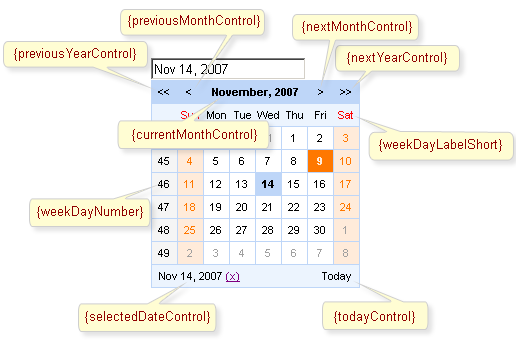
Simple example of usage is placed below.
Example:
...
<!-- Styles for cells -->
<style>
.width100{
width:100%;
}
.talign{
text-align:center;
}
</style>
...
...
<rich:calendar id="myCalendar" popup="true" locale="#{calendarBean.locale}" value="#{bean.date}"
preloadRangeBegin="#{bean.date}" preloadRangeEnd="#{bean.date}" cellWidth="40px" cellHeight="40px">
<!-- Customization with usage of facets and accessible elements -->
<f:facet name="header">
<h:panelGrid columns="2" width="100%" columnClasses="width100, fake">
<h:outputText value="{selectedDateControl}" />
<h:outputText value="{todayControl}" style="font-weight:bold; text-align:left"/>
</h:panelGrid>
</f:facet>
<f:facet name="weekDay">
<h:panelGroup style="width:60px; overflow:hidden;" layout="block">
<h:outputText value="{weekDayLabelShort}"/>
</h:panelGroup>
</f:facet>
<f:facet name="weekNumber">
<h:panelGroup>
<h:outputText value="{weekNumber}" style="color:red"/>
</h:panelGroup>
</f:facet>
<f:facet name="footer">
<h:panelGrid columns="3" width="100%" columnClasses="fake, width100 talign">
<h:outputText value="{previousMonthControl}" style="font-weight:bold;"/>
<h:outputText value="{currentMonthControl}" style="font-weight:bold;"/>
<h:outputText value="{nextMonthControl}" style="font-weight:bold;"/>
</h:panelGrid>
</f:facet>
<h:outputText value="{day}"></h:outputText>
</rich:calendar>
...
This is a result:
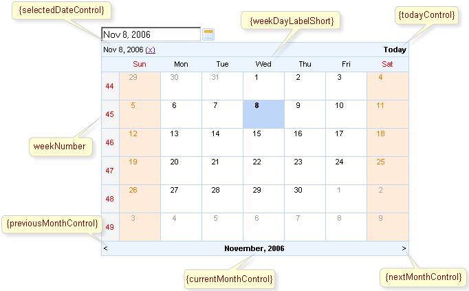
As it's shown on the picture above
{selectedDateControl}, {todayControl}
elements are placed in the
"header"
facet, {previousMonthControl},
{currentMonthControl},
{nextMonthControl} - in the
"footer"
facet, {weekDayLabelShort} - in the
"weekDay"
facet, {nextYearControl},
{previousYearControl} are absent. Numbers of
weeks are red colored.
It is possible to show and manage date. Except scrolling controls you can use quick month and year selection feature. It's necessary to click on its field, i.e. current month control, and choose required month and year.
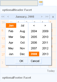
Also the
<rich:calendar>
component allows to show and manage time. It's
necessary to define time in a pattern (for example, it could be
defined as "d/M/yy HH:mm"). Then after
you choose some data in the calendar, it becomes possible to manage
time for this date. For time editing it's necessary to click
on its field (see a picture below). To clean the field click on the
"Clean".
It's possible to handle events for calendar from JavaScript code. A simplest example of usage JavaScript API is placed below:
Example:
...
<rich:calendar value="#{calendarBean.selectedDate}" id="calendarID"
locale="#{calendarBean.locale}"
popup="#{calendarBean.popup}"
datePattern="#{calendarBean.pattern}"
showApplyButton="#{calendarBean.showApply}" style="width:200px"/>
<a4j:commandLink onclick="$('formID:calendarID').component.doExpand(event)" value="Expand"/>
...
Also the discussion about this problem can be found on the RichFaces Users Forum.
The
<rich:calendar>
component provides the possibility to use
internationalization method to redefine and localize the labels. You
could use application resource bundle and define
RICH_CALENDAR_APPLY_LABEL,
RICH_CALENDAR_TODAY_LABEL,
RICH_CALENDAR_CLOSE_LABEL,
RICH_CALENDAR_OK_LABEL,
RICH_CALENDAR_CLEAN_LABEL,
RICH_CALENDAR_CANCEL_LABEL there.
You could also pack org.richfaces.renderkit.calendar
resource bundle with your JARs defining the same
properties.
Note:
Only for Internet Explorer 6 and later. To make <rich:calendar> inside <rich:modalPanel> rendered properly, enable the standards-compliant mode. Explore !DOCTYPE reference at MSDN to find out how to do this.
Table of <rich:calendar> attributes.
Table 6.163. JavaScript API
| Function | Description |
|---|---|
| selectDate(date) | Selects the date specified. If the date isn't in current month - performs request to select |
| isDateEnabled(date) | Checks if given date is selectable (to be implemented) |
| enableDate(date) | Enables date cell control on the calendar (to be implemented) |
| disableDate(date) | Disables date cell control on the calendar (to be implemented) |
| enableDates(date[]) | Enables dates cell controls set on the calendar (to be implemented) |
| disableDates(date[]) | Disables dates cell controls set on the calendar (to be implemented) |
| nextMonth() | Navigates to next month |
| nextYear() | Navigates to next year |
| prevMonth() | Navigates to previous month |
| prevYear() | Navigates to previous year |
| today() | Selects today date |
| getSelectedDate() | Returns currently selected date |
| Object getData() | Returns additional data for the date |
| getCurrentMonth() | Returns number of the month currently being viewed |
| getCurrentYear() | Returns number of the year currently being viewed |
| doCollapse() | Collapses calendar element |
| doExpand() | Expands calendar element |
| resetSelectedDate() | Clears a selected day value |
| doSwitch() | Inverts a state for the popup calendar |
Table 6.164. Facets
| Facet | Description |
|---|---|
| header | Redefines calendar header. Related attribute is "showHeader" |
| footer | Redefines calendar footer. Related attribute is "showFooter" |
| optionalHeader | Defines calendar's optional header |
| optionalFooter | Defines calendar's optional footer |
| weekNumber | Redefines week number |
| weekDay | Redefines names of the week days. Related attributes are "weekDayLabels" and "weekDayLabelsShort" |
Table 6.165. Style classes (selectors) with the corresponding skin parameters
| Class (selector) name | Description | Skin Parameter | CSS properties mapped |
|---|---|---|---|
| .rich-calendar-exterior | Defines styles for a popup element exterior | panelBorderColor | border-color |
| .rich-calendar-header-optional | Defines styles for a header | panelBorderColor | border-bottom-color |
| additionalBackgroundColor | background-color | ||
| generalSizeFont | font-size | ||
| generalFamilyFont | font-family | ||
| .rich-calendar-header | Defines styles for an optional header | panelBorderColor | border-bottom-color |
| additionalBackgroundColor | background-color | ||
| generalSizeFont | font-size | ||
| generalFamilyFont | font-family | ||
| .rich-calendar-cell | Defines styles for cells with days | panelBorderColor | border-bottom-color, border-right-color |
| tableBackgroundColor | background-color | ||
| generalSizeFont | font-size | ||
| generalFamilyFont | font-family | ||
| .rich-calendar-tool | Defines styles for toolbars | headerBackgroundColor | background-color |
| headerSizeFont | font-size | ||
| headerFamilyFont | font-family | ||
| headerWeightFont | font-weight | ||
| headerTextColor | color | ||
| .rich-calendar-month | Defines styles for names of months | headerBackgroundColor | background-color |
| headerSizeFont | font-size | ||
| headerFamilyFont | font-family | ||
| headerWeightFont | font-weight | ||
| headerTextColor | color | ||
| .rich-calendar-days | Defines styles for names of working days in a header | panelBorderColor | border-bottom-color, border-right-color |
| additionalBackgroundColor | background | ||
| generalSizeFont | font-size | ||
| generalFamilyFont | font-family | ||
| .rich-calendar-week | Defines styles for weeks numbers | panelBorderColor | border-bottom-color, border-right-color |
| additionalBackgroundColor | background | ||
| calendarWeekBackgroundColor | background-color | ||
| generalSizeFont | font-size | ||
| generalFamilyFont | font-family | ||
| .rich-calendar-holly | Defines styles for holiday | calendarHolidaysBackgroundColor | background-color |
| calendarHolidaysTextColor | color | ||
| .rich-calendar-today | Defines styles for cell with a current date | calendarCurrentBackgroundColor | background-color |
| calendarCurrentTextColor | color | ||
| .rich-calendar-select | Defines styles for a selected day | headerBackgroundColor | background-color |
| headerTextColor | color | ||
| .rich-calendar-hover | Defines styles for a hovered day | calendarSpecBackgroundColor | background-color |
| calendarSpecTextColor | color | ||
| .rich-calendar-toolfooter | Defines styles for a tollbar items in the footer | additionalBackgroundColor | background |
| generalSizeFont | font-size | ||
| generalFamilyFont | font-family | ||
| .rich-calendar-tool-btn-hover | Defines styles for a toolbar button hovered | calendarWeekBackgroundColor | background-color |
| generalTextColor | color | ||
| tableBackgroundColor | border-color | ||
| panelBorderColor | border-right-color, border-bottom-color | ||
| .rich-calendar-tool-btn-press | Defines styles for a toolbar button pressed | panelBorderColor | border-color |
| tableBackgroundColor | border-right-color, border-bottom-color | ||
| .rich-calendar-footer | Defines styles for a footer | panelBorderColor | border-right-color, border-top-color |
| additionalBackgroundColor | background | ||
| generalSizeFont | font-size | ||
| generalFamilyFont | font-family | ||
| .rich-calendar-footer-optional | Defines styles for an optional footer | panelBorderColor | border-right-color, border-top-color |
| additionalBackgroundColor | background | ||
| generalSizeFont | font-size | ||
| generalFamilyFont | font-family | ||
| .rich-calendar-editor-shadow | Defines styles for the calendar editor shadow | tableBackgroundColor | background |
| .rich-calendar-time-layout | Defines styles for a popup element during time selection | panelBorderColor | border-color |
| additionalBackgroundColor | background | ||
| generalSizeFont | font-size | ||
| generalFamilyFont | font-family | ||
| .rich-calendar-date-layout | Defines styles for a popup element during quick month/year selection | panelBorderColor | border-color |
| tableBackgroundColor | background | ||
| generalSizeFont | font-size | ||
| generalFamilyFont | font-family | ||
| .rich-calendar-time-layout input | Defines styles for the input fields in the popup element during time selection | generalSizeFont | font-size |
| generalFamilyFont | font-family | ||
| .rich-calendar-date-layout-cancel | Defines styles for the "Cancel" button | additionalBackgroundColor | background |
| panelBorderColor | border-top-color | ||
| .rich-calendar-date-layout-ok | Defines styles for the "Ok" button | additionalBackgroundColor | background |
| panelBorderColor | border-top-color | ||
| .rich-calendar-date-layout-split | Defines styles for a wrapper <td> element for month items near split line | panelBorderColor | border-right-color |
| .rich-calendar-time-btn | Defines styles for a button in the popup element for time section | tableBackgroundColor | border-color |
| panelBorderColor | border-right-color, border-bottom-color | ||
| .rich-calendar-time-btn-press | Defines styles for a pressed button in the popup element for time section | tableBackgroundColor | border-right-color, border-bottom-color |
| panelBorderColor | border-color | ||
| calendarWeekBackgroundColor | background-color | ||
| .rich-calendar-spinner-buttons | Defines styles for a wrapper <td> element for spinner buttons in the popup element for time selection | headerBackgroundColor | background-color, border-color |
| .rich-calendar-spinner-input-container | Defines styles for a wrapper <td> element of a spinner input field in the popup element for time selection | controlBackgroundColor | background-color |
| panelBorderColor | border-color | ||
| subBorderColor | border-right-color, border-bottom-color | ||
| .rich-calendar-spinner-input | Defines styles for a spinner input field in the popup element for time section | buttonSizeFont | font-size |
| buttonFamilyFont | font-family | ||
| .rich-calendar-editor-layout-shadow | Defines styles for the layout shadow of the calendar editor | shadowBackgroundColor | background-color |
| .rich-calendar-editor-btn-over | Defines styles for the calendar editor button when the pointer is moved onto | panelBorderColor | border-color |
| calendarSpecBackgroundColor | background | ||
| .rich-calendar-editor-btn-selected | Defines styles for the calendar editor button selected | calendarCurrentBackgroundColor | background-color |
| calendarCurrentTextColor | color | ||
| .rich-calendar-editor-tool-over | Defines styles for a hovered toolbar items in the calendar editor | additionalBackgroundColor | background |
| tableBackgroundColor | border-color | ||
| panelBorderColor | border-right-color, border-bottom-color | ||
| .rich-calendar-editor-tool-press | Defines styles for a pressed toolbar items in the calendar editor | additionalBackgroundColor | background |
| panelBorderColor | border-color | ||
| tableBackgroundColor | border-right-color, border-bottom-color |
Table 6.166. Style classes (selectors) without skin parameters
| Class name | Description |
|---|---|
| .rich-calendar-input | Defines styles for an input field |
| .rich-calendar-button | Defines styles for a popup button |
| .rich-calendar-weekends | Defines styles for names of weekend in a header |
| .rich-calendar-popup | Defines styles for a popup element |
| .rich-calendar-tool-btn | Defines styles for a toolbar buttons |
| .rich-calendar-tool-btn-disabled | Defines styles for a toolbar buttons disabled |
| .rich-calendar-tool-close | Defines styles for a toolbar "Close" button |
| .rich-calendar-boundary-dates | Defines styles for an active boundary button |
| .rich-calendar-btn | Defines styles for a date button |
| .rich-calendar-editor-btn | Defines styles for a button in the calendar editor |
| .rich-calendar-time-layout-fields | Defines styles for a wrapper <td> element for input fields and buttons |
| .rich-calendar-spinner-up | Defines styles for the "Up" spinner button in the popup element for time section |
| .rich-calendar-spinner-down | Defines styles for the "Down" spinner button in the popup element for time section |
| .rich-calendar-spinner-pressed | Defines styles for a pressed spinner button in the popup element for time section |
| .rich-calendar-time-layout-ok | Defines styles for the "Ok" button in the popup element for time section |
| .rich-calendar-time-layout-cancel | Defines styles for the "Cancel" button in the popup element for time section |
You can find all necessary information about style classes redefinition in Definition of Custom Style Classes section.
On the component LiveDemo page you can see the example of <rich:calendar> usage and sources for the given example.
How to use JavaScript API see on the RichFaces Users Forum.
The "value" attribute stores the selected color.
...
<rich:colorPicker value="#{bean.color}" colorMode="rgb" />
...

The <rich:colorPicker> component has two representation states: flat and inline. With the help of the "flat" attribute you can define whether the component is rendered flat.
Example:
...
<rich:colorPicker value="#{bean.color}" flat="true" />
...
The component specific event handler "onbeforeshow" captures the event which occurs before the <rich:colorPicker> widget is opened. The "onbeforeshow" attribute could be used in order to cancel this event. See the example below:
...
<rich:colorPicker value="#{bean.color}" onbeforeshow="if (!confirm('Are you sure you want to change a color?')){return false;}" />
...
The "showEvent" attribute defines the event that shows <rich:colorPicker> widget. The default value is "onclick".
The <rich:colorPicker> component allows to use the "icon" facet.
You can also customize
<rich:colorPicker>
rainbow slider (  ) with the help of the
"arrows"
facet.
) with the help of the
"arrows"
facet.
...
<rich:colorPicker value="#{bean.color}">
<f:facet name="icon">
<h:graphicImage value="/pages/colorPicker_ico.png" />
</f:facet>
<f:facet name="arrows">
<f:verbatim>
<div style="width: 33px; height: 5px; border: 1px solid #bed6f8; background:none;" />
</f:verbatim>
</f:facet>
</rich:colorPicker>
...
This is the result:
Table of <rich:colorPicker> attributes.
Table 6.169. Style classes (selectors) with the corresponding skin parameters
| Class (selector) name | Description | Skin Parameter | CSS properties mapped |
|---|---|---|---|
| .rich-colorpicker-ext | Defines styles for the component widget | panelBorderColor | border-color |
| generalBackgroundColor | background-color | ||
| generalFamilyFont | font-family | ||
| .rich-color-picker-span input | Defines styles for the input field that contains selected color | panelBorderColor | border-color |
| generalSizeFont | font-size | ||
| generalFamilyFont | font-family | ||
| .rich-color-picker-ext input | Defines styles for the input field within the component widget | controlTextColor | color |
| controlBackgroundColor | background-color | ||
| .rich-color-picker-ext label | Defines styles for the label within the component widget | generalTextColor | color |
| generalSizeFont | font-size | ||
| generalFamilyFont | font-family | ||
| .rich-color-picker-icon | Defines styles for the component icon | panelBorderColor | border-color |
| .rich-color-picker-color | Defines styles for the color palette | panelBorderColor | border-color |
| .rich-color-picker-new-color | Defines styles for the already selected color | panelBorderColor | border-color |
| .rich-color-picker-current-color | Defines styles for the currently selected color | panelBorderColor | border-color |
| .rich-color-picker-cancel | Defines styles for the "Cancel" button | buttonFontSize | font-size |
| buttonFamilyFont, generalFamilyFont | font-family | ||
| headerTextColor | color | ||
| headerBackgroundColor, panelBorderColor | border-color | ||
| headerBackgroundColor | background-color | ||
| .rich-color-picker-submit | Defines styles for the "Apply" button | buttonFontSize, panelBorderColor | font-size |
| buttonFamilyFont, generalFamilyFont | font-family | ||
| headerTextColor | color | ||
| headerBackgroundColor, panelBorderColor | border-color | ||
| headerBackgroundColor | background-color | ||
| .rich-color-picker-colors-input | Defines styles for the hex, RGB, and HSB input fileds | generalSizeFont | font-size |
| generalFamilyFont | font-family | ||
| generalTextColor | color | ||
| panelBorderColor | border-color | ||
| controlBackgroundColor | background-color |
Table 6.170. Style classes (selectors) without skin parameters
| Selector name | Description |
|---|---|
| .rich-color-picker-span | Defines styles for the wrapper <span> element of the component |
| .rich-color-picker-wrapper | Defines styles for the wrapper <div> element of a widget |
| .rich-color-picker-color div div | Defines styles for the color picker icon within the color palette |
| .rich-color-picker-rainbow | Defines styles for the widget rainbow |
| .rich-color-picker-rainbow div | Defines styles for the slider of the widget rainbow |
| .rich-color-picker-hex-wrapper | Defines styles for the wrapper of the region for selecting a color in the hex model |
| .rich-color-picker-rgb-wrapper | Defines styles for the wrapper of the region for selecting a color in the RGB model |
| .rich-color-picker-rgb-r | Defines styles for the region for setting red color intensity in the RGB model |
| .rich-color-picker-rgb-g | Defines styles for the region for setting green color intensity in the RGB model |
| .rich-color-picker-rgb-b | Defines styles for the region for setting blue color intensity in the RGB model |
| .rich-color-picker-hsb-wrapper | Defines styles for the wrapper of the region for selecting a color in the HSB color scheme |
| .rich-color-picker-hsb-h | Defines styles for the region for setting the H value in the HSB color scheme |
| .rich-color-picker-hsb-s | Defines styles for the region for setting the S value in the HSB color scheme |
| .rich-color-picker-hsb-b | Defines styles for the region for setting the B value in the HSB color scheme |
You can find all necessary information about style classes redefinition in Definition of Custom Style Classes section.
On the component LiveDemo page you can see the example of the <rich:colorPicker> component usage and sources for the given example.
The <rich:comboBox> component allows to create a combobox element with the built-in Ajax capability.
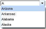
There are two ways to get values for the popup list of suggestions:
Using the "suggestionValues" attribute, that defines the suggestion collection
...
<rich:comboBox value="#{bean.state}" suggestionValues="#{bean.suggestions}" />
...
Using the <f:selectItem /> or <f:selectItems /> JSF components.
...
<rich:comboBox value="#{bean.state}" valueChangeListener="#{bean.selectionChanged}">
<f:selectItems value="#{bean.selectItems}"/>
<f:selectItem itemValue="Oregon"/>
<f:selectItem itemValue="Pennsylvania"/>
<f:selectItem itemValue="Rhode Island"/>
<f:selectItem itemValue="South Carolina"/>
</rich:comboBox>
...
The "value" attribute stores value from input after submit.
...
<rich:comboBox value="#{bean.state}" suggestionValues="#{bean.suggestions}" directInputSuggestions="true" />
...
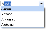
The "selectFirstOnUpdate" attribute defines if the first value from suggested is selected in a popup list. If it's "false" nothing is selected in the list before a user hovers some item with the mouse.
...
<rich:comboBox value="#{bean.state}" suggestionValues="#{bean.suggestions}" selectFirstOnUpdate="false" />
...
This is a result:
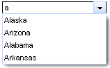
The "defaultLabel" attribute defines the default label of the input element. Simple example is placed below.
...
<rich:comboBox value="#{bean.state}" suggestionValues="#{bean.suggestions}" defaultLabel="Select a city..." />
...
This is a result:

With the help of the "disabled" attribute you can disable the whole <rich:comboBox> component. See the following example.
...
<rich:comboBox value="#{bean.state}" suggestionValues="#{bean.suggestions}" defaultLabel="Select a city..." disabled="true" />
...
This is a result:

The
"enableManualInput"
attribute enables/disables input field, so when enableManualInput = "false",
user can only pick the value manually and has no possibility to type in the value (default value is "false").
The <rich:comboBox> component provides to use specific event attributes:
"onlistcall" which is fired before the list opening and gives you a possibility to cancel list popup/update
"onselect" which gives you a possibility to send Ajax request when item is selected
The <rich:comboBox> component allows to use sizes attributes:
"listWidth" and "listHeight" attributes specify popup list sizes with values in pixels
"width" attribute customizes the size of input element with values in pixels.
Table of <rich:comboBox> attributes.
Table 6.172. JavaScript API
| Function | Description |
|---|---|
| showList() | Shows the popup list |
| hideList() | Hides the popup list |
| enable() | Enables the control for input |
| disable() | Disables the control for input |
Table 6.173. Style classes (selectors) with the corresponding skin parameters
| Class (selector) name | Description | Skin Parameter | CSS properties mapped |
|---|---|---|---|
| input.rich-combobox-button-background, input.rich-combobox-button-background-disabled, input.rich-combobox-button-background-inactive | Define styles for a background of the combobox button, disabled button and inactive button respectively | tabBackgroundColor | background-color |
| input.rich-combobox-button-pressed-background | Define styles for a background of the pressed button | tabBackgroundColor | background-color |
| input.rich-combobox-button, input.rich-combobox-button-inactive, input.rich-combobox-button-disabled | Define styles for the combobox button, disabled button and inactive button respectively | panelBorderColor | border-top-color |
| panelBorderColor | border-left-color | ||
| .rich-combobox-font, input.rich-combobox-font | Define styles for a font | generalSizeFont | font-size |
| generalFamilyFont | font-family | ||
| generalTextColor | color | ||
| input.rich-combobox-font-disabled, .rich-combobox-font-disabled | Defines styles for a disabled font | headerFamilyFont | font-family |
| headerSizeFont | font-size | ||
| input.rich-combobox-font-inactive, .rich-combobox-font-inactive | Defines styles for an inactive font | generalSizeFont | font-size |
| generalFamilyFont | font-family | ||
| generalTextColor | color | ||
| .rich-combobox-item | Defines styles for an item | generalSizeFont | font-size |
| generalFamilyFont | font-family | ||
| generalTextColor | color | ||
| .rich-combobox-input, .rich-combobox-input-disabled, .rich-combobox-input-inactive | Define styles for an input field, a disabled input field, an inactive input field respectively | controlBackgroundColor | background-color |
| panelBorderColor | border-bottom-color | ||
| panelBorderColor | border-right-color | ||
| .rich-combobox-item-selected | Defines styles for a selected item | headerBackgroundColor | background-color, border-color |
| headerTextColor | color | ||
| .rich-combobox-list-decoration | Defines styles for a list decoration | panelBorderColor | border-color |
| tableBackgroundColor | background | ||
| input.rich-combobox-button-hovered | Defines styles for a hovered button | selectControlColor | border-color |
Table 6.174. Style classes (selectors) without skin parameters
| Class name | Description |
|---|---|
| .rich-combobox-shell | Defines styles for a wrapper <div> element of a list |
| .rich-combobox-list-position | Defines position of a list |
| .rich-combobox-list-scroll | Defines styles for a list scrolling |
| input.rich-combobox-button-icon | Defines styles for a button icon |
| input.rich-combobox-button-icon-inactive | Defines styles for an inactive button icon |
| input.rich-combobox-button-icon-disabled | Defines styles for a disabled button icon |
| .rich-combobox-shadow | Defines styles for a wrapper <div> element of a shadow |
| .rich-combobox-shadow-tl | Defines styles for a top-left element of a shadow |
| .rich-combobox-shadow-tr | Defines styles for a top-right element of a shadow |
| .rich-combobox-shadow-bl | Defines styles for a bottom-left element of a shadow |
| .rich-combobox-shadow-br | Defines styles for a bottom-right element of a shadow |
You can find all necessary information about style classes redefinition in Definition of Custom Style Classes section.
Visit the ComboBox page at RichFaces LiveDemo for examples of component usage and their sources.
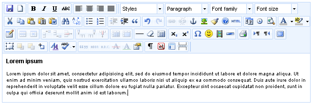
The easiest way to place the <rich:editor> on a page is as follows:
<rich:editor value="#{bean.editorValue}" />
Implementation of <rich:editor> provides three ways to define the properties of the component:
The three methods are described in details in the chapter.
For example, a theme for the editor can be defined using the "theme" attribute like this:
<rich:editor value="#{bean.editorValue}" theme="advanced" />
Setting a different skin for the editor can be done using the "skin" attribute.
...
<rich:editor value="#{editor.submit}" theme="advanced" viewMode="#{editor.viewMode}" >
...
<h:selectOneRadio value="#{editor.viewMode}" onchange="submit();">
<f:selectItem itemValue="visual" itemLabel="visual" />
<f:selectItem itemValue="source" itemLabel="source" />
</h:selectOneRadio>
...
</rich:editor>
...
For example, this code adds some buttons to the editor and positions the toolbar.
...
<rich:editor value="#{bean.editorValue}" theme="advanced" plugins="save,paste" >
<f:param name="theme_advanced_buttons1" value="bold,italic,underline, cut,copy,paste,pasteword"/>
<f:param name="theme_advanced_toolbar_location" value="top"/>
<f:param name="theme_advanced_toolbar_align" value="left"/>
</rich:editor>
...
This is what you get as a result:
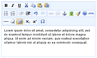
The third way to configure the <rich:editor> is to use configuration file (.properties)
This method eases your life if you need to configure multiple instances of the <rich:editor> : you configure the editor once and in one spot and the configuration properties can be applied to any <rich:editor> in your application.
To implement this type of configuration you need to take a few steps:
Create a configuration file (.properties) in the classpath folder and add some properties to it. Use standard syntax for the .properties files:
parameter=value. Here is an example of configuration file:Example:
theme="advanced"
plugins="save,paste"
theme_advanced_buttons1="bold,italic,underline, cut,copy,paste,pasteword"
theme_advanced_toolbar_location="top"
theme_advanced_toolbar_align="left"
The properties stored in configuration file are passed to the <rich:editor> via "configuration" attribute which takes the name of the configuration file as a value (with out .properties extension).
For example, if you named the configuration file "editorconfig", you would address it as follows:
Example:
...
<rich:editor value="#{bean.editorValue}" configuration="editorconfig"/>
...
Alternately, you can use a EL-expression to define a configuration file. This way you can dynamically change the sets of configuration properties.
For example, you have two configuration files "configurationAdvanced" and "configurationSimple" and you want them to be applied under some condition.
To do this you need to bind "configuration" attribute to the appropriate bean property like this.
Example:
...
<rich:editor value="#{bean.editorValue}" configuration="#{editor.configuration}" />
...
Your Java file should look like this.
...
String configuration;
if(some condition){//defines some condition
configuration = "configurationAdvanced"; //the name on the file with advanced properties
}
else{
configuration= "configurationSimple"; //the name on the file with simplified properties
}
...
You also might want to add some custom plug-ins to your editor. You can read about how to create a plugin in TinyMCE Wiki article.
Adding a custom plugin also requires a few steps to take. Though, the procedure is very similar to adding a configuration file.
This is what you need to add a plugin:
Create a .properties file and put the name of the plug-in and a path to it into the file. The file can contain multiple plug-in declarations. Your .properties file should be like this.
Example:
...
pluginName=/mytinymceplugins/plugin1Name/editor_plugin.js
...
Use the "customPlugins" attribute to specify the .properties file with a plugin name and a path to it.
If your .properties file is named "myPlugins", then your will have this code on the page.
Example:
...
<rich:editor theme="advanced" customPlugins="myPlugins" plugins="pluginName" />
...
Note:
Some plug-ins which available for download might have some dependencies on TinyMCE scripts. For example, dialog pop-ups require tiny_mce_popup.js script file. Assuming that you will not plug custom plugins to the RF jar with editor component (standard TinyMCE plugins creation implies that plugins are put into TinyMCE's corresponding directory) you should manually add required TinyMCE scripts to some project folder and correct the js includes.
The implementation of the <rich:editor> component has two methods for handling events.
The attributes take some function name as a value with is triggered on the appropriate event. You need to use standard JavaScript function calling syntax.
Using attributes ( "onchange" , "oninit" , "onsave" , "onsetup" )
Example:
...
<rich:editor value="#{bean.editorValue}" onchange="myCustomOnChangeHandler()" />
...
Using <f:param> as a child element defining the "name" attribute with one of the TinyMCE's callbacks and the "value" attribute takes the function name you want to be called on the corresponding event as the value. Note, that the syntax in this case is a bit different: parentheses are not required.
Example:
...
<rich:editor value="#{bean.editorValue}">
<f:param name="onchange" value="myCustomOnChangeHandler" />
</rich:editor>
...
The <rich:editor> component has a build-in converter that renders HTML code generated by the editor to Seam text (you can read more on Seam in Seam guide.), it also interprets Seam text passed to the <rich:editor> and renders it to HTML. The converter can be enable with the "useSeamText" attribute.
Example:
This HTML code generated by editor
...
<p><a href="http://mysite.com">Lorem ipsum</a> <i>dolor sit</i> amet, ea <u>commodo</u> consequat.</p>
...
will be parsed to the following Seam text:
...
[Lorem ipsum=>http://mysite.com] *dolor sit* amet, ea _commodo_ consequat.
...
Accordingly, if the Seam text is passed to the component it will be parsed to HTML code.
Table of <rich:editor> attributes.
Table 6.176. Style classes (selectors) with the corresponding skin parameters
| Class (selector) name | Description | Skin Parameter | CSS properties mapped |
|---|---|---|---|
| .richfacesSkin a:hover, .richfacesSkin a:link, .richfacesSkin a:visited, .richfacesSkin a:active | Defines styles for links state | generalTextColor | color |
| .richfacesSkin table | Defines styles for the wrapper <table> element of the editor | additionalBackgroundColor | background |
| .richfacesSkin iframe | Defines styles for the editor text area | tableBackgroundColor | background |
| .richfacesSkin .mceExternalToolbar | Defines styles for the toolbar | panelBorderColor | border-color |
| .richfacesSkin table.mceLayout | Defines styles for the table layout | panelBorderColor | border-left-color, border-right-color |
| .richfacesSkin table.mceLayout tr.mceFirst td | Defines styles for the toolbar elements | panelBorderColor | border-top-color |
| .richfacesSkin table.mceLayout tr.mceLast td | Defines styles for the editor window | panelBorderColor | border-bottom-color |
| .richfacesSkin .mceIframeContainer | Defines styles for the editor container | panelBorderColor | border-top-color, border-bottom-color |
| .richfacesSkin .mceStatusbar | Defines styles for the status bar | generalFamilyFont | font-family |
| generalTextColor | color | ||
| .richfacesSkin a.mceButtonEnabled:hover | Defines styles for the editor buttons hovered | headerBackgroundColor | background-color |
| .richfacesSkin span.mceButtonLabel | Defines styles for the editor buttons labels | generalFamilyFont | font-family |
| .richfacesSkin .mceListBox .mceText | Defines styles for the list box | generalFamilyFont | font-family |
| panelBorderColor | border-color | ||
| tableBackgroundColor | background | ||
| .richfacesSkin table.mceListBoxEnabled:hover .mceText, .richfacesSkin .mceListBoxSelected .mceText | Define styles for the list box hovered, selected respectively | tableBackgroundColor | background |
| .richfacesSkin div.mceColorSplitMenu table | Defines styles for the wrapper <table> element of the popup element for color selecting | tableBackgroundColor | background |
| panelBorderColor | border-color | ||
| .richfacesSkin .mceColorSplitMenu a | Defines styles for the items in the popup element for color selecting | panelBorderColor | border-color |
| .richfacesSkin .mceColorSplitMenu a.mceMoreColors | Defines styles for the "More Colors" button | panelBorderColor | border-color |
| generalFamilyFont | font-family | ||
| .richfacesSkin .mceColorSplitMenu a.mceMoreColors:hover | Defines styles for the "More Colors" button hovered | panelBorderColor | border-color |
| additionalBackgroundColor | background-color | ||
| .richfacesSkin a.mceMoreColors:hover | Defines styles for the "More Colors" button hovered | headerBackgroundColor | border-color |
| .richfacesSkin .mceColorPreview | Defines styles for the color preview | tableBorderColor | background |
| .richfacesSkin .mceMenu | Defines styles for the menus | panelBorderColor | border-color |
| .richfacesSkin .mceMenu table | Defines styles for the wrapper <table> element of the menu | tableBackgroundColor | background |
| .richfacesSkin .mceMenu .mceText | Defines styles for the menus labels | generalFamilyFont | font-family |
| generalTextColor | color | ||
| .richfacesSkin .mceMenu .mceMenuItemActive | Defines styles for the active menu items | additionalBackgroundColor | background-color |
| .richfacesSkin .mceMenu .mceMenuItemEnabled a:hover | Defines styles for the enabled menu items hovered | additionalBackgroundColor | background-color |
| .richfacesSkin td.mceMenuItemSeparator | Defines styles for the menu items separator | panelBorderColor | background |
| .richfacesSkin .mceMenuItemTitle a | Defines styles for the titles of the menu items | additionalBackgroundColor | background |
| panelBorderColor | border-bottom-color | ||
| .richfacesSkin .mceMenuItemDisabled .mceText | Defines styles for the disabled menu items | tabDisabledTextColor | color |
| .richfacesSkin .mceBlocker | Defines styles for the editor blocker | tableBackgroundColor | background |
| .richfacesSkin .mcePlaceHolder | Defines styles for the editor place holder | tableBorderColor | border-color |
Table 6.177. Style classes (selectors) without skin parameters
| Class name | Description |
|---|---|
| .richfacesSkin table.mceToolbar | Defines styles for the rows of icons within toolbar |
| .richfacesSkin .mceToolbar .mceToolbarStart span | Defines styles for the icon of the toolbar start element |
| .richfacesSkin .mceToolbar .mceToolbarEnd span | Defines styles for the icon of the toolbar end element |
| .richfacesSkin .mceIcon | Defines styles for the icons of the toolbar buttons |
| .richfacesSkin .mceButton | Defines styles for the buttons |
| .richfacesSkin .mceSeparator | Defines styles for the buttons separator |
| .richfacesSkin .mceButtonDisabled .mceIcon | Defines styles for the icons of the disabled buttons |
| .richfacesSkin .mceListBox .mceOpen | Defines styles for the icons of the list box "Open" button |
| .richfacesSkin .mceSplitButton a.mceOpen | Defines styles for the icons of the split buttons for color selecting |
| .richfacesSkin .mceSplitButton span.mceAction | Defines styles for the icons of the split buttons |
| .richfacesSkin .mceMenuItemSelected .mceIcon | Defines styles for the icons of the selected menu items |
| .richfacesSkin .mceNoIcons .mceMenuItemSelected a | Defines styles for the selected menu items without no icons |
| .richfacesSkin .mceMenuItemSub a | Defines styles for the icon of the submenu item |
| .richfacesSkin .mceProgress | Defines styles for the editor progress icon |
| .richfacesSkin .mceStatusbar a.mceResize | Defines styles for the resize button |
You can find all necessary information about style classes redefinition in Definition of Custom Style Classes section.
The <rich:editor> is based on TinyMCE editor and supports almost all its features and properties some of which are not described here since you can find more detailed documentation on them on the official web site.
On RichFaces LiveDemo page you can see an example of <rich:editor> usage and sources for the given example.
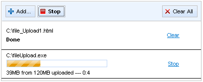
The <rich:fileUpload> component consists of two parts:
There are two places where the uploaded files are stored:
The "uploadData" attribute defines the collection of files uploaded. See the example below.
...
<rich:fileUpload uploadData="#{bean.data}"/>
...
...
<rich:fileUpload uploadData="#{bean.data}" fileUploadListener="#{bean.listener}"/>
...
The following methods for processing the uploaded files are available:
...
<rich:fileUpload uploadData="#{bean.data}" fileUploadListener="#{bean.listener}" immediateUpload="true"/>
...
...
<rich:fileUpload uploadData="#{bean.data}" autoclear="true"/>
...
The <rich:fileUpload> component provides following restrictions:
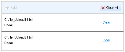
The <rich:fileUpload> component provides a number of specific event attributes:
The "onupload" which gives you a possibility to cancel the upload at client side
The "onuploadcomplete" which is called after all files from the list are uploaded
The "onuploadcanceled" which is called after upload has been canceled via cancel control
The "onerror" which is called if the file upload was interrupted according to any errors
These are the additional features that the Flash module provides:
Apart from uploading files to the sever without using Ajax, the Flash module provides a number of useful API functions that can be used to obtain information about the uploaded file.
There are 2 ways to obtain the data stored in the FileUploadEntry object.
By means of JavaScript on the client side. Use the following syntax for that
entries[i].propertyName. For exampleentries[0].statewill return the state of the file that is being processed or has just been processed.The properties of
FileUploadEntryobject can be retrieved using theentry.propertyNameexpression in the specific event attributes. For example,onupload="alert(event.memo.entry.fileName);"will display a message with the name of the file at the very moment when upload operation starts. A full list of properties can be found in RichFaces Developer Guide section on properties and their attributes.
The given bellow code sample demonstrates how the properties can be used. Please study it carefully.
...
<head>
<script>
function _onaddHandler (e) {
var i = 0;
for (; i < e.memo.entries.lenght; i++) {
alert(e.memo.entries[i].creator); //Shows creators of the added files
}
}
function _onerrorhandle(e) {
alert(e.memo.entry.fileName + "file was not uploaded due transfer error");
}
</script>
</head>
...
Moreover, embedded Flash module provides a smoother representation of progress bar during the uploading process: the polling is performed is not by Ajax, but by means of the flash module.
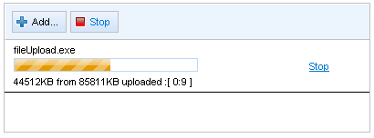
However, the Flash module doesn't perform any visual representation of the component.
In order to customize the information regarding the ongoing process you could use "label" facet with the following macrosubstitution:
{B},{KB},{MB}contains the size of file uploaded in bytes, kilobytes, megabytes respectively{_B},{_KB},{_MB}contains the remain file size to upload in bytes, kilobytes, megabytes respectively{ss},{mm},{hh}contains elapsed time in seconds, minutes and hours respectively
Example:
...
<rich:fileUpload uploadData="#{bean.data}" fileUploadListener="#{bean.listener}">
<f:facet name="label">
<h:outputText value="{_KB}KB from {KB}KB uploaded --- {mm}:{ss}" />
</f:facet>
</rich:fileUpload>
...
This is the result:
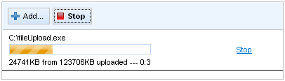
You could define labels of the component controls with the help of "addControlLabel" , "clearAllControlLabel" , "clearControlLabel" , "stopEntryControlLabel" , "uploadControlLabel" attributes. See the following example.
Example:
...
<rich:fileUpload addControlLabel="Add file..." clearAllControlLabel="Clear all" clearControlLabel="Clear"
stopEntryControlLabel="Stop process" uploadControlLabel="Upload file"/>
...
This is the result:
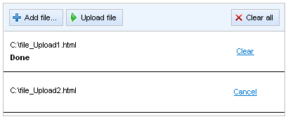
The <rich:fileUpload> component allows to use sizes attributes:
"listHeight" attribute specifies a height for list of files in pixels
"listWidth" attribute specifies a width for list of files in pixels
In order to disable the whole component you could use the "disabled" attribute. See the following example.
Example:
...
<rich:fileUpload disabled="true"/>
...
This is the result:
It's possible to handle events for fileUpload using JavaScript code. A simplest example of JavaScript API usage is placed below:
Example:
...
<rich:fileUpload id="upload" disabled="false"/>
<h:commandButton onclick="${rich:component('upload')}.disable();" value="Disable" />
...
The
<rich:fileUpload>
component also provides a number of JavaScript properties, that can be used to
process uploaded files, file states etc. The given below example illustrates how the
entries[0].state property can be used to get access to the file state.
Full list of JavaScript properties can be found below.
...
<rich:fileUpload fileUploadListener="#{fileUploadBean.listener}"
maxFilesQuantity="#{fileUploadBean.uploadsAvailable}"
id="upload"
immediateUpload="#{fileUploadBean.autoUpload}"
acceptedTypes="jpg, gif, png, bmp"/>
<a4j:support event="onuploadcomplete" reRender="info" />
</rich:fileUpload>
<h:commandButton onclick="if($('j_id232:upload').component.entries[0].state == FileUploadEntry.UPLOAD_SUCCESS) alert ('DONE');" value="Check file state"/>
...
The
<rich:fileUpload>
component allows to use internationalization method to redefine and localize
the labels. You could use application resource bundle and define
RICH_FILE_UPLOAD_CANCEL_LABEL,
RICH_FILE_UPLOAD_STOP_LABEL, RICH_FILE_UPLOAD_ADD_LABEL,
RICH_FILE_UPLOAD_UPLOAD_LABEL,
RICH_FILE_UPLOAD_CLEAR_LABEL,
RICH_FILE_UPLOAD_CLEAR_ALL_LABEL,
RICH_FILE_UPLOAD_PROGRESS_LABEL,
RICH_FILE_UPLOAD_SIZE_ERROR_LABLE,
RICH_FILE_UPLOAD_TRANSFER_ERROR_LABLE,
RICH_FILE_UPLOAD_ENTRY_STOP_LABEL,
RICH_FILE_UPLOAD_ENTRY_CLEAR_LABEL,
RICH_FILE_UPLOAD_ENTRY_CANCEL_LABEL there.
To make <rich:fileUpload> component work properly with MyFaces extensions, the order in which filters are defined and mapped in web.xml is important. See corresponding FAQ chapter.
Table of <rich:fileUpload> attributes.
Table 6.179. JavaScript API
| Function | Description |
|---|---|
| beforeSubmit() | Sets up necessary request parameters for file uploading and submits form to server by command button. This method should be used together with commands. |
| clear() | Removes all files from the list. The function can also get the $('id').component.entries[i] as a parameter to remove a particular file. |
| disable() | Disables the component |
| enable() | Enables the component |
| remove() | Cancels the request for uploading a file by removing this file from
upload list and upload queue. Gets $('id').component.entries[i] as a parameter. |
| stop() | Stops the uploading process |
| submitForm() | Submits form to server. All added files will be put to model and event. |
Table 6.180. Client-side object properties
| Property | Description |
|---|---|
| entries | Returns a array of all files in the list |
| entries.length | Returns the number of files in the list |
| entries[i].fileName | Returns the file name, that is retrieved by the array index |
| entries[i].state | Returns the file state. Possible states are
|
| entries[i].size | Returns the size of the file. Available in flash enabled version only |
| entries[i].Type | Returns the mime type of the file. Available in flash enabled version only |
| entries[i].creator | Returns the name of the author of the file. Available in flash enabled version only |
| entries[i].creationDate | Returns the date when the file was created. Available in flash enabled version only |
| entries[i].modificationDate | Returns the date of the last file modification. Available in flash enabled version only |
Table 6.181. Client-side object properties available with specific event attributes
| Property | Description |
|---|---|
| entry.state | Returns the file state. Possible states are
|
| entry.fileName | Returns the file's name. This property works with all event handlers except for "onadd". |
| entry.size | Returns the size of the file. Available in flash enabled version only |
| entry.Type | Returns the mime type of the file. Available in flash enabled version only |
| entry.creator | Returns the name of the author of the file. Available in flash enabled version only |
| entry.creationDate | Returns the date when the file was created. Available in flash enabled version only |
| entry.modificationDate | Returns the date of the last file modification. Available in flash enabled version only |
Table 6.183. Style classes (selectors) with the corresponding skin parameters
| Class (selector) name | Description | Skin Parameter | CSS properties mapped |
|---|---|---|---|
| .rich-fileupload-font | Defines styles for a font of buttons and items | generalFamilyFont | font-family |
| generalSizeFont | font-size | ||
| .rich-fileupload-table-td | Defines styles for the <td> elements of the added item | tableBorderColor | border-bottom-color |
| .rich-fileupload-list-decor | Defines styles for a wrapper <div> element of a fileUpload | tableBorderColor | border-color |
| tableBackgroundColor | background-color | ||
| .rich-fileupload-anc | Defines styles for the "Cancel", "Stop", "Clear" links | generalLinkColor | color |
| .rich-fileupload-toolbar-decor | Defines styles for a toolbar | additionalBackgroundColor | background-color |
| tableBorderColor | border-bottom-color | ||
| tableBackgroundColor | border-top-color, border-left-color | ||
| .rich-fileupload-button-border | Defines styles for a border of buttons | tableBorderColor | border-color |
| .rich-fileupload-enrty-dis | Defines styles for a disabled entry | trimColor | background-color |
| .rich-fileupload-button-content | Defines styles for the buttons content | generalTextColor | color |
| .rich-fileupload-button | Defines styles for a buttons | trimColor | background-color |
| .rich-fileupload-button-light | Defines styles for a highlight of button | trimColor | background-color |
| selectControlColor | border-color | ||
| .rich-fileupload-button-press | Defines styles for a pressed button | selectControlColor | border-color |
| additionalBackgroundColor | background-color | ||
| .rich-fileupload-ico-add-dis | Defines styles for a disabled "Add" button icon | tableBorderColor | color |
| .rich-fileupload-ico-start-dis | Defines styles for a disabled "Upload" button icon | tableBorderColor | color |
| .rich-fileupload-ico-clear-dis | Defines styles for a disabled "Clear" button icon | tableBorderColor | color |
Table 6.184. Style classes (selectors) without skin parameters
| Class name | Description |
|---|---|
| rich-fileupload-list-overflow | Defines styles for a list of files |
| rich-fileupload-button-dis | Defines styles for a disabled button |
| rich-fileupload-button-selection | Defines styles for "Upload", "Clean" buttons |
| rich-fileupload-ico | Defines styles for an icon |
| rich-fileupload-ico-add | Defines styles for a "Add" button icon |
| rich-fileupload-ico-start | Defines styles for a "Upload" button icon |
| rich-fileupload-ico-stop | Defines styles for a "Stop" button icon |
| rich-fileupload-ico-clear | Defines styles for a "Clear" button icon |
| rich-fileupload-table-td | Defines styles for a wrapper <td> element of a list items |
You can find all necessary information about style classes redefinition in Definition of Custom Style Classes section.
On RichFaces LiveDemo page you can see an example of <rich:fileUpload> usage and sources for the given example.
<rich:fileUpload> with MyFaces article describes how to avoid problems with <rich:fileUpload> compenent caused by wrong application configuration.
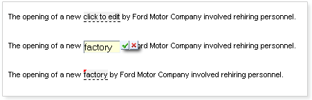
The "value" attribute is a value-binding expression for the current value of the component.
The component has three functional states:
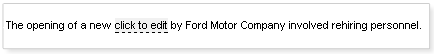
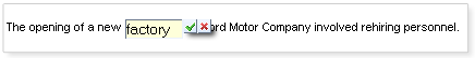
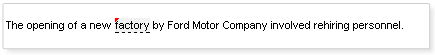
...
<rich:inplaceInput value="#{bean.value}" editEvent="ondblclick"/>
...
The <rich:inplaceInput> component provides specific event attributes:
...
<rich:inplaceInput value="#{bean.value}" oneditactivation="if (!confirm('Are you sure you want to change the value?')){return false;}" />
...
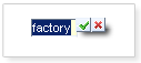
If the <rich:inplaceInput> loses focus, input data is saved automatically and the component displays a new value. Additionally, the data is saved when "Enter" is pressed. Nevertheless, you can use the "showControls" attribute, which makes "Save" and "Cancel" buttons appear next to the input field. If the controls are used, data is not saved automatically when the form loses focus: user has to confirm that he/she wants to save/discard the data explicitly. In both cases (with controls or without them) the input data can be discarded by pressing "Esc" key.
Example:
...
<rich:inplaceInput value="#{bean.value}" showControls="true"/>
...
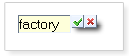
You can also position the controls relatively to the input field, by means of
the "controlsHorizontalPosition" attribute with "left", "right" and "center" definitions
the "controlsVerticalPosition " attribute with "bottom", "center" and "top" definitions
Example:
...
<rich:inplaceInput value="#{bean.value}" showControls="true" controlsVerticalPosition="bottom" controlsHorizontalPosition="left"/>
...
This is the result:
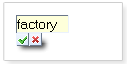
It is also possible to use "controls" facet in order to replace the default controls with facets content. See the example below.
Example:
...
<rich:inplaceInput defaultLabel="Click here to edit" showControls="true" controlsHorizontalPosition="left" controlsVerticalPosition="bottom" id="inplaceInput">
<f:facet name="controls">
<h:commandButton value="Save" onclick="#{rich:component('inplaceInput')}.save();" type="button" />
<h:commandButton value="Cancel" onclick="#{rich:component('inplaceInput')}.cancel();" type="button" />
</f:facet>
</rich:inplaceInput>
...
This is the result:
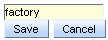
Note:
The "controls" facet also implies using "showControls" attribute and it has to be defined as "true".
Redefinition of the "save" and "cancel" icons can be performed using "saveControlIcon" and "cancelControlIcon" attributes. You need to define the path to where your images are located.
Example:
...
<rich:inplaceInput value="#{bean.value}" defaultLabel='click to edit'
showControls="true"
controlsHorizontalPosition="left"
controlsVerticalPosition="top"
saveControlIcon="/images/cancel.gif"
cancelControlIcon="/images/save.gif"/>
...
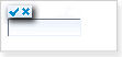
The <rich:inplaceInput> component could be rendered with <span> or <div> elements to display its value. In order to change default <span> output, use "layout" attribute with "block" value.
The <rich:inplaceInput> component supports the standard "tabindex" attribute. When the component gets focus the edit mode is activated.
The "inputWidth" , "minInputWidth" , "maxInputWidth" attributes are provided to specify the width, minimal width and maximal width for the input element respectively.
Table 6.185. Keyboard usage
| Keys and combinations | Description |
|---|---|
| ENTER | Saves the input data, and changes the state from edit to changed |
| ESC | Changes the state from edit to view or changed, value is not affected |
| TAB | Switches between the components |
Table of <rich:inplaceInput> attributes.
Table 6.187. JavaScript API
| Function | Description |
|---|---|
| edit() | Changes the state to edit |
| cancel() | Changes its state to the previous one before editing (changed or view) |
| save() | Changes its state to changed with a new value |
| getValue() | Gets the current value |
| setValue(newValue) | Sets the current value (to be implemented) |
Table 6.188. Facets
| Facet name | Description |
|---|---|
| controls | Defines the contols contents. Related attributes are "saveControlIcon" and "cancelControlIcon" |
Table 6.189. Style classes (selectors) with the corresponding skin parameters
| Class (selector) name | Description | Skin Parameters | CSS properties mapped |
|---|---|---|---|
| .rich-inplace-control | Defines styles for the controls | tabBackgroundColor | background-color |
| panelBorderColor | border-color | ||
| .rich-inplace-control-press | Defines styles for the controls when either of the buttons is pressed | tabBackgroundColor | background-color |
| panelBorderColor | border-color | ||
| .rich-inplace-view | Defines styles for the view state | editorBackgroundColor | background-color |
| generalTextColor | border-bottom-color | ||
| .rich-inplace-changed | Defines styles for the "Changed" state | editorBackgroundColor | background-color |
| generalTextColor | border-bottom-color | ||
| input.rich-inplace-field | Defines styles for the input field in edit state | editorBackgroundColor | background-color |
| panelBorderColor | border-color |
Table 6.190. Style classes (selectors) without skin parameters
| Class name | Description |
|---|---|
| .rich-inplace | Defines styles for a wrapper <span> (or <div>) element of a component |
| .rich-inplace-input | Defines styles for the component input field |
| .rich-inplace-input-view-hover | Defines styles for hovered text in the view state |
| .rich-inplace-field | Defines styles for the input field look and feel in edit state |
| .rich-inplace-input-changed-hover | Defines styles for the hovered text in the "Changed" state |
| .rich-inplace-shadow-size | Defines size of the shadow |
| .rich-inplace-shadow-tl | Defines styles for the shadow in the top left corner |
| .rich-inplace-shadow-tr | Defines styles for the shadow in the top right corner |
| .rich-inplace-shadow-bl | Defines styles for the shadow in the bottom left corner |
| .rich-inplace-shadow-br | Defines styles for the shadow in the bottom right corner |
You can find all necessary information about style classes redefinition in Definition of Custom Style Classes section.
On the component Live Demo page you can see the example of <rich:inplaceIput> usage and sources for the given example.
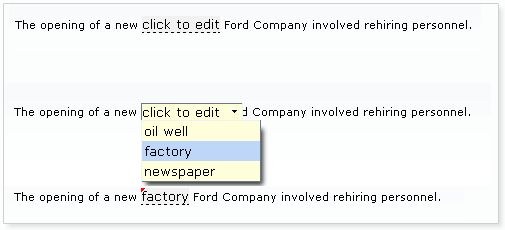
The "value" attribute is a value-binding expression for the current value of the component.
The <rich:inplaceSelect> component has three functional states:
View state displays default label with the value taken from "value" or "defaultLabel" attributes.
...
<rich:inplaceSelect value="#{bean.value}" defaultLabel="click to edit">
<f:selectItems value="#{bean.selectItems}" />
</rich:inplaceSelect>
...
Edit state - select representation to allow value edit
Changed state - value representation after it was changed
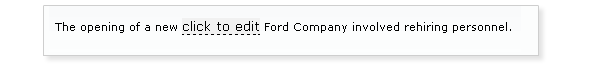
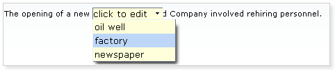
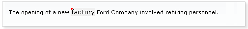
You can form the list of the options using <f:selectItem/> and <f:selectItems/> JSF components.
Please, see the example below.
...
<rich:inplaceSelect value="#{bean.inputValue}" defaultLabel="click to edit">
<f:selectItems value="#{bean.selectItems}"/>
<f:selectItem itemValue="1" itemLabel="factory"/>
<f:selectItem itemValue="2" itemLabel="newspaper"/>
</rich:inplaceSelect>
...
In the example above the value of the selected item is available via "value" attribute.
...
<rich:inplaceSelect value="#{bean.inputValue}" defaultLabel="Double Click to edit" editEvent="ondblclick">
<f:selectItems value="#{demo.selectItems}" />
</rich:inplaceSelect>
...
The <rich:inplaceSelect> component provides specific event attributes:
...
<rich:inplaceSelect value="#{bean.inputValue}" oneditactivation="if (!confirm('Are you sure you want to change the value?')){return false;}">
<f:selectItems value="#{demo.selectItems}" />
</rich:inplaceSelect>
...
...
<rich:inplaceSelect value="#{bean.inputValue}" showControls="true" openOnEdit="false">
<f:selectItems value="#{bean.selectItems}"/>
</rich:inplaceSelect>
...
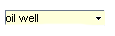
Nowever, if you want to confirm the data saving explicitly you can use the "showControls" attribute, which makes "Save" and "Cancel" buttons (displayed as icons) appear next to the input field. Edit state can be deactivated by pressing "Esc" key. An option in the drop-drown list can be also selected by pressing "Enter".
Example:
...
<rich:inplaceSelect value="#{bean.inputValue}" showControls="true">
<f:selectItems value="#{bean.selectItems}"/>
</rich:inplaceSelect>
...
This is the result:
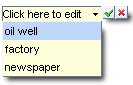
You can also position the controls relatively to the input field, by means of
the "controlsHorizontalPosition" attribute with "left", "right" and "center" definitions
the "controlsVerticalPosition " attribute with "bottom" and "top" definitions
Example:
...
<rich:inplaceSelect value="#{bean.inputValue}" controlsHorizontalPosition="left" controlsVerticalPosition="center" showControls="true">
<f:selectItems value="#{bean.selectItems}"/>
</rich:inplaceSelect>
...
This is the result:
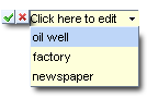
It is also possible to use "controls" facet in order to replace the default controls with facets content. See the example below.
Example:
...
<rich:inplaceSelect value="#{bean.inputValue}" showControls="true">
<f:facet name="controls">
<button onclick="#{rich:component('inplaceSelect')}.save();" type="button">Save</button>
<button onclick="#{rich:component('inplaceSelect')}.cancel();" type="button">Cancel</button>
</f:facet>
<f:selectItems value="#{bean.selectItems}"/>
</rich:inplaceSelect>
...
This is the result:

Note:
The "controls" facet also implies using "showControls" attribute and it has to be defined as "true".
The <rich:inplaceSelect> component could be rendered with <span> or <div> elements to display its value. In order to change default <span> output, use the "layout" attribute with "block" value.
The <rich:inplaceSelect> component supports the standard "tabindex" attribute. When the component gets focus the edit mode is activated and drop-down list is opened.
The "selectWidth" , "minSelectWidth" and "maxSelectWidth" attributes are provided to specify the width, minimal width and maximal width for the input element respectively.
In order to specify the height and width parameters for the list items of the component, you can use "listHeight" and " listWidth" attributes.
Table of <rich:inplaceSelect> attributes.
Table 6.192. JavaScript API
| Function | Description |
|---|---|
| edit() | Changes the state to edit |
| cancel() | Changes its state to the previous one before editing (changed or view) |
| save() | Changes its state to changed with a new value |
| getValue() | Gets the current value |
| setValue(newValue) | Sets the current value and name |
Table 6.193. Facets
| Facet name | Description |
|---|---|
| controls | Defines the contols contents. Related attributes are "saveControlIcon" and "cancelControlIcon" |
Table 6.194. Style classes (selectors) with the corresponding skin parameters
| Class (selector) name | Description | Skin Parameters | CSS properties mapped |
|---|---|---|---|
| .rich-inplace-select-view | Defines styles for the component in the view state | editorBackgroundColor | background-color |
| generaTextColor | border-bottom-color | ||
| input.rich-inplace-select-field, .rich-inplace-select-field | Define styles for the component input field | editorBackgroundColor | background-color |
| panelBorderColor | border-color | ||
| .rich-inplace-select-control | Defines styles for the component control | tabBackgroundColor | background-color |
| panelBorderColor | border-color | ||
| .rich-inplace-select-control-press | Defines styles for the pressed control | tabBackgroundColor | background-color |
| panelBorderColor | border-color | ||
| .rich-inplace-select-list-decoration | Defines styles for a wrapper <table> element of the component | editBackgroundColor | background-color |
| panelBorderColor | border-color | ||
| .rich-inplace-select-selected-item | Defines styles for the selected item | headerBackgroundColor | background-color, border-color |
| headerTextColor | color | ||
| input.rich-inplace-select-arrow | Defines styles for the drop-down arrow | editBackgroundColor | background-color |
Table 6.195. Style classes (selectors) without skin parameters
| Class name | Description |
|---|---|
| .rich-inplace-select-changed | Defines styles for the component in the changed state |
| .rich-inplace-select-shadow-tl | Defines styles for the top-left shadow |
| .rich-inplace-select-shadow-tr | Defines styles for the top-right shadow |
| .rich-inplace-select-shadow-bl | Defines styles for the bottom-left shadow |
| .rich-inplace-select-shadow-br | Defines styles for the bottom-right shadow |
You can find all necessary information about style classes redefinition in Definition of Custom Style Classes section.
On the component Live Demo page you can see the example of <rich:inplaceSelect> usage and sources for the given example.
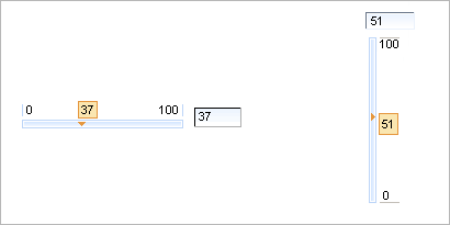
<rich:inputNumberSlider> is used to facilitate your data input with rich UI Controls.
<rich:inputNumberSlider></rich:inputNumberSlider>
Here is a component generated on a page:
Using "showInput" (default value is "true") and "enableManualInput" (default value is "true") attributes, it's possible to output the input area near the slider, and make it read-only or editable.
To remove input area use
showInput = "false"
:
Example:
<rich:inputNumberSlider minValue="1" maxValue="100" showInput="false"/>
It's displayed on a page like this:
It's also possible to switch off displaying of "boundary values" and a toolTip showing on a handle drawing. This could be performed with the help of the component defined attributes: "showBoundaryValues" which is responsible for "boundary values" displaying (default value is "true") and "showToolTip" which is responsible for tooltTip displaying (default value is "true").
Moreover, to add e.g. some JavaScript effects, events defined on it are used.
"onchange"
"onmouseover"
"onclick"
"onfocus"
"onmouseout"
etc.
The
"label"
attribute is a generic attribute. The
"label"
attribute provides an association between the component and
the message that the component (indirectly) produced. This
attribute defines the parameters of a localized error and
informational messages that occur as a result of conversion,
validation, or other application actions during the request
processing lifecycle. With the help of this attribute you
can replace the last parameter substitution token shown in
the messages. For example, {1} for
"DoubleRangeValidator.MAXIMUM"
, {2} for
"ShortConverter.SHORT".
The "showArrows" boolean attribute when set to "true" enables additional controls for increasing and decreasing slider value. The controls (arrows by default) are placed in the beginning and in the end of a slider track:
Clicking an arrow changes the driven value on the amount defined with "step" attribute. Keepeng an arrow control pressed changes the value continuous. Time that value takes to change from one step to another is definded with "delay" attribute.
Table of <rich:inputNumberSlider> attributes.
Table 6.197. Style classes (selectors) with the corresponding skin parameters
| Class (selector) name | Description | Skin Parameters | CSS properties mapped |
|---|---|---|---|
| .rich-inslider-tip | Defines styles for a hint | tipBackgroundColor | background-color |
| tipBorderColor | border-color | ||
| generalFamilyFont | font-family | ||
| generalSizeFont | font-size | ||
| .rich-inslider-left-num | Defines styles for the left number | panelBorderColor | border-color |
| generalFamilyFont | font-family | ||
| generalSizeFont | font-size, line-height | ||
| generalTextColor | color | ||
| .rich-inslider-right-num | Defines styles for the right number | panelBorderColor | border-color |
| generalFamilyFont | font-family | ||
| generalSizeFont | font-size, line-height | ||
| generalTextColor | color | ||
| .rich-inslider-track | Defines styles for the wrapper <div> element of the slider track | controlBackgroundColor | background-color |
| .rich-inslider-track-decor-1 | Defines styles for the wrapper <table> element of the slider track | panelBorderColor | border-color |
| .rich-inslider-track-decor-2 | Defines styles for the slider track | controlBackgroundColor | border-color |
| .rich-inslider-field | Defines styles for a text field | controlBackgroundColor | background-color |
| generalFamilyFont | font-family | ||
| generalSizeFont | font-size | ||
| controlTextColor | color | ||
| panelBorderColor | border-color |
Table 6.198. Style classes (selectors) without skin parameters
| Class name | Description |
|---|---|
| .rich-slider | Defines styles for the wrapper <table> element of the component |
| .rich-inslider-handler | Defines styles for the slider handler |
| .rich-inslider-handler-vertical | Defines styles for the vertical slider handler |
| .rich-inslider-track-vertical | Defines styles for the vertical slider track |
| .rich-inslider-handler-selected | Defines styles for a selected handler |
| .rich-inslider-handler-selected-vertical | Defines styles for a selected handler on the vertical slider |
| .rich-inslider-track-border | Defines styles for track border |
| .inputNumberSlider-increase-vertical | Defines styles for the top arrow |
| .inputNumberSlider-decrease-vertical | Defines styles for the bottom arrow |
| .inputNumberSlider-increase-horizontal | Defines styles for the right arrow |
| .inputNumberSlider-decrease-horizontal | Defines styles for the left arrow |
You can find all necessary information about style classes redefinition in Definition of Custom Style Classes section.
On the component Live Demo page you can see the example of <rich:inputNumberSlider> usage and sources for the given example.
<rich:inputNumberSpinner> is used to facilitate your data input with rich UI Controls.
...
<rich:inputNumberSpinner minValue="1" maxValue="100"/>
...
There are also several attributes to define functionality peculiarities:
"cycled" if the attribute is "true" after the current value reaches the border value it's be reversed to another border value after next increasing/decreasing. In other case possibilities of next increasing/decreasing are locked
"disabled" is an attribute that defines whether a component is active on a page
"enableManualInput" is an attribute that defines whether a keyboard input is possible or only UI controls could be used
Moreover, to add e.g. some JavaScript effects, events defined on it are used
"onchange"
"onmouseover"
"onclick"
"onfocus"
"onmouseout"
etc.
The
"label"
attribute is a generic attribute. The
"label"
attribute provides an association between a component, and
the message that the component (indirectly) produced. This attribute
defines the parameters of localized error and informational messages
that occur as a result of conversion, validation, or other application
actions during the request processing lifecycle. With the help of this
attribute you can replace the last parameter substitution token shown
in the messages. For example, {1} for
"DoubleRangeValidator.MAXIMUM"
, {2} for "ShortConverter.SHORT" .
Table of <rich:inputNumberSpinner> attributes.
Table 6.200. Style classes (selectors) with the corresponding skin parameters
| Class (selector) name | Description | Skin Parameters | CSS properties mapped |
|---|---|---|---|
| .rich-spinner-buttons | Defines styles for all buttons | headerBackgroundColor | background-color |
| panelBorderColor | border-color | ||
| .rich-spinner-input | Defines styles for a wrapper <td> element for input fields | buttonSizeFont | font-size |
| buttonFamilyFont | font-family | ||
| .rich-spinner-input-container | Defines styles for a container | controlBackgroundColor | background-color |
| panelBorderColor | border-color |
Table 6.201. Style classes (selectors) without skin parameters
| Class name | Description |
|---|---|
| .rich-spinner-c | Defines styles for a wrapper <table> element of a component |
| .rich-spinner-button | Defines styles for a button |
You can find all necessary information about style classes redefinition in Definition of Custom Style Classes section.
On the component Live Demo page you can see the example of <rich:inputNumberSpinner> usage and sources for the given example.
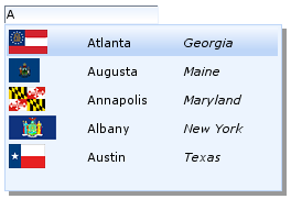
There are 3 main component attributes:
To create the simplest variant on a page use the following syntax:
...
<h:inputText id="city" value="#{capitalsBean.capital}" />
<rich:suggestionbox for="city" var="result"
suggestionAction="#{capitalsBean.autocomplete}">
<h:column>
<h:outputText value="#{result.name}" />
</h:column>
</rich:suggestionbox>
...
...
public class SBbean {
private ArrayList<Capital> capitals = new ArrayList<Capital>();
private ArrayList<String> capitalsNames = new
ArrayList<String>();
private List<SelectItem> capitalsOptions = new
ArrayList<SelectItem>();
private String capital = "";
public List<Capital> autocomplete(Object suggest) {
String pref = (String) suggest;
ArrayList<Capital> result = new ArrayList<Capital>();
Iterator<Capital> iterator = getCapitals().iterator();
while (iterator.hasNext()) {
Capital elem = ((Capital) iterator.next());
if ((elem.getName() != null && elem.getName().toLowerCase()
.indexOf(pref.toLowerCase()) == 0)
|| "".equals(pref)) {
result.add(elem);
}
}
return result;
}
public SBbean() {
URL rulesUrl = getClass().getResource("capitals-rules.xml");
Digester digester = DigesterLoader.createDigester(rulesUrl);
digester.push(this);
try {
digester.parse(getClass().getResourceAsStream("capitals.xml"));
} catch (IOException e) {
throw new FacesException(e);
} catch (SAXException e) {
throw new FacesException(e);
}
capitalsNames.clear();
for (Capital cap : capitals) {
capitalsNames.add(cap.getName());
}
capitalsOptions.clear();
for (Capital cap : capitals) {
capitalsOptions.add(new SelectItem(cap.getName(), cap.getState()));
}
}
public String addCapital(Capital capital) {
capitals.add(capital);
return null;
}
}
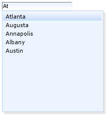
The <rich:suggestionbox> component could get any collection and outputs it in a popup in several columns. The "fetchValue" attribute points to the data that is inserted into the input field if a particular row is selected or clicked from the suggested list. Therefore when some string is chosen input receives the proper value.
...
<h:inputText id="city" value="#{capitalsBean.capital}" />
<rich:suggestionbox for="city" var="result"
fetchValue="#{result.state}"
suggestionAction="#{capitalsBean.autocomplete}">
<h:column>
<h:outputText value="#{result.name}" />
</h:column>
<h:column>
<h:outputText value="#{result.state}" />
</h:column>
</rich:suggestionbox>
...
In the example above if you choose any string input will receive the
corresponding value
from the second column containing
#{result.state}
.
Here is a result:
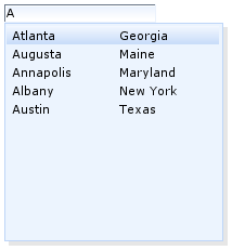
There is also one more important attribute named "tokens" that specifies separators after which a set of some characters sequence is defined as a new prefix beginning from this separator and not from the string beginning.
Example:
...
<h:inputText id="city" value="#{capitalsBean.capital}" />
<rich:suggestionbox for="city" var="result"
suggestionAction="#{capitalsBean.autocomplete}"
tokens=",">
<h:column>
<h:outputText value="#{result.name}" />
</h:column>
</rich:suggestionbox>
...
This example shows that when a city is chosen and a comma and first letter character are input, Ajax request is called again, but it submits a value starting from the last token:
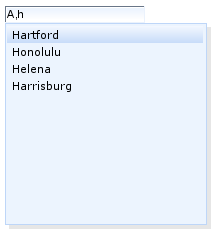
For
a multiple definition use either "
,.;[]
"
syntax as a value for
"tokens"
attribute or link a parameter to some bean
property that transmits
separators collection.
...
<h:inputText id="city" value="#{capitalsBean.capital}" />
<rich:suggestionbox for="city" var="result"
suggestionAction="#{capitalsBean.autocomplete}"
onobjectchange="processObjects(suggestion)"
usingSuggestObjects="true">
<h:column>
<h:outputText value="#{result.name}" />
</h:column>
</rich:suggestionbox>
<h:panelGroup>
<div id="state"></div>
</h:panelGroup>
...
<script
type="text/javascript">
function processObjects(suggestionBox) {
var items = suggestionBox.getSelectedItems();
var state;
if (items && items.length > 0) {
for ( var i = 0; i < items.length; i++) {
state = items[i].state;
}
document.getElementById('state').innerHTML = "State: "+state;
}else{
document.getElementById('state').innerHTML = '';
}
}
</script>
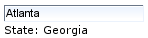
...
<rich:suggestionbox for="city" var="result"
suggestionAction="#{capitalsBean.autocomplete}"
nothingLabel="No cities found">
<h:column>
<h:outputText value="#{result.name}" />
</h:column>
</rich:suggestionbox>
...
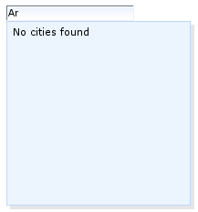
You can also use facets for the further <rich:suggestionbox> customization:
...
<h:inputText id="city" value="#{capitalsBean.capital}" />
<rich:suggestionbox for="city" var="result"
suggestionAction="#{capitalsBean.autocomplete}">
<f:facet name="nothingLabel">
<h:outputText value="No cities found" />
</f:facet>
<f:facet name="header">
<h:outputText value="Select your city" />
</f:facet>
<h:column>
<h:outputText value="#{result.name}" />
</h:column>
</rich:suggestionbox>
...
Here is a result:
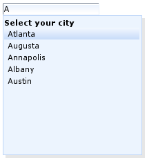
Information about the "process" attribute usage you can findin the "Decide what to process" guide section.
In RichFaces Wiki article about Additional Properties you can find example of getting additional properties.
Table of <rich:suggestionbox> attributes .
Table 6.203. Facets
| Facet name | Description |
|---|---|
| nothingLabel | Redefines the content item if the autocomplete returns empty list. Related attribute is "nothingLabel" |
| popup | Redefines the content for the popup list of the suggestion |
| header | Defines the header content |
| footer | Defines the footer content |
Table 6.204. Style classes (selectors) with the corresponding skin parameters
| Class name | Description | Skin Parameters | CSS properties |
|---|---|---|---|
| .rich-sb-int | Defines the styles for a suggestion box table rows <tr> | generalSizeFont | font-size |
| generalFamilyFont | font-family | ||
| generalTextColor | color | ||
| .rich-sb-int-sel | Defines styles for a selected row | headerBackgroundColor | background-color |
| generalSizeFont | font-size | ||
| generalFamilyFont | font-family | ||
| headerTextColor | color | ||
| .rich-sb-ext-decor-2 | Defines styles for the second wrapper <div> element of a suggestion box exterior | panelBorderColor | border-color |
| additionalBackgroundColor | background-color | ||
| .rich-sb-shadow | Defines styles for a suggestion box shadow | shadowBackgroundColor | background-color |
| shadowBackgroundColor | border-color | ||
| shadowOpacity | opacity |
Table 6.205. Style classes (selectors) without skin parameters
| Class name | Description |
|---|---|
| .rich-sb-common-container | Defines styles for a wrapper <div> element of a suggestion container |
| .rich-sb-ext-decor-1 | Defines styles for the first wrapper <div> element of a suggestion box exterior |
| .rich-sb-ext-decor-3 | Defines styles for the third wrapper <div> element of a suggestion box exterior |
| .rich-sb-overflow | Defines styles for a inner wrapper <div> element |
| .rich-sb-int-decor-table | Defines styles for a suggestion box table |
| .rich-sb-cell-padding | Defines the styles for suggestion box table cells <td> |
You can find all necessary information about style classes redefinition in Definition of Custom Style Classes section.
Visit <rich:suggestionbox> page at RichFaces Livedemo for examples of component usage and sources.
RichFaces cookbook at JBoss Portal includes some articles that cover different aspects of working with <rich:suggestionbox> :
RichFaces library provides desktop like complex controls to implement user select functionality.
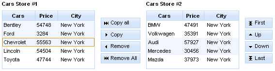
The <rich:listShuttle> component consists of the following parts:
Note:
Now the listener can not be called from the column facet. This is a temporary limitation. The additional information can be found in RichFaces Jira.
The "sourceValue" attribute defines a List or Array of items to be shown in the source list.
The "targetValue" attribute defines a List or Array of items to be shown in the target list.
The "var" attribute could be shared between both Lists or Arrays to define lists on the page.
The "sourceRequired" and "targetRequired" attributes define the case when source and target values are being validated. If the value of both attributes is "true" there should be at least one item in source and target lists. Otherwise validation fails.
Example:
...
<h:form id="myForm">
<rich:messages>
<f:facet name="errorMarker">
<h:graphicImage value="/images/ajax/error.gif" />
</f:facet>
</rich:messages>
<rich:listShuttle id="myListShuttle" sourceValue="#{toolBar.freeItems}" targetValue="#{toolBar.items}"
sourceRequired = "true" targetRequired = "true" var="items" converter="listShuttleconverter"
sourceCaptionLabel="Source List" targetCaptionLabel="Target List">
<rich:column>
<h:graphicImage value="#{items.iconURI}" />
</rich:column>
<rich:column>
<h:outputText value="#{items.label}" />
</rich:column>
</rich:listShuttle>
<a4j:commandButton value="Submit" />
</h:form>
...
In the example above the source list is empty. If you submit the form validation fails and error message appears on a page.
This is the result:
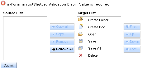
The "converter" attribute is used to convert component data to a particular component's value. For example, when you select items in a list, a converter is used to format a set of objects to a strings to be displayed.
...
<rich:listShuttle var="item" sourceValue="#{bean.source}" targetValue="#{bean.target}" sourceSelection="#{bean.sourceSelection}"
targetSelection="#{bean.targetSelection}" converter="listShuttleconverter">
<f:facet name="sourceCaption">
<h:outputText value="Cars Store #1" />
</f:facet>
<f:facet name="targetCaption">
<h:outputText value="Cars Store #2" />
</f:facet>
<rich:column>
<h:outputText value="#{items.name}" />
</rich:column>
</rich:listShuttle>
...
...
<rich:listShuttle var="item" sourceValue="#{bean.source}" targetValue="#{bean.target}" converter="listShuttleconverter">
...
<f:facet name="topControl">
<h:outputText value="Move to top" />
</f:facet>
<f:facet name="upControl">
<h:outputText value="Move up" />
</f:facet>
<f:facet name="downControl">
<h:outputText value="Move down" />
</f:facet>
<f:facet name="bottomControl">
<h:outputText value="Move to bottom" />
</f:facet>
</rich:listShuttle>
...
...
<rich:listShuttle var="item" sourceValue="#{bean.source}" targetValue="#{bean.target}" converter="listShuttleconverter"
copyControlLabel="Copy" removeControlLabel="Remove"
copyAllControlLabel="Copy all" removeAllControlLabel="Remove all">
<h:column>
<f:facet name="header">
<h:outputText value="Cars" />
</f:facet>
<h:outputText value="#{item.name}" />
</h:column>
</rich:listShuttle>
...
Controls rendering is based on the "controlsType" attribute. Possible types are button and none.
Table 6.207. Keyboard usage for elements reordering
| Keys and combinations | Description |
|---|---|
| Home | Moves selected set to the top of a list (for target list only) |
| End | Moves selected set to the bottom of a list (for target list only) |
| CTRL+Up arrow | Moves selected item to one position upper |
| CTRL+Down arrow | Moves selected item to one position lower |
Table of <rich:listShuttle> attributes.
Table 6.209. JavaScript API
| Function | Description |
|---|---|
| enable() | Enables ordering control (to be implemented) |
| disable() | Disables ordering control (to be implemented) |
| isEnabled() | Checks if current control is enabled (to be implemented) |
| up() | Moves up selected item in the list |
| down() | Moves down selected item in the list |
| top() | Moves top selected item in the list |
| bottom() | Moves bottom selected item in the list |
| copy() | Copies selected item from the source list to the target list |
| remove() | Removes selected item from the target list to the source list |
| copyAll() | Copies all items from the source list to the target list |
| removeAll() | Removes all items from the target list to the source list |
| getSelection() | Returns currently selected item (to be implemented) |
| getItems() | Returns the collection of all items (to be implemented) |
Table 6.210. Facets
| Facet | Description |
|---|---|
| copyAllControl | Redefines the label content for the "copyAll" control. Related attribute is "copyAllControlLabel" |
| removeAllControl | Redefines the label content for the "removeAll" control. Related attribute is "removeAllControlLabel" |
| copyControl | Redefines the label content for the "copy" control. Related attribute is "copyControlLabel" |
| removeControl | Redefines the label content for the "remove" control. Related attribute is "removeControlLabel" |
| copyAllControlDisabled | Redefines the disabled label content for the "copyAll" control |
| removeAllControlDisabled | Redefines the disabled label content for the "removeAll" control |
| caption | Redefines the caption control |
| sourceCaption | Defines source list caption representation text. Related attribute is "sourceCaptionLabel" |
| targetCaption | Defines source list target representation text. Related attribute is "targetCaptionLabel" |
Table 6.211. Classes names that define a list representation
| Class name | Description |
|---|---|
| rich-list-shuttle | Defines styles for a wrapper table element of a listShuttle |
| rich-list-shuttle-caption | Defines styles for a list caption |
| rich-shuttle-body | Defines styles for a list body |
| rich-shuttle-list-content | Defines styles for a list content |
| rich-shuttle-source-items | Defines styles for a wrapper <div> element for source list |
| rich-shuttle-target-items | Defines styles for a wrapper <div> element for target list |
| rich-shuttle-list-header | Defines styles for a lists header |
| rich-shuttle-header-tab-cell | Defines styles for a header cell |
Table 6.212. Classes names that define a caption representations in a source and target lists
| Class name | Description |
|---|---|
| rich-shuttle-source-caption | Defines styles for a caption in a source list |
| rich-shuttle-target-caption | Defines styles for a caption in a target list |
Table 6.213. Classes names that define a rows representations in a source list
| Class name | Description |
|---|---|
| rich-shuttle-source-row | Defines styles for a row in a source list |
| rich-shuttle-source-row-selected | Defines styles for a selected row in a source list |
| rich-shuttle-source-row-active | Defines styles for an active row in a source list |
Table 6.214. Classes names that define a rows representations in a target list
| Class name | Description |
|---|---|
| rich-shuttle-target-row | Defines styles for a row in a target list |
| rich-shuttle-target-row-selected | Defines styles for a selected row in a target list |
| rich-shuttle-target-row-active | Defines styles for an active row in a target list |
Table 6.215. Classes names that define a cells representations in a source list
| Class name | Description |
|---|---|
| rich-shuttle-source-cell | Defines styles for a cell in a source list |
| rich-shuttle-source-cell-selected | Defines styles for a selected cell in a source list |
| rich-shuttle-source-cell-active | Defines styles for an active cell in a source list |
Table 6.216. Classes names that define a cells representations in a target list
| Class name | Description |
|---|---|
| rich-shuttle-target-cell | Defines styles for a cell in a target list |
| rich-shuttle-target-cell-selected | Defines styles for a selected cell in a target list |
| rich-shuttle-target-cell-active | Defines styles for an active cell in a target list |
Table 6.217. Classes names that define controls representations
| Class name | Description |
|---|---|
| rich-shuttle-controls | Defines styles for a controls group |
| rich-shuttle-top | Defines styles for a "Top" control |
| rich-shuttle-bottom | Defines styles for a "Bottom" control |
| rich-shuttle-up | Defines styles for a "Up" control |
| rich-shuttle-down | Defines styles for a "Down" control |
| rich-shuttle-copy | Defines styles for a "Copy" control |
| rich-shuttle-remove | Defines styles for a "Remove" control |
| rich-shuttle-copyAll | Defines styles for a "copyAll" control |
| rich-shuttle-removeAll | Defines styles for a "removeAll" control |
| rich-shuttle-control-disabled | Defines styles for a control in a disabled state |
Table 6.218. Classes names that define a button representation
| Class name | Description |
|---|---|
| rich-list-shuttle-button | Defines styles for a button |
| rich-list-shuttle-button-disabled | Defines styles for a disabled button |
| rich-list-shuttle-button-light | Defines styles for a button highlight |
| rich-list-shuttle-button-press | Defines styles for a pressed button |
| rich-list-shuttle-button-content | Defines styles for a button content |
| rich-list-shuttle-button-selection | Defines styles for a button selection |
You can find all necessary information about style classes redefinition in Definition of Custom Style Classes section.
On RichFaces LiveDemo page you can see an example of <rich:listShuttle> usage and sources for the given example.
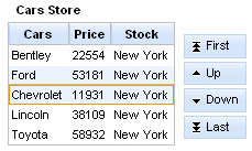
The <rich:orderingList> component consists of
The "value" and "var" attributes are used to access the values of a list.
Controls rendering is based on the "controlsType" attribute. Possible types are button or none.
The information about the "converter" attribute is here.
The "selection" attribute stores the collection of items selected by you. In the example below after submitting the form the current collection is placed in the object's property and then <rich:dataTable> with selected items is shown.
Example:
...
<h:form>
<rich:orderingList value="#{bean.simpleItems}" var="item" selection="#{bean.selection}" controlsType="button">
<rich:column>
<f:facet name="header">
<h:outputText value="Cars" />
</f:facet>
<h:outputText value="#{item}" />
</rich:column>
</rich:orderingList>
<rich:dataTable id="infoPanelID" value="#{bean.info}" var="info" rendered="true">
<rich:column>
<h:outputText value="#{info}" />
</rich:column>
</rich:dataTable>
<a4j:commandButton value="reRender" reRender="infoPanelID" />
</h:form>
...
The <rich:orderingList> component allows to use "caption" facet. A caption could be also defined with "captionLabel" attribute.
Simple example is placed below.
Example:
...
<rich:orderingList value="#{bean.simpleItems}" var="item" controlsType="button" selection="#{bean.selection}">
<f:facet name="caption">
<h:outputText value="Caption Facet" />
</f:facet>
<rich:column>
<f:facet name="header">
<h:outputText value="Cars" />
</f:facet>
<h:outputText value="#{item.name}" />
</rich:column>
<rich:column>
<f:facet name="header">
<h:outputText value="Price" />
</f:facet>
<h:outputText value="#{item.price}" />
</rich:column>
</rich:orderingList>
...
The <rich:orderingList> component provides the possibility to use ordering controls set, which performs reordering. Every control has possibility to be disabled.
An ordering controls set could be defined with "topControlLabel" , "bottomControlLabel" , "upControlLabel" , "downControlLabel" attributes.
It is also possible to use "topControl" , "topControlDisabled" , "bottomControl" , "bottomControlDisabled" , "upControl" , "upControlDisabled" , "downControl" , "downControlDisabled" facets in order to replace the default controls with facets content.
Example:
...
<rich:orderingList value="#{bean.simpleItems}" var="item" controlsType="button" selection="#{bean.selection}">
<f:facet name="topControl">
<h:outputText value="Move to top" />
</f:facet>
<f:facet name="upControl">
<h:outputText value="Move up" />
</f:facet>
<f:facet name="downControl">
<h:outputText value="Move down" />
</f:facet>
<f:facet name="bottomControl">
<h:outputText value="Move to bottom" />
</f:facet>
<rich:orderingList>
...
The position of the controls relatively to a list could be customized with:
"controlsHorizontalAlign" attribute. Possible values:
"left" - controls render to the left side of a list
"right" (default) - controls render to the right side of a list
"center" - controls is centered
"controlsVerticalAlign" attribute. Possible values:
"top" - controls render aligned to the top side of a list
"bottom" - controls render aligned to the bottom side of a list
"center" (default) - controls is centered relatively to a list
The <rich:orderingList> component has a possibility to hide any of the controls by pairs using following attributes:
"orderControlsVisible" attribute has two values: "true" or "false". If false Up and Down controls are not displayed.
"fastOrderControlsVisible" attribute has two values: "true" or "false". If false Top and Bottom controls are not displayed.
The
<rich:orderingList>
component allows to use internationalization method
to redefine and localize the labels. You could use application resource bundle and define
RICH_SHUTTLES_TOP_LABEL,
RICH_SHUTTLES_BOTTOM_LABEL,
RICH_SHUTTLES_UP_LABEL,
RICH_SHUTTLES_DOWN_LABEL there.
You could also pack org.richfaces.renderkit.orderingList resource bundle with your JARs defining the same properties.
Table 6.220. Keyboard usage for elements reordering
| Keys and combinations | Description |
|---|---|
| Page Up | Moves selected set to the top of a list |
| Page Down | Moves selected set to the bottom of a list |
| CTRL+Up arrow | Moves selected item to one position upper |
| CTRL+Down arrow | Moves selected item to one position lower |
Table of <rich:orderingList> attributes.
Table 6.222. JavaScript API
| Function | Description |
|---|---|
| hide() | Hides ordering control (to be implemented) |
| show() | Shows ordering control (to be implemented) |
| isShown() | Checks if current control is shown (to be implemented) |
| enable() | Enables ordering control (to be implemented) |
| disable() | Disables ordering control (to be implemented) |
| isEnabled() | Checks if current control is enabled (to be implemented) |
| Up() | Moves up selected item in the list |
| Down() | Moves down selected item in the list |
| Top() | Moves top selected item in the list |
| Bottom() | Moves bottom selected item in the list |
| getSelection() | Returns currently selected item |
| getItems() | Returns the collection of all items |
Table 6.223. Facets
| Facet | Description |
|---|---|
| caption | Redefines the caption content. Related attribute is "captionLabel" |
| topControl | Redefines the label for the "Top" control. Related attribute is "topControlLabel" |
| bottomControl | Redefines the label for the "Bottom" control. Related attribute is "bottomControlLabel" |
| upControl | Redefines the label for the "Up" control. Related attribute is "upControlLabel" |
| downControl | Redefines the label for the "Down" control. Related attribute is "downControlLabel" |
| topControlDisabled | Redefines the disabled label for the "Top" control |
| bottomControlDisabled | Redefines the disabled label for the "Bottom" control |
| upControlDisabled | Redefines the disabled label for the "Up" control |
| downControlDisabled | Redefines the disabled label for the "Down" control |
Table 6.224. Classes names that define a list representation
| Class name | Description |
|---|---|
| rich-ordering-list-body | Defines styles for a wrapper table element of an orderingList |
| rich-ordering-list-output | Defines styles for a wrapper <div> element of a list |
| rich-ordering-list-items | Defines styles for a wrapper table element of items in the list |
| rich-ordering-list-content | Defines styles for a list content |
| rich-ordering-list-header | Defines styles for a wrapper <div> element for a list header |
| rich-ordering-list-table-header | Defines styles for a wrapper <tr> element for a list header |
| rich-ordering-list-table-header-cell | Defines styles for a header cell |
Table 6.225. Classes names that define a caption representation
| Class name | Description |
|---|---|
| rich-ordering-list-caption | Defines styles for a caption |
| rich-ordering-list-caption-disabled | Defines styles for a caption in disabled state |
| rich-ordering-list-caption-active | Defines styles for a caption in active state |
Table 6.226. Classes names that define rows representation
| Class name | Description |
|---|---|
| rich-ordering-list-row | Defines styles for a row |
| rich-ordering-list-row-selected | Defines styles for a selected row |
| rich-ordering-list-row-active | Defines styles for an active row |
| rich-ordering-list-row-disabled | Defines styles for a disabled row |
Table 6.227. Classes names that define cells representation
| Class name | Description |
|---|---|
| rich-ordering-list-cell | Defines styles for a cell |
| rich-ordering-list-cell-selected | Defines styles for a selected cell |
| rich-ordering-list-cell-active | Defines styles for an active cell |
| rich-ordering-list-cell-disabled | Defines styles for a disabled cell |
Table 6.228. Classes names that define a button representation
| Class name | Description |
|---|---|
| rich-ordering-list-button | Defines styles for a button |
| rich-ordering-list-button-disabled | Defines styles for a disabled button |
| rich-ordering-list-button-light | Defines styles for a button highlight |
| rich-ordering-list-button-press | Defines styles for a pressed button |
| rich-ordering-list-button-content | Defines styles for a button content |
| rich-ordering-list-button-selection | Defines styles for a button selection |
| rich-ordering-list-button-valign | Defines styles for a wrapper <td> element for buttons vertical align |
| rich-ordering-list-button-layout | Defines styles for a wrapper <div> element of buttons layout |
Table 6.229. Classes names that define controls representation
| Class name | Description |
|---|---|
| rich-ordering-controls | Defines styles for a controls group |
| rich-ordering-control-top | Defines styles for a "top" control |
| rich-ordering-control-bottom | Defines styles for a "bottom" control |
| rich-ordering-control-up | Defines styles for a "up" control |
| rich-ordering-control-down | Defines styles for a "down" control |
| rich-ordering-control-disabled | Defines styles for controls in disabled state |
You can find all necessary information about style classes redefinition in Definition of Custom Style Classes section.
On RichFaces LiveDemo page you can see an example of <rich:orderingList> usage and sources for the given example.
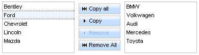
The <rich:pickList> component consists of
The "value" attribute is the initial value of this component.
The <f:selectItem /> or <f:selectItems /> facets are used to define the values of a source list.
...
<rich:pickList value="#{pickBean.listValues}">
<f:selectItem itemValue="Bentley" itemLabel="Bentley"/>
<f:selectItem itemValue="Audi" itemLabel="Audi"/>
<f:selectItems value="#{pickBean.sourceList}"/>
</rich:pickList>
...
...
<rich:pickList copyAllControlLabel = "#{pickBean.copyAllLabel}" copyControlLabel = "#{pickBean.copyLabel}"
removeControlLabel = "#{pickBean.removeLabel}" removeAllControlLabel ="#{pickBean.removeAllLabel}" value="#{pickBean.listValues}">
<f:selectItem itemValue="Bentley" itemLabel="Bentley"/>
<f:selectItem itemValue="Audi" itemLabel="Audi"/>
<f:selectItems value="#{pickBean.sourceList}"/>
</rich:pickList>
...
If you don't want to display labels on the buttons you need to set "showButtonsLabel" to "false".
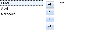
Alternative to the given attributes are the following facets: "copyAllControl" , "removeAllControl" , "copyControl" , "removeControl" , "copyAllControlDisabled" , "removeAllControlDisabled" , "copyControlDisabled" , "removeControlDisabled" , "caption" .
It is an example of usage of the facets and it is identical to the previous example.
...
<rich:pickList value="#{pickBean.listValues}">
<f:facet name="copyAllControl">
<h:commandButton value="#{pickBean.copyAllLabel}" />
</f:facet>
<f:facet name="copyControl">
<h:commandButton value="#{pickBean.copyLabel}" />
</f:facet>
<f:facet name="removeControl">
<h:commandButton value="#{pickBean.removeLabel}" />
</f:facet>
<f:facet name="removeAllControl">
<h:commandButton value="#{pickBean.removeAllLabel}" />
</f:facet>
<f:selectItem itemValue="Bentley" itemLabel="Bentley"/>
<f:selectItem itemValue="Audi" itemLabel="Audi"/>
<f:selectItems value="#{pickBean.sourceList}"/>
</rich:pickList>
...
With the help of "moveControlsVerticalAlign" attribute you can align move controls vertically.
The possible value for "moveControlsVerticalAlign" are "top", "bottom" and "center" (default value).
The <rich:pickList> component provides resizing of lists by using such attributes as:
"listsHeight" defines height of the lists.
"sourceListWidth" defines width of a source list.
"targetListWidth" defines width of a target list.
Example:
...
<rich:pickList listsHeight="#{pickBean.listsHeight}" sourceListWidth="#{pickBean.sourceListWidth}" targetListWidth="#{pickBean.targetListWidth}" value="#{pickBean.listValues}">
<f:selectItem itemValue="Bentley" itemLabel="Bentley"/>
<f:selectItem itemValue="Audi" itemLabel="Audi"/>
<f:selectItems value="#{pickBean.sourceList}"/>
</rich:pickList>
...
The
<rich:pickList>
component allows to use internationalization method
to redefine and localize the labels. You could use application resource bundle and define
RICH_PICK_LIST_COPY_ALL_LABEL,
RICH_PICK_LIST_COPY_LABEL,
RICH_PICK_LIST_REMOVE_ALL_LABEL,
RICH_PICK_LIST_REMOVE_LABEL there.
Table 6.230. Keyboard usage for elements selection
| Keys and combinations | Description |
|---|---|
| CTRL+click | Inverts selection for an item |
| SHIFT+click | Selects all rows from active one to a clicked row if they differ, else select the active row. All other selections are cleared |
| CTRL+A | Selects all elements inside the list if some active element is already present in a list |
| Up, Down arrows | Changes the active and selected elements to the next or previous in a list |
Table of <rich:pickList> attributes.
Table 6.232. Facets
| Facet | Description |
|---|---|
| copyAllControl | Redefines the "copyAll" label with the control set. Related attribute is "copyAllControlLabel" |
| removeAllControl | Redefines the "removeAll" label with the control set. Related attribute is "removeAllControlLabel" |
| copyControl | Redefines the "copy" label with the control set. Related attribute is "copyControlLabel" |
| removeControl | Redefines the "remove" label with the control set. Related attribute is "removeControlLabel" |
| copyAllControlDisabled | Redefines the disabled "copyAll" label with the control set. |
| removeAllControlDisabled | Redefines the disabled "removeAll" label with the control set. |
| copyControlDisabled | Redefines the disabled "copy" label with the control set. |
| removeControlDisabled | Redefines the disabled "remove" label with the control set. |
| caption | Defines the "caption" label with the control set. |
Table 6.233. Classes names that define a list representation
| Class name | Description |
|---|---|
| rich-list-picklist | Defines styles for a wrapper <table> element of a pickList |
Table 6.234. Classes names that define a source and target items representation
| Class name | Description |
|---|---|
| rich-picklist-source-items | Defines styles for a wrapper <div> element of a source list |
| rich-picklist-target-items | Defines styles for a wrapper <div> element of a target list |
| rich-picklist-body | Defines styles for a wrapper <table> element of a list body (source and target) |
| rich-picklist-list | Defines styles for a (source and target) list |
| rich-picklist-list-content | Defines styles for a (source and target) list content |
| rich-picklist-internal-tab | Defines styles for a wrapper <table> element of list items (source and target) |
Table 6.235. Classes names that define rows representation
| Class name | Description |
|---|---|
| rich-picklist-source-row | Defines styles for a source list row |
| rich-picklist-source-row-selected | Defines styles for a selected row in a source list |
| rich-picklist-target-row-selected | Defines styles for a selected row in a target list |
Table 6.236. Classes names that define a source cell representation
| Class name | Description |
|---|---|
| rich-picklist-source-cell | Defines styles for a cell in a source list |
| rich-picklist-source-cell-selected | Defines styles for a selected cell in a source list |
| rich-picklist-source-cell-active | Defines styles for an active cell in a source list |
Table 6.237. Classes names that define a target cell representation
| Class name | Description |
|---|---|
| rich-picklist-target-cell | Defines styles for a target list cell |
| rich-picklist-target-cell-selected | Defines styles for a selected cell in a target list |
| rich-picklist-target-cell-active | Defines styles for an active cell in a target list |
Table 6.238. Classes names that define a control representation
| Class name | Description |
|---|---|
| rich-picklist-controls | Defines styles for wrapper <div> element of a pickList controls |
| rich-picklist-control-disabled | Defines styles for a control in a disabled state |
| rich-picklist-control-copyall | Defines styles for a "copyAll" control |
| rich-picklist-control-copy | Defines styles for a "Copy" control |
| rich-picklist-control-remove | Defines styles for a "Remove" control |
| rich-picklist-control-removeall | Defines styles for a "removeAll" control |
| rich-picklist-control-img | Defines styles for a control image |
Table 6.239. Classes names that define a button representation
| Class name | Description |
|---|---|
| rich-list-picklist-button | Defines styles for a button |
| rich-list-picklist-button-disabled | Defines styles for a disabled button |
| rich-list-picklist-button-press | Defines styles for a pressed button |
| rich-list-picklist-button-light | Defines styles for a button highlight |
| rich-list-picklist-button-selection | Defines styles for a button selection |
| rich-list-picklist-button-content | Defines styles for a button content |
You can find all necessary information about style classes redefinition in Definition of Custom Style Classes section.
On RichFaces LiveDemo page you can see an example of <rich:pickList> usage and sources for the given example.
Layout components enrich RichFaces with functionality that enables you to create the whole page layout and define the parameters of the page. You can also create your custom theme and use it alongside with these components.
The "contentType" allows to specify the type of the content and encoding for the page.
...
<rich:page pageTitle="The title of the page" markupType="xhtml">
<f:facet name="pageHeader">
<meta content="The rich:page component" name="keywords" />
<link rel="shortcut icon" href="/images/favicon.ico" />
<link href="/css/style.css" rel="stylesheet" type="text/css" />
<script type="text/javascript" src="/js/menu.js"></script>
</f:facet>
<!-- page content -->
</rich:page>
...
...
<rich:page sidebarPosition="left" sidebarWidth="300">
<f:facet name="header">
<!-- header content -->
</f:facet>
<f:facet name="sidebar">
<!-- side panel content -->
</f:facet>
<!-- body content -->
<f:facet name="footer">
<!-- footer content -->
</f:facet>
</rich:page>
...
As a whole, RichFaces provides 4 themes for the <rich:page> component out-of-the-box: "simple", "violetRays", "oldschool", "smooth". The Creating a Theme for <rich:page> article tells how you can create your custom theme for the <rich:page> component.
Table of <rich:page> attributes.
Table 6.241. Facets
| Facet Name | Description |
|---|---|
| pageHeader | Creates the <head/> part of the HTML page |
| header | Creates a header |
| subheader | Creates a horizontal panel under the header |
| footer | Creates a footer |
| sidebar | Creates a left/right panel |
Table 6.242. CSS Selectors that define the representation of the component's blocks
| CSS Selector | Description |
|---|---|
| .rich-page | Defines styles for the whole page |
| .rich-page-header | Defines styles for the header |
| .rich-page-subheader | Defines styles for the block under the header |
| .rich-page-sidebar | Defines styles for the sidebar |
| .rich-page-body | Defines styles for the body part of the page |
| .rich-page-footer | Defines styles for the footer |
On the component Live Demo page you can see the example of <rich:page> component usage and sources for the given example.
The Layout components for RichFaces 3.3.1 on the JBoss.org Wiki
Refer to the "Changing the layout of the page dynamically" to find out how to change the layout of a page on the fly with <rich:page>.
Example:
...
<rich:layout>
<rich:layoutPanel position="top">
<!--top-->
</rich:layoutPanel>
<rich:layoutPanel position="left">
<!--left-->
</rich:layoutPanel>
<rich:layoutPanel position="center">
<!--center-->
</rich:layoutPanel>
<rich:layoutPanel position="right">
<!--right-->
</rich:layoutPanel>
<rich:layoutPanel position="bottom">
<!--bottom-->
</rich:layoutPanel>
</rich:layout>
...
To get more details about <rich:layoutPanel> please read the chapter about layoutPanel in the guide.
Visit layout page at RichFaces Live Demo for examples of component usage and their sources.
The Layout components for RichFaces on the JBoss.org Wiki
...
<rich:layout>
<rich:layoutPanel position="top">
<!--top-->
</rich:layoutPanel>
<rich:layoutPanel position="left">
<!--left-->
</rich:layoutPanel>
<rich:layoutPanel position="center">
<!--center-->
</rich:layoutPanel>
<rich:layoutPanel position="right">
<!--right-->
</rich:layoutPanel>
<rich:layoutPanel position="bottom">
<!--bottom-->
</rich:layoutPanel>
</rich:layout>
...
You can specify the width of the layout area with the "width" attribute.
On RichFaces Live Demo page you can see an example of <rich:layoutPanel> usage and sources for the given example.
See also the <rich:layout> chapter of the guide.
The Layout components for RichFaces 3.3.1 on the JBoss.org Wiki.
- 6.14.1. < rich:componentControl > available since 3.0.0
- 6.14.2. <rich:effect> available since 3.1.0
- 6.14.3. < rich:gmap > available since 3.0.0
- 6.14.4. < rich:virtualEarth > available since 3.1.0
- 6.14.5. < rich:hotKey > available since 3.2.2
- 6.14.6. < rich:insert > available since 3.1.0
- 6.14.7. <rich:message> available since 3.1.0
- 6.14.8. <rich:messages> available since 3.1.0
- 6.14.9. < rich:jQuery > available since 3.0.0
A collection of Ajax Miscellaneous components
...
<rich:componentControl attachTo="doExpandCalendarID" event="onclick" operation="Expand" for="ccCalendarID" />
...
<h:commandButton value="Show Modal Panel">
<!--componentControl is attached to the commandButton-->
<rich:componentControl for="ccModalPanelID" event="onclick" operation="show"/>
</h:commandButton>
function func (event) { }
<rich:componentControl name="func" event="onRowClick" for="menu" operation="show" />
...
<rich:componentControl name="func" event="onRowClick" for="menu" operation="show" params="#{car.model}"/>
...
...
<rich:componentControl event="onRowClick" for="menu" operation="show">
<f:param value="#{car.model}" name="model"/>
</rich:componentControl>
...
<h:form>
<rich:toolTip id="toolTip" mode="ajax" value="and then just touch me." direction="top-right" />
</h:form>
<h:commandButton id="ButtonID" value="Push me">
<rich:componentControl attachTo="ButtonID" event="onmouseover" operation="show" for="toolTip" />
</h:commandButton>
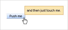
Visit the ComponentControl page at RichFaces LiveDemo for examples of component usage and their sources.
Information on JSF <f:param> component You can find at <f:param> TLD reference in Java Server Faces technology section at Sun portal.
It is possible to use <rich:effect> in two modes:
Those a the typical variants of using:
<!-- triggered by an event -->
<rich:panel>
<rich:effect event="onmouseout" type="Opacity" params="duration:0.8,from:1.0,to:0.3" />
...
</rich:panel>
<!-- invoking by JavaScript -->
<div id="contentDiv">...</div>
<input type="button" onclick="hideDiv({duration:0.7})" value="Hide" />
<input type="button" onclick="showDiv()" value="Show" />
<rich:effect name="hideDiv" for="contentDiv" type="Fade" />
<rich:effect name="showDiv" for="contentDiv" type="Appear" />
<!-- attached to a window onload event and applied to a particular page element -->
<rich:effect for="window" event="onload" type="Appear" params="targetId:'contentDiv',duration:0.8,from:0.3,to:1.0" />
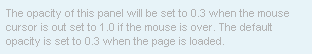
The "name" attribute defines a name of the JavaScript function that will be generated on a page after the component is rendered. This function will activate the needed effect. The function accesses one parameter. It is a set of effect options in JSON format.
The "type" attribute defines the type of an effect that will be applied.
Possible values are Fade, Blind, Opacity.
The "for" attribute defines the ID of the component or HTML tag, the effect is attached to. RichFaces converts value of "for" attribute to a component client ID if such component is found. In case if such component is not found the value is left because of possible wirings with some DOM element id on the client side. By default, the target of the effect is the same element that effect is pointed to. Тarget element can be redefined with the "targetId" attribute; new parameters should be passed with the "params" attribute.
The "params" attribute allows to define a set of options (duration, delay, from, to) possible for a particurar effect.
Additionally to the options used by the effect itself, there are two option that might override the <rich:effect>attribute:
"targetId" allows to re-define the target of effect. The option is override the value of "for" attribute.
"type" defines the effect type. The option is override the value of "type" attribute.
Besides all you can load the Scriptaculous library to the page and use it directly without <rich:effect>:
<a4j:loadScript src="resource://scriptaculous/effect.js" />
But if you use the <rich:effect> there is no need to include this library because it's already there.
Visit the Effect page at RichFaces LiveDemo for examples of component usage and their sources.
Useful articels:
"Create a banner using effects and poll" and "Create a HTML banner using effects and poll" at RichFaces wiki contains sorces for creating an image and HTML banners;
"Slideshow" article at RichFaces Cookbook describes how to make a slideshow with help of the <rich:effect> and <a4j:poll> components;
Look at Scriptaculous documentation for set of available effect.
Find more information about the compinent at RichFaces Users Forum.
To use Google Map in your application, generate a key on Google Map official resource . One key could be used for one directory on the server.
Here are the main settings of initial rendering performed with a component map that are accessible with the following attributes:
"zoom" defines an approximation size (boundary values 1-18)
"lat" specifies an initial latitude coordinate in degrees, as a number between -90 and +90
"lng" specifies an initial longitude coordinate in degrees, as a number between -180 and +180
"mapType" specifies a type of a rendered map (
G_NORMAL_MAP,G_SATELLITE_MAP(DEFAULT),G_HYBRID_MAP)
For example, the city of Paris is shown after rendering with
the following initial settings:
lat = "48.44"
,
lng = "2.24"
and
zoom = "5"
.
It's also possible to set accessible controls on the map with the help of the attributes:
"showGMapTypeControl" determines whether the controls for a map type definition are switched on
"showGScaleControl" determines whether the controls for scaling are switched on
"showGLargeMapControl" determines whether the control for map scale rendering is rendered
To set the controls as well as to perform other activities (Zoom In/Out etc.) is possible with your JavaScript, i.e. declare a name of a map object in the "gmapVar" attribute and then call the object directly with Google Maps API.
For instance, if you have gmapVar = "map" declared for your component, to zoom in a map you should call map.zoomIn() on an
event. See also an example of
<rich:gmap>
usage on the RichFaces Live Demo.
Tip:
You do not need to use reRender to perform uptades for the <rich:gmap> component. Use the "gmapVar" attribute and Google Maps native API instead as it's described above.
Moreover, to add e.g. some JavaScript effects, events defined on it are used.
"onmouseover"
"onclick"
"onmouseout"
etc.
Note
Google Map does not support XHTML format of the page. Thus, if you use Facelets and JSF 1.2, do not forget to put the following tags somewhere on the page:
...
<f:view contentType="text/html">...</f:view>
...
Table of <rich:gmap> attributes.
Table 6.248. Classes names that define a component appearance
| Class name | Description |
|---|---|
| rich-gmap | Defines styles for a wrapper <div> element of a component |
You can find all necessary information about style classes redefinition in Definition of Custom Style Classes section.
On the component Live Demo page you can see the example of <rich:gmap> usage and sources for the given example.

Code for this example is placed below:
<rich:virtualEarth style="width:800px;" id="vm" lat="48.833" lng="2.40" dashboardSize="Normal" zoom="11" mapStyle="Hybrid" var="map" />
To set all these parameters and perform some activity (Zoom In/Out etc.) is possible with your JavaScript, i.e. declare a name of an object on a map in the "var" attribute and then call the object directly with API Microsoft Virtual Earth map .
For example, to approximate a map for var = "map" declared inside the component, call map.ZoomIn() on an event.
Moreover, to add e.g. some JavaScript effects, events defined on it are used.
onmouseoveronclickonmouseoutetc.
Note
Virtual Earth does not support XHTML format of the page. Thus, if you use Facelets and JSF 1.2, do not forget to put the following tags somewhere on the page:
<f:view contentType="text/html">...</f:view>
Table of <rich:virtualEarth> attributes.
Table 6.250. Classes names that define a component appearance
| Class name | Description | Skin parameter | CSS property |
|---|---|---|---|
| rich-virtualEarth | Defines styles for a wrapper <div> element of a component | no | height, width |
Visit the VirtualEarth page at RichFaces LiveDemo for examples of component usage and their sources.
Useful articles:
Bing Map Control SDK 6.2 at MSDN portal provides invormation about Microsoft interactive Earth map.
Includes all features of the Javascript jQuery Hotkeys Plugin
Hot key registration by request through JavaScript API
Possibility to attach <rich:hotKey> to a whole page or to a particular element using "selector" attribute
Hot key registration timing
Enabling/disabling the <rich:hotKey> using JavaScript API
There are two ways to register <rich:hotKey>:
attach it with "selector" attribute to all the elements defined using this selector. This attribute uses defined by w3c consortium syntax for CSS rule selector with some jQuery extensions.
The "key" attribute defines the hot key itself which is processed by the component.
After the hot key has been registered and defined you could set the "handler" attribute which determines a JavaScript function to be called every time when corresponding keys are pressed.
<rich:listShuttle var="cap" sourceValue="#{capitalsBean.capitals}" id="ls">
<rich:column>
<f:facet name="header">
<h:outputText value="State flag"/>
</f:facet>
<h:graphicImage value="#{cap.stateFlag}"/>
</rich:column>
<rich:column>
<f:facet name="header">
<h:outputText value="State name"/>
</f:facet>
<h:outputText value="#{cap.name}"/>
</rich:column>
</rich:listShuttle>
<rich:hotKey selector="#ls" key="right" handler="#{rich:component('ls')}.copy()"/>
<rich:hotKey selector="#ls" key="left" handler="#{rich:component('ls')}.remove()"/>
<rich:hotKey selector="#ls" key="end" handler="#{rich:component('ls')}.copyAll()"/>
<rich:hotKey selector="#ls" key="home" handler="#{rich:component('ls')}.removeAll()"/>
In the example above the "selector" attribute is used. So the keys work only if <rich:listShuttle> component is focused.
You could press Right or Left keys in order to move some selected items between lists. You could press Home or End buttons in order to move all items between lists.
With the help of the "timing" attribute you could manage <rich:hotKey> registration timing. There are three possible values of this attribute:
immediate— the component is rendered in browser immediately (default value);onload— the component is rendered after the page is fully loaded;onregistercall— the component is rendered only after JavaScript API for the key registration is used.
The "type" attribute defines the type of keyboard event. Possible values are: onkeyup, onkeypress and onkeydown.
The
"disableInInput"
attribute disables the
<rich:hotKey>
if it is activated on input elements and the value of this attribute is true.
The "checkParent" attribute defines the hotkey handling of events generated by child components nested into the parent component to which the <rich:hotKey> is attached.
The <rich:hotKey> component also provides a number of JavaScript API functions. There is an example below.
<h:form id="myForm">
<rich:hotKey id="myKey" key="ctrl+g" handler="alert('Ctrl+G is pressed')" />
<button onclick="${rich:component('myKey')}.enable(); return false;">Turn Ctrl+G On</button>
<button onclick="${rich:component('myKey')}.disable(); return false;">Turn Ctrl+G Off</button>
</h:form>
In the example above the Ctrl+G is registered as a global hotkey, so if you press this key combination the alert window with the "Ctrl+G is pressed" text appears.
With the help of enable(), disable() JavaScript API fucntions you could enable or disable registered hotkey.
Table of <rich:hotKey> attributes.
Table 6.252. JavaScript API
| Function | Description |
|---|---|
| add(selector, key, handler) | Adds the hotkey(from key param) for elements targeted by selector. it assigns a handler function to the key |
| remove() | Removes hotkey registration |
| enable() | Enables registered hotkey |
| disable() | Disables registered hotkey |
Visit the HotKey page at RichFaces LiveDemo for examples of component usage and their sources.
If "highlight" attribute is defined and JHighlight open source library is in the classpath, the text from the file is formated and colorized.
An example is placed below:
<rich:insert src="/pages/sourcePage.xhtml" highlight="xhtml"/>
The result of using <rich:insert> component is shown on the picture:
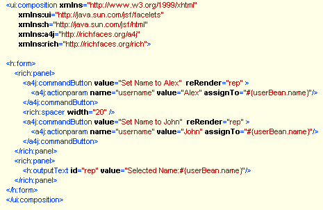
The <rich:insert> component provides the same functionality as JHighlight. Thus, all names of highlight style classes for source code of particular language could be changed to your names, which are used by the JHighlight library.
The "errorContent" attribute defines the alternative content that will be shown in case the <rich:insert> cannot read the resource defined with "src" attribute. If "errorContent" attribute is not defined, the component shown the actual error message in the place where the content is expected.
Visit the Insert page at RichFaces LiveDemo for examples of component usage and their sources.
The component has the same behavior as standard <h:message> component. Besides some extra features:
<rich:message for="id" passedLabel="No errors" showSummary="true">
<f:facet name="errorMarker">
<h:graphicImage url="/image/error.png"/>
</f:facet>
<f:facet name="passedMarker">
<h:graphicImage url="/image/passed.png"/>
</f:facet>
</rich:message>
Table of <rich:message> attributes.
Table 6.255. Facets
| Facet | Description |
|---|---|
| errorMarker | Defines pictogram for message with error severity class |
| fatalMarker | Defines pictogram for message with fatal severity class |
| infoMarker | Defines pictogram for message with info severity class |
| passedMarker | Defines pictogram if there is no fatal, error, warn or info message |
| warnMarker | Defines pictogram for message with warn severity class |
Table 6.256. Classes names that define a component appearance
| Class name | Description |
|---|---|
| rich-message | Defines styles for a wrapper element |
| rich-message-marker | Defines styles for a marker |
| rich-message-label | Defines styles for a label |
You can find all necessary information about style classes redefinition in Definition of Custom Style Classes section.
Visit the Message page at RichFaces LiveDemo for examples of component usage and their sources.
The component has the same behavior as standard <h:message> component. Besides some extra features:
The following example shows different variants of customization of the component.
<rich:messages layout="table" tooltip="true" showDetail="false" showSummary="true">
<f:facet name="errorMarker">
<h:graphicImage url="/image/error.png"/>
</f:facet>
<f:facet name="infoMarker">
<h:graphicImage url="/image/info.png"/>
</f:facet>
</rich:messages>
Table of <rich:messages> attributes.
Table 6.258. Facets
| Facet | Description |
|---|---|
| errorMarker | Defines pictogram for message with error severity class |
| fatalMarker | Defines pictogram for message with fatal severity class |
| infoMarker | Defines pictogram for message with info severity class |
| passedMarker | Defines pictogram if there is no fatal, error, warn or info message |
| warnMarker | Defines pictogram for message with warn severity class |
Table 6.259. Classes names that define a component appearance
| Class name | Description |
|---|---|
| rich-messages | Defines styles for a wrapper element |
| rich-messages-marker | Defines styles for a marker |
| rich-messages-label | Defines styles for a label |
You can find all necessary information about style classes redefinition in Definition of Custom Style Classes section.
Visit the Messages page at RichFaces LiveDemo for examples of component usage and their sources.
<rich:jQuery> can be used in two main modes:
The mode is chosen with "timing" attribute that has the following options:
Here is an example of how to highlight odd rows in a table:
<style>
.odd {background-color: #FFC;}
</style>
<rich:dataTable id="customList" ...>
...
</rich:dataTable>
<rich:jQuery selector="#customList tr:odd" timing="onload" query="addClass(odd)" />
The "selector" attribute uses defined by w3c consortium syntax for CSS rule selector with some jQuery extensions
Those are typical examples of using selector in the <rich:jQuery> component.
In addition, RichFaces allows using either a component id or client id if you apply the query to a JSF component. When you define a selector, RichFaces examines its content and tries to replace the defined in the selector id with a component id if it's found.
For example, you have the following code:
<h:form id="form">
<h:panelGrid id="menu">
<h:graphicImage value="pic1.jpg" />
<h:graphicImage value="pic2.jpg" />
</h:panelGrid>
</h:form>
The actual id of the
<h:panelGrid>
table in the browser DOM is "form:menu". However, you still can reference to images inside this table using the following selector:
...
<rich:jQuery selector="#menu img" query="..." />
...
You can define the exact id in the selector if you want. The following code reference to the same set of a DOM object:
...
<rich:jQuery selector="#form\\:menu img" query="..." />
...
Pay attention to double slashes that escape a colon in the id.
In case when the "name" attribute is defined, <rich:jQuery> generates a JavaScript function that might be used from any place of JavaScript code on a page.
There is an example of how to enlarge the picture smoothly on a mouse over event and return back to the normal size on mouse out:
...
<h:graphicImage width="50" value="/images/price.png" onmouseover="enlargePic(this, {pwidth:'60px'})" onmouseout="releasePic(this)" />
<h:graphicImage width="50" value="/images/discount.png" onmouseover="enlargePic(this, {pwidth:'100px'})" onmouseout="releasePic(this)" />
...
<rich:jQuery name="enlargePic" timing="onJScall" query="animate({width:param.pwidth})" />
<rich:jQuery name="releasePic" timing="onJScall" query="animate({width:'50px'})"/>
...
The JavaScript could use two parameters. The first parameter is a replacement for the selector attribute. Thus, you can share the same query, applying it to the different DOM objects. You can use a literal value or a direct reference for an existing DOM object. The second parameter can be used to path the specific value inside the query. The JSON syntax is used for the second parameter. The "param." namespace is used for referencing data inside the parameter value.
<rich:jQuery> adds styles and behavior to the DOM object dynamically. This means if you replace something on a page during an Ajax response, the applied artifacts is overwritten. But you are allowed to apply them again after the Ajax response is complete.
Usually, it could be done with reRendering the <rich:jQuery> components in the same Ajax interaction with the components these queries are applied to. Note, that queries with "timing" attribute set to "onload" are not invoked even if the query is reRendered, because a DOM document is not fully reloaded during the Ajax interaction. If you need to re-applies query with "onload" value of "timing" attribute, define the "name" attribute and invoke the query by name in the "oncomplete" attribute of the Ajax component.
RichFaces includes jQuery JavaScript framework. You can use the futures of jQuery directly without defining the <rich:jQuery> component on a page if it is convenient for you. To start using the jQuery feature on the page, include the library into a page with the following code:
...
<a4j:loadScript src="resource://jquery.js"/>
...
Refer to the jQuery documentation for the right syntax. Remember to use jQuery() function instead of $(), as soon as jQuery works without conflicts
with prototype.js.
Visit the jQuery page at RichFaces LiveDemo for examples of component usage and their sources.
More information about jQuery framework you can find injQuery official documentation.
See also:
"Using jQuery with Other Libraries" in jQuery official documentation.
RichFaces support is implemented in JBoss Developer Studio 1.0.0 GA and in Jboss Tools. JBoss Developer Studio is a fully packaged IDE that provides full support for Java Server Faces, RichFaces, Facelets, Struts and other Web technologies. In addition to this, it seamlessly combines visual and source-oriented development approaches. One of the special support feature for RichFaces is that it is available as project "capabilitiy" which can be added to any existing JSF project by adding libraries and modifying configuration files as required."